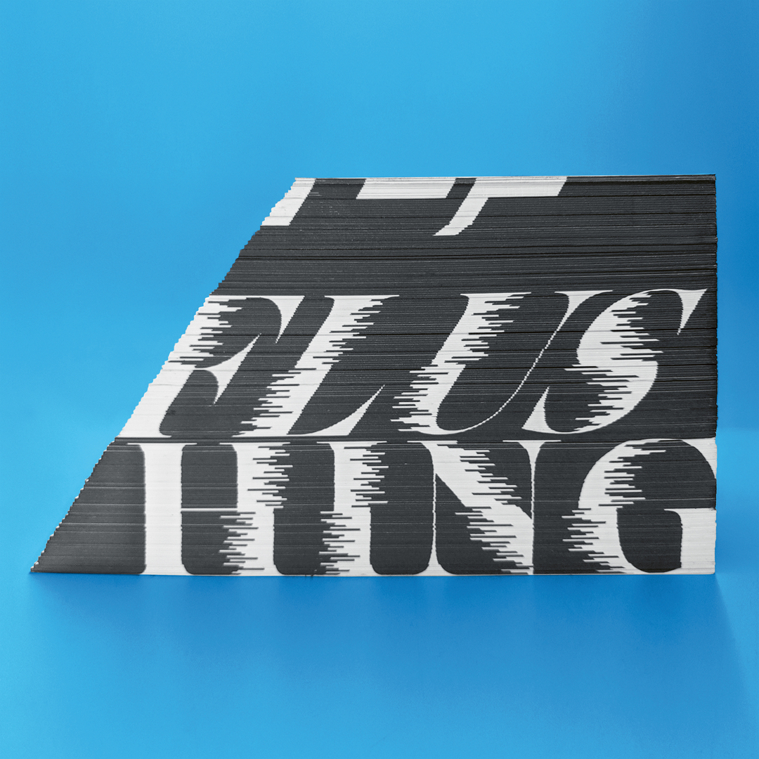
![](/fileadmin/_processed_/b/a/csm_07-02383-2020-22_3eb3cc6e2b.jpg)
Client: Ding Ding Co., Ltd., Taipei City, Taiwan
Begründung der Jury
Based entirely on a newly developed typeface, the brand image of the French creative studio Murmure is courageous in the truest sense. It breaks with the idea of reading friendliness and literally demands a close look. The playful, humorous and modern use of letter doubling and unusual ligatures is great fun, represents a surprising solution and, thus, successfully reflects the studio’s enormous creative potential.