![[Translate to English:]](/fileadmin/_processed_/8/9/csm_02-DP06089-2023BC.1003496_CO-Wiederhergestellt_Kopie_2f996ab689.jpg "[Translate to English:]")
Siegel+Gale
Winners profile
It was with this definition of successful communication that Alan Siegel founded his agency in 1969. Today, as part of the Omnicom Group and with offices in New York, Los Angeles, San Francisco, London, Dubai, Shanghai and Tokyo, the global agency Siegel+Gale is one of the most renowned branding agencies in the world. Over the decades and in all of its projects – from designing the iconic NBA logo to simplifying the US tax form 1040EZ to current design strategies for corporations, non-profit organisations and government institutions – the agency has remained true to its motto. The designers are still today convinced that “brands that embrace simplicity build deeper relationships with their customers and employees – and thus achieve better results.”
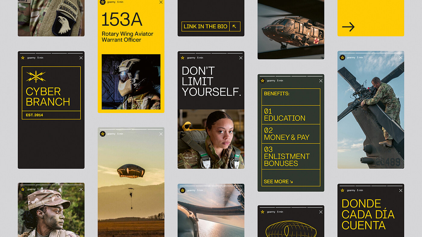
Despite their wealth of experience, there are still exciting challenges for Siegel+Gale. One such challenge is developing new branding for a special client: “The US Army is a unique client – that would probably be the case for any agency. Aside from the camouflage uniforms and other obvious differentiators, there aren’t many other organisations that can boast more than a million employees and 248 years of tradition.” The result is a smart and nifty appearance that ensures an intuitive identification of the army members with the troops – and, of course, the same approach was applied here: simple is smart.
Red Dot: Your brand design for the U.S. Army is very complex. Which component would you call the centrepiece?
Team DDB: The new logo is surely the most visible and iconic element. However, we have also established simple, universal identity principles that inspired all the components and how they work together. These are characterised by clarity, confidence and humanity.
The colours have remained the same as far as possible …
The Army has been using the colours black, gold and white for many years. We added an “Army green” to this palette to give it a unique Army character. Otherwise, we felt the existing colour spectrum was very well thought out in terms of recognition value and the ability to unify the sub-brands.
When developing the brand, the focus was primarily on young adults. How important was it to create an authentic image?
Authenticity was a top priority for several reasons. This identity must tell a frank and engaging story about the wide range of possibilities the Army offers to young people. At the same time, it needs to resonate with current soldiers and veterans who, of course, know the Army better than anyone else.
We decided early on to avoid “inventing” or introducing anything from the outside. The Army has such a rich and distinctive visual culture that every creative decision was inspired in some way by already established features of this brand.
Can you elaborate a little bit on the development of the font?
The Army is a very straightforward organisation. The GI font is an example of how authenticity was embraced. The Army places great emphasis on clear communication, even in using very specific nomenclature and acronyms. This created a highly unique dynamic for the development of a custom font.
The new pictogram system is very extensive. How did this come about?
The iconography system is also very solid. We have created more than 250 icons so far, each of which is produced in three different sizes. The Army had no established predecessors, but all icons relating to objects such as equipment or vehicles are based on actual Army models.
In addition, the icons blend seamlessly with the custom GI font in their design. And the angular or pointed elements in the icons match those of the Army Star symbol as far as possible.