![[Translate to English:]](/fileadmin/_processed_/c/b/csm_326321895_3504026216495880_316289535006936403_n_fae503906c.png "[Translate to English:]")
Anti Inc
Winners profile
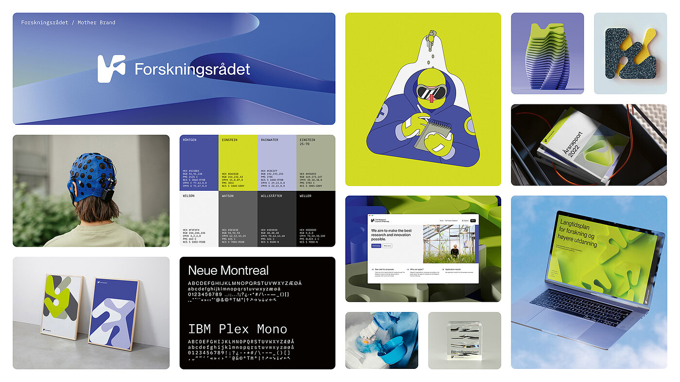
“We love working with smart clients to find their story and tell it like it’s never been told before.“ In this spirit, the agency also developed a well-thought-out and flexible corporate design for the complexly structured Research Council of Norway, which could even be experienced haptically by its employees.
“We started in 2008 as a punk band, a small agency that vowed never to consist of more than five people and never to do anything but design. That didn’t work out,” said the two founders, Kenneth Pedersen and Kjetil Wold Østmoen from the Norwegian agency ANTI. What worked very well, however, was to transfer this somewhat anarchistic spirit to the growing number of employees (now 75 in two offices): a strategic approach, of course. Goal-oriented communication on all analogue and digital channels – in every case. But always also breaking through boundaries, constantly questioning the status quo, taking unconventional approaches – all this still characterises ANTI’s work to this day.
The agency’s name is by no means associated with a rejectionist attitude; rather, ANTI stands for “A New Type of Interference”. „Interference can be understood as disruption, but it can also be seen as a competitive advantage – or simply as: standing out from the crowd.“ Exactly what brands need today more than ever.
Red Dot: When developing this corporate design, different organisations needed to be taken into account. What were your initial considerations?
Anti Inc AS: When creating identities, we always work very conceptually with storytelling. The key lies in good stories that also have the potential to make good systems. And we always start by understanding our clients comprehensively. As a government agency, the Research Council of Norway operates within strict standards and regulations, but the variety of proposals it receives from different researchers is enormous.This required a system with the potential to allow the development of concepts in all directions. We wanted to find a visual language that was clear enough to be recognised across all forms, while allowing for individual expression.
You used a Dubins path generator for this. Can you briefly explain what that is?
We were looking for a generative system that would support the idea of making connections, which led us to the Dubins path. The generator uses a four-by-four grid, with each grid point representing an area where the research council is working. It selects a series of random points in the grid and uses the Dubins path to connect them, creating dozens of variations that share a consistent aesthetic.
One advantage of this method is that the corporate design can be further developed easily and thus cost-efficiently. Do agencies have to think more economically today than in the past?
We always see our work as an investment for our clients, not as an expense factor. And we don’t spend money on fancy things – we invest in intelligence. You might think that clients pay more attention to cost these days, but we believe that design and branding are now seen as an investment in competitive advantage to a much greater extent.
You also created 3D objects of the icons for the project. Is it important to give the customers something haptic to hold in their hands?
If the concept allows, there is nothing better than creating something for the physical space that extends and enhances the brand experience! The 3D-rendered illustrations were developed to increase expressive variety, but when the shapes found their way into the real world, for example as furniture, it was a true pleasure. It allowed employees to connect more tangibly with the brand identity.
![[Translate to English:]](/fileadmin/_processed_/0/e/csm_07-00833-2023BC.0941983_CO_18045719be.jpg "[Translate to English:]")