![[Translate to English:]](/fileadmin/_processed_/c/b/csm_326321895_3504026216495880_316289535006936403_n_fae503906c.png "[Translate to English:]")
Anti Inc
Winners profile
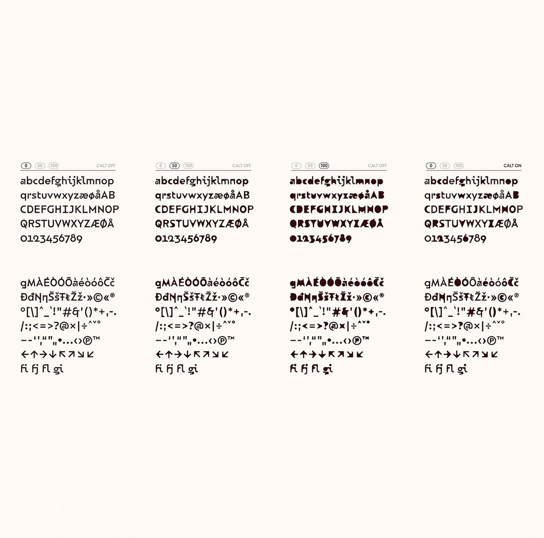
Based on the architectural features of the city district in Oslo that gives the font its name, “Marienlyst Display” is the centrepiece of its new identity. It possesses history while simultaneously conveying the idea of a living future – ANTI has succeeded in creating a font that tells many stories and at the same time captures an attitude towards life.
Red Dot: Marienlyst was created as part of a new identity for the eponymous city district in Oslo. Can you tell us something about its development?
ANTI: More than 80 years ago, the Norwegian broadcaster NRK moved to this part of the city and left a clear mark. In a couple of years, NRK will leave the historic buildings behind, but the story of Marienlyst continues. The idea behind the variable font was to capture the heritage and history, while communicating the transformation of the neighbourhood. The font plays a central role in the identity and was designed with flexible animation in mind, as the appearance will mainly be seen on digital formats in the early years. Marienlyst allows for a playful digital presence with surprising qualities.
Could you talk about typographic storytelling?
Storytelling is always the key to our work. And it is important that the story being told is true to the client. For this project, we were able to work with an archive documenting 80 years of history. Marienlyst Display is rooted in the concept “The story continues” – which stands for transformation and movement between history and the future.
So the typography was also at the heart of the identity?
The typeface is an important part of the brand; it refers to the architecture of the NRK and its distinctive visual qualities. The basic shape is inspired by the architecture of Kringkastingshuset (Broadcasting House or KKH) and the Store Studio. The contrast between the brutal square shape of KKH and the organic asymmetry of the Store Studio is evident in the letter forms. An allusion to the NRK logo is found in the minuscule “r”, which can also be discerned in the original drawings of Paul Renner’s Futura from 1927. It was created in the period when the architect Nils Holter designed the KKH. This reflects the listed facade: the outer shape of the letters is preserved, while the inner shape undergoes a transformation, thus symbolising that the building will soon be filled with new life.
How important can a customised typeface be for companies today?
The importance depends on the client and the usage. A custom typeface can be beneficial for big companies that have many users and different media implementations. At the same time, a distinctive font can help a business stand out from other companies.
In the Marienlyst project, we knew early on that the typeface would play an important role as a storyteller and that a custom typeface was required.
![[Translate to English:]](/fileadmin/_processed_/d/6/csm_02-00345-2023BC.0940335_CO_d484939d48.jpg "[Translate to English:]")