
REWE / ACME — Fully Sustainable
Designer profile

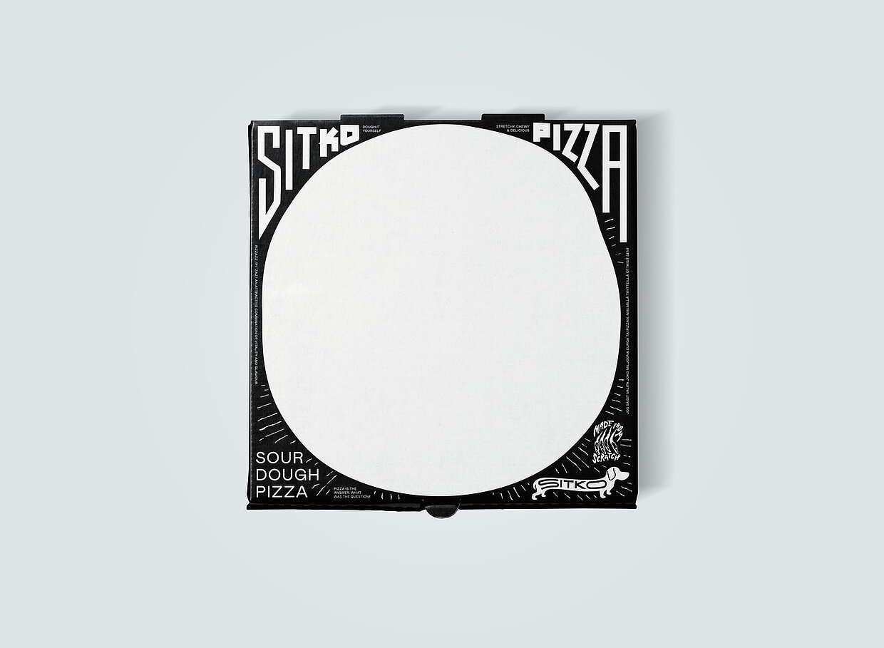
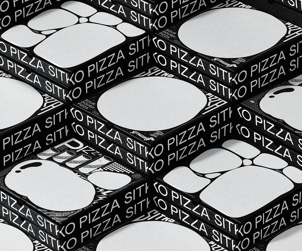
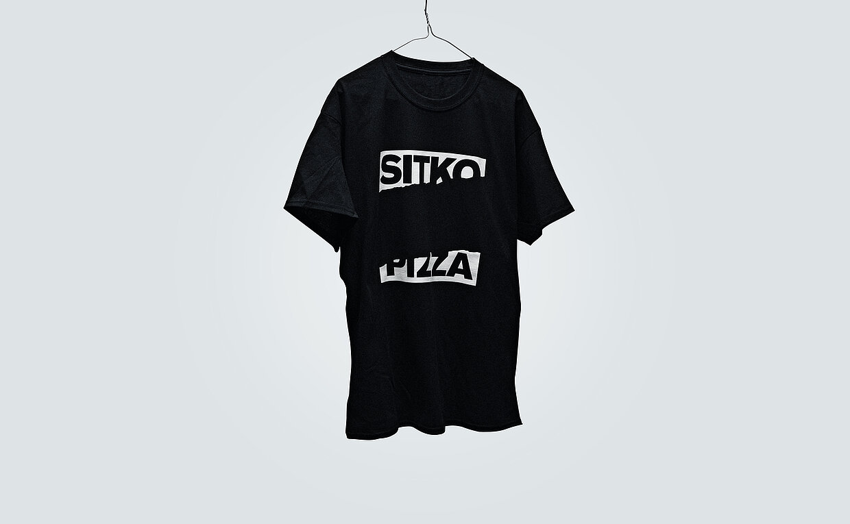
“Sometimes things are not as they seem – and that is a good thing. And sometimes it requires a bit of courage to do things differently from the familiar way. The work of the Werklig agency for the Sitko pizza company breaks with almost every established image associated with pizza. No Italy, no primo gusto, no tomatoes and definitely no red and green”, the jury said about Sitko Pizza’s brand identity. And the design team at Werklig is certainly not lacking in courage.
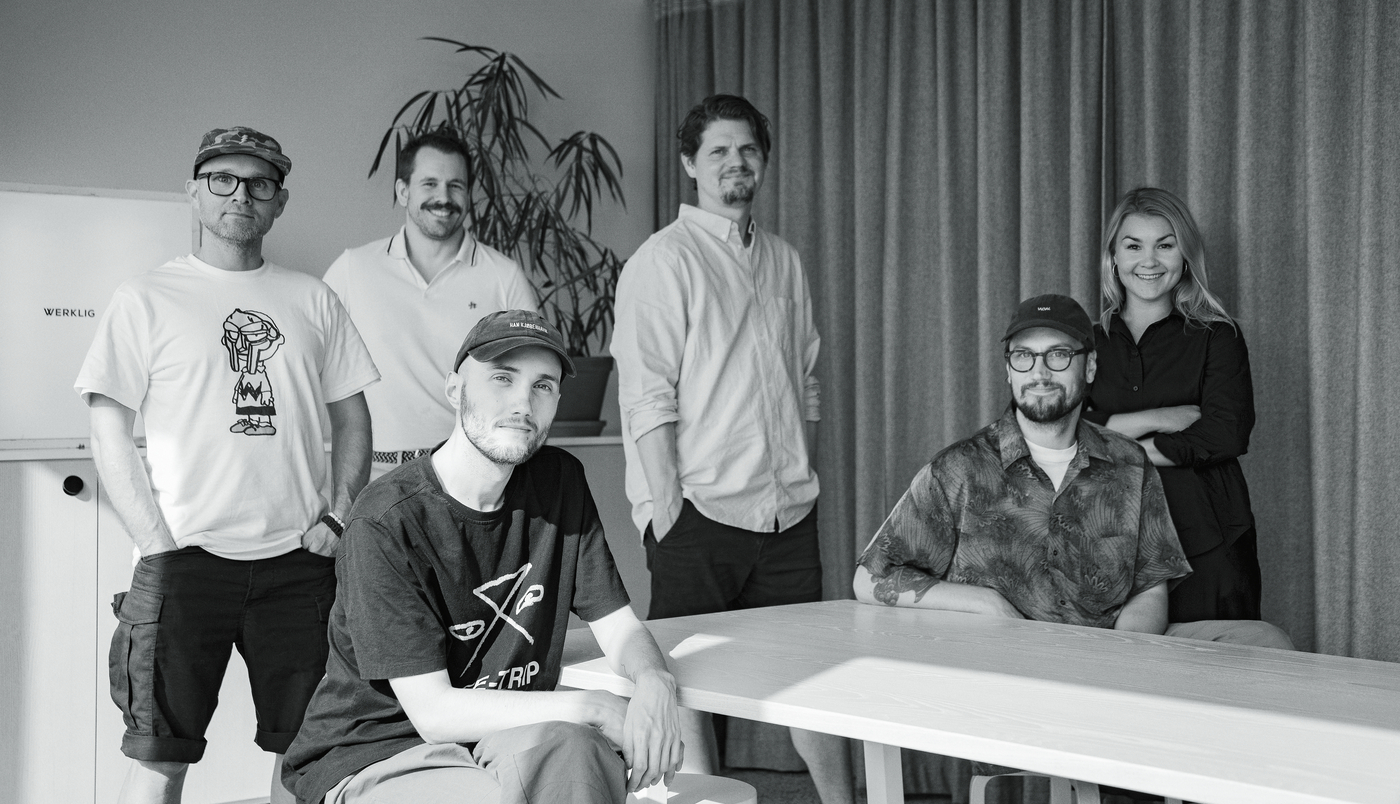
Founded in Helsinki in 2008, the agency specialises in branding. In the last decade and a half, it has supported 500 clients as their creative and strategic partner and helped them to (re)focus, to break through the background noise in the market and make their presence known. What characterises a strong brand? “A strong brand is something you want to return to, that you want to experience again and about which you want to know what is coming next. A strong brand also dares to provoke emotions. It resonates at the same frequency as we do.” That is what the designers at Werklig believe. “With a clever combination of different elements, we create a living organism that begins to tell its own story. A very important – and often overlooked – part of a brand are the ingredients that are not used, that are deliberately left out.”
When Sitko Pizza approached Werklig, the company was looking for an unmistakable visual identity, for something that would help them to stand out from other craft pizzerias and at the same time give them the opportunity to expand into other areas and retail products. The company commissioned Werklig to “sprinkle in a little punk rock, to spice things up a bit”. (Mikko Reponen, Lead Creative, Werklig)
Red Dot: The Sitko Pizza brand design breaks with the familiar, with stereotypes. Is this the spirit of the times or does it still take courage today?
Werklig: If you want to stand out, being unconventional in the right way really helps. We managed to make the atypical work with the product. To break the rules, you must first know them. And that takes time and expertise. In the case of Sitko Pizza, all those small details may initially seem very random and nonsensical, but they are the result of some serious background study and pondering.
And what makes the Sitko Pizza brand design so special?
The visual identity is the expression of a company that refuses to be stereotyped or classified but boldly draws influences from various sources and creates something completely new with an unapologetic attitude. These are the subtle cultural references and quirky details with hidden meanings in the graphics, slogans and taglines. They are a bit like Easter eggs. Most people will never find them, but those who do will hopefully enjoy them.

![[Translate to English:]](/fileadmin/_processed_/d/c/csm_91-03738-2022BC_zuschnitt_20aa518134.jpg "[Translate to English:]")