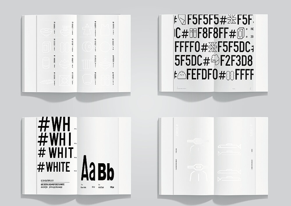
The mission of this work is to awaken interest in the Taiwanese culture. The brand design centres on a range of well-known products which are all white in colour – be it tofu, rice, dried fish, newsprint or a scooter. For obvious reasons, the logo is inspired by the Chinese character “bai”, which means “white”. It has been transformed into a graphic symbol illustrating the dialogue between paper and design. A six-digit code, consisting of capital letters and numbers, is assigned to each entry in the index. Combined with clear pictograms, the brand adopts an easily recognisable, cohesive appearance.