Corporate Design Rebranding

Kita kinderzimmer

뒤로 다운로드

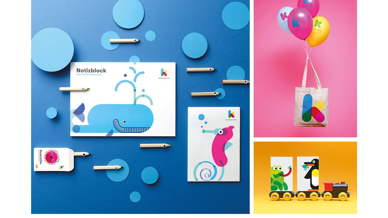
The new corporate identity for the Kita kinderzimmer day-care centre has been inspired by the kids themselves in that the aim of lending it a friendly and emotional face was achieved with a lot of imagination. The simple shape of the logo was turned into a colourful construction kit, from which the corporate identity has been derived. The result is not only a colourful set of over 20 playful and vividly colourful icons illustrating the various animals in a charming and highly child-oriented manner. It also presents an imaginative world in which everyone can feel comfortable: the children, their parents and the day-care centre employees. The simple mechanics of the corporate design allow an unlimited number of possibilities for illustrations and media, without ever having any of them lose their identity. As the first step of a new design, the logo is divided into individual modules, which then form the basis for countless illustrations. This ensures a simple yet coherent look across all media.

심사평

The design of the new corporate identity for the Kita kinderzimmer day-care centre merges simplicity with joy and playfulness – exactly what distinguishes a day-care centre. The elements derived from the logo cleverly re-emerge in the various illustrations and icons, which not only lends the identity an overall appeal that is thoroughly coherent, clear and forms a unity, but which also promises joy and a lot of fun.

Red Dot: Best of the Best

By starting the video, you agree that data, e.g. your IP address, will be sent to Vimeo. vimeo.com/privacy

Others interested too