


Red Dot Jury
All of the jurors for the Red Dot Award: Brands & Communication Design are rich in experience and expertise. Get to know…

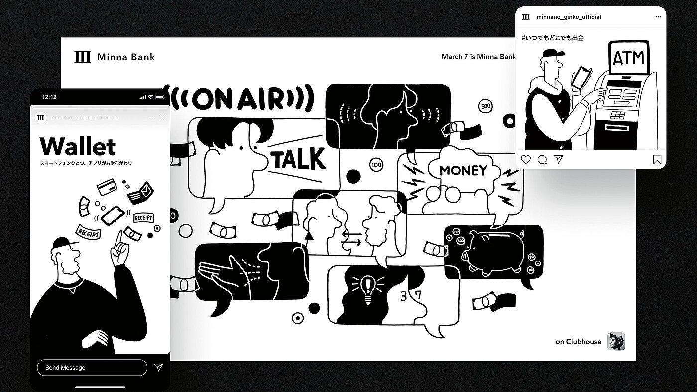
With the idea of fundamentally reshaping banking, Japan’s Minna Bank, a subsidiary of the Fukuoka Financial Group, was founded in 2019. Minna Bank is Japan’s first fully digital bank and offers services for the generation of digital natives. A special feature of the bank is that it can handle all services – from account opening to deposits and withdrawals to transfers and the management of loan applications – via the smartphone. Minna Bank is fundamentally different from traditional banks not only in its business orientation but also in its brand identity.
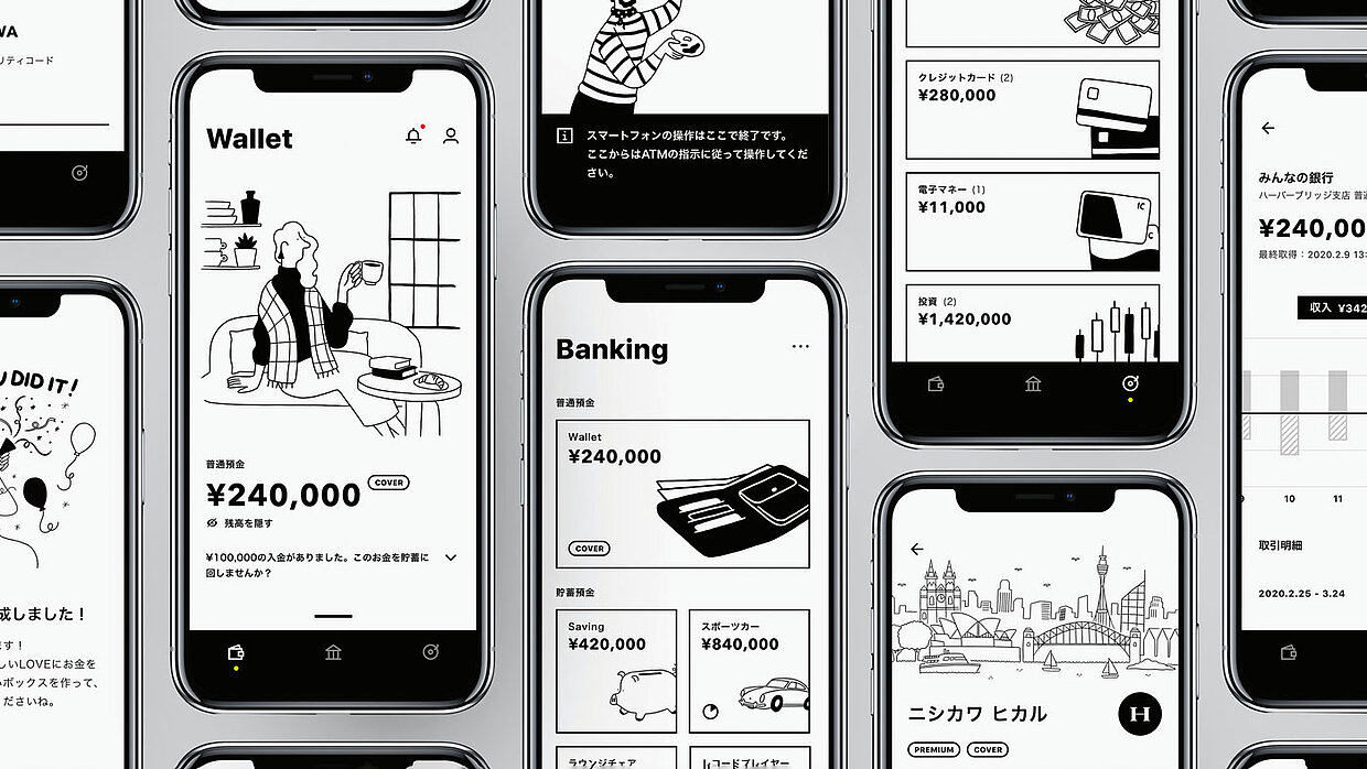
The bank’s name, “Minna”, means “everyone” in Japanese and wants to be understood in the sense of “a bank for everyone”. The bank’s logo is a monogram consisting of three Roman ones (“III”), symbolising both the individual and the community, which come together to form an M. These minimalist elements are reminiscent of the traditional iconography of banks but represent a new interpretation. The design of the app, website and other communication media essentially centres on black and white, creating a monochrome effect. This reduced appearance is timeless, concise and striking at the same time and sets the bank apart from the appearance of traditional financial services brands.
To draw attention to particularly important information, a vivid yellow is used as an accent colour. However, the bank’s orientation towards a young target group and their needs is made clear above all by the extensive use of playful illustrations and animations: original characters and scenarios are consistently used to illustrate and explain the bank’s individual digital services. At the same time, they convey the brand-specific casualness and modernity that sets Minna Bank apart from the competition. The corporate typeface “Pillar” is based on the Roman numeral one, like the logo, and is used to highlight important information. In addition, the standard fonts “Avenir Next” for English and “AXIS” for Japanese are used, both of which are distinguishable and adaptable to all media.
![[Translate to English:]](/fileadmin/_processed_/8/c/csm_rdd-36_2969a851ea.jpg "[Translate to English:]")
