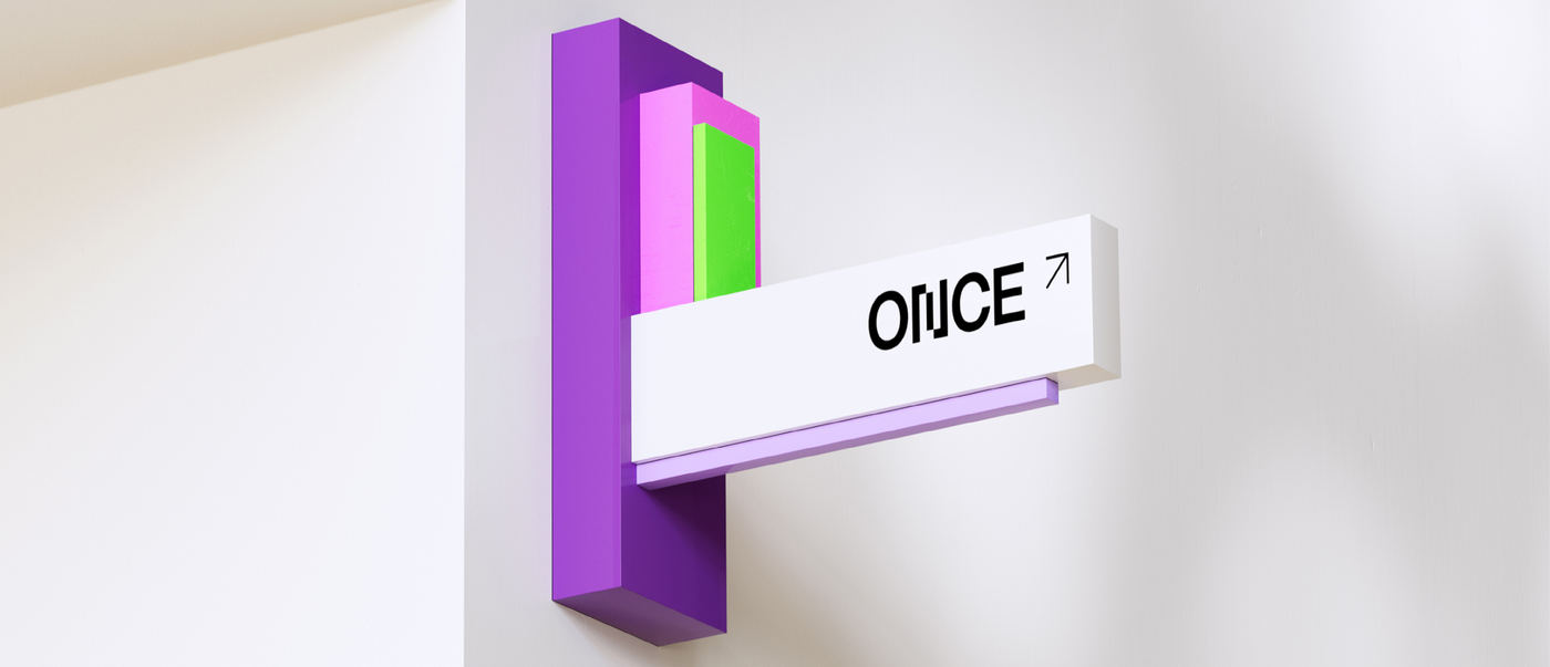
Three established media agencies merged to create one single entity called Once – allowing them to pool their expertise and push the boundaries of what is technically possible, yet without compromising on creativity. The strategic design agency Resoluut supported the unification process by creating an identity that visualises what happens at Once: data is transformed into experiences, and everything happens everywhere all at once.
Interview with Resoluut
Red Dot: You helped to define the client’s strategy and build its brand. What approach did you take?
Resoluut: First, we organised strategy workshops for all three companies to identify what set them apart and what connected them. Then we worked with the management team to create a strategic road map for the unification of the three brands. After that was accomplished, our team of designers began working on the initial concepts and ultimately came up with the detailed design.
How did you manage to unify three agencies into a single entity?
The brand concept focuses on live data handling because that’s what links the three companies. When everything is happening all at once, the way data is handled makes a crucial difference to the customer experience. Reliability is absolutely essential.
What are the brand values underpinning the design?
The conviction that great ideas always need to be supported and that relationships are key. The bigger the application, the lighter it has to seem – like the Eurovision Song Contest voting system. Once also believes that different is better and all-in is the only way.
The identity has to work across all formats, screens and applications. What are the connecting principles?
We created a tool for the client that lets them generate assets based on the data and variables that apply to social networks, websites and print.
Can you tell me more about Once’s generative design language?
Once handles vast amounts of data. We wanted to find a way of visualising the constantly changing data flow without detracting from recognition value. The dynamic logo symbolises this variation and adaptability. We knew that we needed a structure or design grid, because it fits the brand and expresses what it stands for: creating order out of chaos.


