Perfect Diary is a Chinese cosmetics brand aimed at Generation Z. The agency SAMURAI developed a design that utilises physical space as an additional communication plane for the flagship store in Guangzhou. LED monitors present impressive continuous motion graphics that are multiplied by mirrors and then shared and disseminated online by customers.
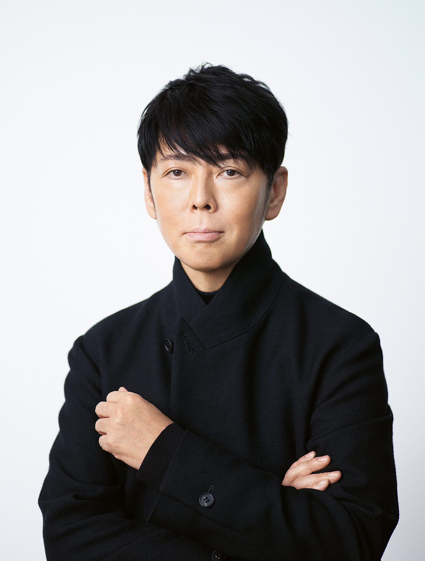
Interview with Kashiwa Sato of SAMURAI
Red Dot: For the Perfect Diary flagship store, Chinese kanji characters serve as key design elements. Can you tell us a bit more about that?
Kashiwa Sato of SAMURAI: The word “diary” is expressed in kanji with the 日記 (riji) characters, which also describe a love of daily experiences that are intricately interwoven. So the name Perfect Diary fully embodies the brand philosophy that a person’s beauty is enhanced by cherishing every moment of each day. We also used the kanji character 記 (ji) as a visual motif. It is made up of the two parts 言 (yan) and 己 (ji), where yan means expression or communication and ji stands for identity. We focused on this key design element to highlight the brand’s Asian origins, rolling the identity out in a design system that follows a perfect grid derived from the kanji characters.
The brand concept is tailored to Generation Z …
We believe that Generation Z individuals excel in their ability to instantaneously pinpoint the information that best suits their sensibilities from the relentless flood of content they are exposed to in the online world. In order to communicate the brand concept without diluting it, all design elements are coherently expressed through the clever deployment of the ji icon.
In-store LED monitors and mirrors create an additional information plane. What effect does that have on the perception of space?
Perfect Diary has grown primarily through online sales, and it has carved out a unique brand position by publishing large amounts of content on a regular basis. To express this modern approach in the flagship store, LED monitors were used to display motion graphics on all surfaces, creating a sense of infinite horizontal and vertical expansion that allows visitors to feel immersed in the infosphere. This branding technique embraces an entirely new space where people can experience the brand with all of their five senses.


