![[Translate to English:]](/fileadmin/_processed_/8/d/csm_91-02475-2022BC.0837280_CO_4174ec3eef.jpg "[Translate to English:]")
Samurai / Kashiwa Sato — Spaces of Tomorrow for Today
Designer profile
Shirley Su graduated with a Bachelor of Fine Arts in Communication Design from Parsons School of Design in New York City in 2002. She has more than 10 years of subsequent experience in illustration and sequential art, working with national and international clients or partners. In 2022, she earned her Master of Fine Arts in Illustration from Savannah College of Art and Design (SCAD) in Atlanta, Georgia. In 2018, she had received an academic honour scholarship there. Since 2020 April until present, she has been a graphic designer and illustrator at the Japan-America Society of Georgia (JASG). Her work ranges from minimalist to soothing, colourful or joyful illustrations. She believes that versatility is her strength when it comes to fulfilling the vision of any client project.
Red Dot: What aims do you have for your future career?
I would love to thrive by creating illustrations that utilise my strength to adapt my style according to each client’s vision. It will be wonderful if I can create more surface illustrations for food and beverage packaging design projects. Learning from my future projects is also another one of my goals. Even though I am interested in the food and beverage field, I am definitely open to other creative fields as well, anywhere my skills are needed. After freelancing since the completion of my undergraduate degree for almost two decades, I realised the more projects you undertake, the higher your skill level becomes. You are able to improve yourself constantly.
How do you think this award will impact your life?
Aside from providing bragging rights to everyone I know, I hope this achievement will attract more opportunities for my career and help distinguish me from other creative individuals in the design and illustration field.
What makes your design style unique?
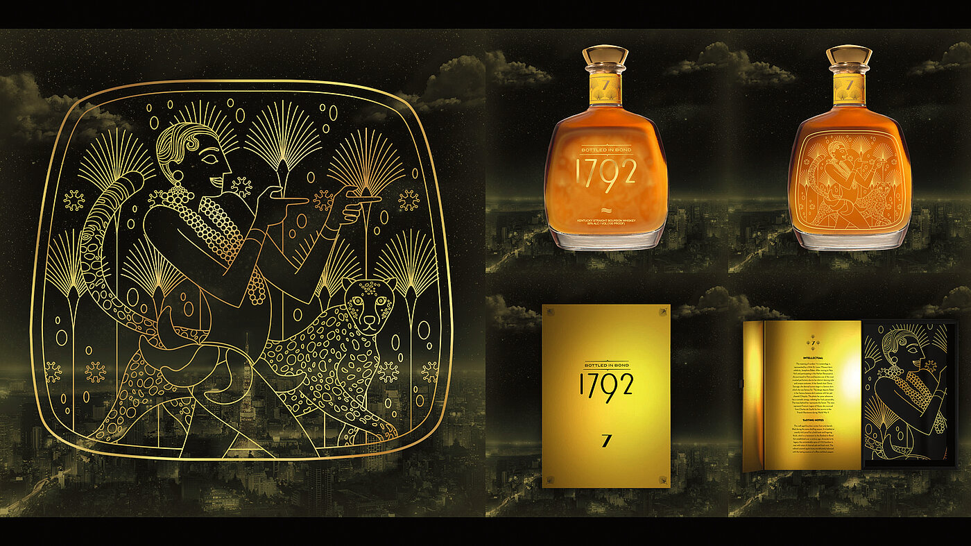
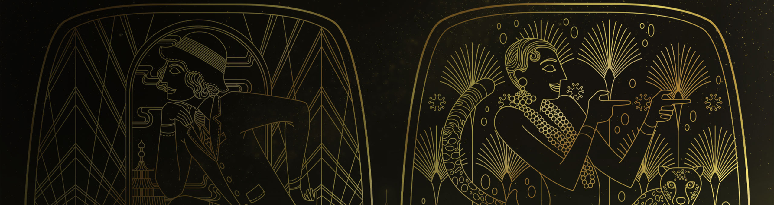
Regarding the style used in my award-winning work, I approached this project with the iconic vector style of art deco due to the visual aesthetic of the distillery’s products. This is an example of how I can adapt my style to the respective client’s existing brand and identity in order to emphasise a particular product in an individual way. This project has also certainly opened my eyes to the wonderful world of packaging and/or surface design.
Was your award-winning work inspired by current social issues?
I am not sure if this is considered a current social issue, I think it is more an observation I made at the beginning of this project. The line of alcoholic beverages I created for my thesis happened to be bourbon. It struck me that, for the longest time, bourbons had been synonymous with high-class gentlemen as their predominant consumers. So, this project’s mission was a brand extension to embrace both genders.
Please describe the concept of creativity against the background of your award-winning work. Given 1792’s new projected target audience, this was a great opportunity to highlight and commemorate the various highly accomplished female figures of the 1920s; therefore, it was a clear choice to depict them on the bottles and packaging design. This project’s design concept is a combination of art deco (the brand aesthetic of 1972), numerology and female icons of the 1920s/jazz age. Each numerology digit represents and highlights the iconic individual’s amazing accomplishments and life story. Each bourbon flavour presents a different one, this ranges from Anna May Wong (United States), Coco Chanel (France), Dolores del Río (Mexico) to Josephine Baker (United States and France).
![[Translate to English:]](/fileadmin/_processed_/4/5/csm_91-01189-2022BC.0837511_CO_656b3648b6.jpg "[Translate to English:]")
![[Translate to English:]](/fileadmin/_processed_/7/0/csm_91-03199-2022BC-BK01_240f7549fa.jpg "[Translate to English:]")