Brand Design

Ypsilon

返回 Download

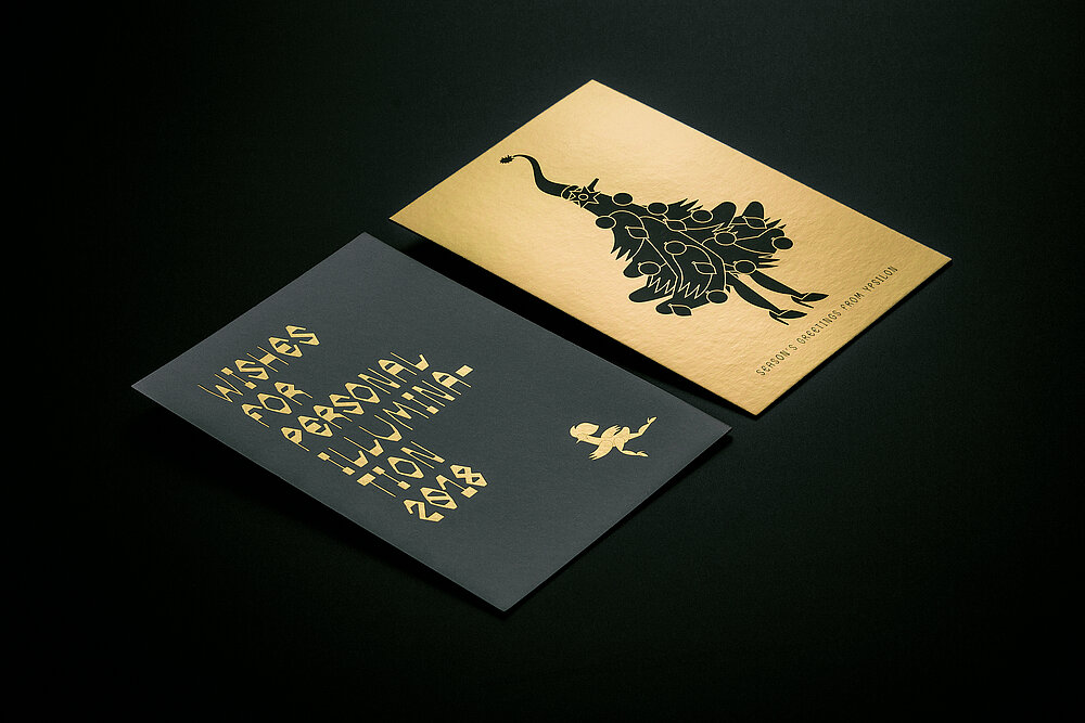
The new brand design for Ypsilon, a diverse multidisciplinary space of entertainment, displays a bold visual identity that connects the present and the future, the imaginary and the real, as well as the serious and the comic, creating a hospitable environment for new ideas. Residing in a renovated neoclassical building of the 19th century, Ypsilon – besides entertaining with events such as concerts, performances, gastronomy, art installations, talks and workshops – aims to inform, educate and push the envelope in all cultural fields by connecting creative groups and individuals. The logo represents a rooster that is both man and woman. It is inspired by the old bronze coats that adorn the doors and windows of old houses. Thus, the visual identity of the space unifies the past with the present, the male with the female, the fantastic with the real and the serious with the comic. A three-weight custom font was designed to enhance consistency across different visual platforms and to further differentiate the image of Ypsilon from others.

评审团评语

The design appearance of the versatile venue Ypsilon is striking in that it boasts unusually self-sufficient illustrations, complemented by a specially developed, highly distinctive font. The latter further enhances the new brand design for the venue and cultural hub and, together with the bold, ambiguous illustrations, piques curiosity in a special manner.

Red Dot: Best of the Best

By starting the video, you agree that data, e.g. your IP address, will be sent to Vimeo. vimeo.com/privacy

Others interested too