Corporate Design

Audi Brand Appearance – from monologue to dialogue
返回 Download

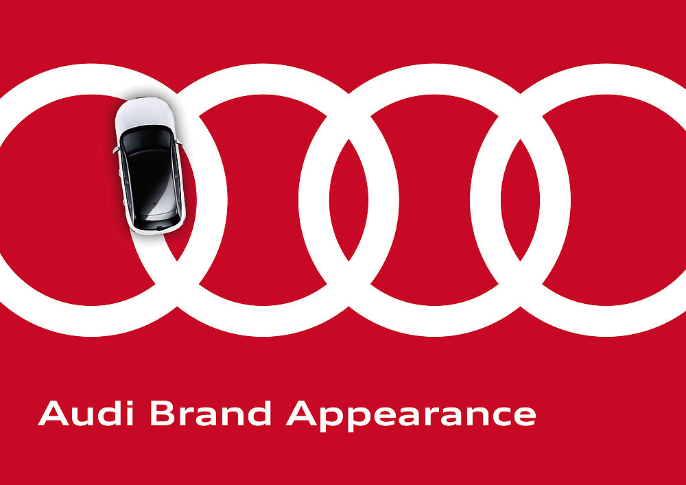
The new corporate design by Audi was conceived for all brand areas and is based on an interaction design principle that allows implementation across both analogue and digital media applications. Developed in a creative process consistently focused on “digital first”, the visual identity can be summarised by the idea of dynamic principles – free logo placement, equally weighted colours, vivid imagery and a flexible typography – that replace complicated rules and create freedom and creative variety based on the principles of versatility, authenticity and balance. The identity of Audi is conveyed through brand-specific core elements following a dialogue approach. The brand-specific design and interaction principle is applied to all digital applications, ranging from apps and smartwatches to displays and end devices. The new logo ending incorporates the solid rings as a dynamic element in the video content, making them part of the message.

评审团评语

This corporate design identity is very much based on the essence of what Audi represents. The four rings of the logo have been changed into graphic and powerful symbols, now usable independent of the claim. This incorporates an excellent solution as the distinctive rings no longer have to follow rigid rules but can instead be implemented consistently into a layout. Complemented by a self-sufficient typography, the corporate design has emerged with a fresh appearance.

Red Dot: Best of the Best

Others interested too