Kurppa Hosk Studio Ab
Winners profile
Kurppa Hosk is a brand agency with offices in Stockholm and New York. It solves the complex problems of business clients by harnessing the powers of strategic thinking and design. In the rebranding project for the hamburger chain TUGG, the Kurppa Hosk team played to its strengths to create a brand that is unusual and likeable, featuring a bold and consistent design.
Red Dot: Why was it time to move away from the classic American hamburger joint branding?
Kurppa Hosk: This is a very homogeneous market. Most of the restaurants have a similar visual style that is inspired by the typical burger joint look. We saw an opportunity to inject more soul. Fast-food dining culture is unpretentious and fun, so we thought a more powerful and radical statement would be appropriate.
You wanted to present the burger as something that people all over the world eat. How does the design reflect this international feel?
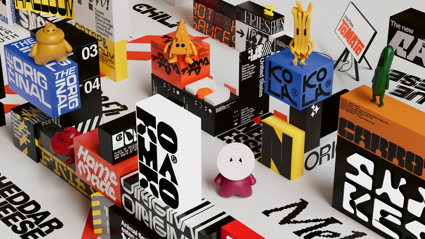
We decided to move away from the stereotype in a more international direction and to incorporate inspiration from every continent. That’s the main reason why we opted for the unique and versatile typography that shapes the brand identity. We wanted a diverse array of typography that represents as many styles as possible. We also decided to use the entire colour spectrum to reinforce this style mix and also the emotional richness.
Why is the typography so important for this branding?
It’s the basis of all communication. We wanted to create a dynamic and multifaceted identity, and that was easiest to achieve with typography. It’s decorative, yet at the same time it serves a communicative purpose, for example in the menus. To achieve clarity, we also included a calmer and more relaxed typographic layer – Tugg Sans – which we designed ourselves. Its purpose is to communicate content and information clearly.
You created characters that look like ketchup and fries, and even the colours are named after burger ingredients. Has working on this project been as much fun as it seems?
The visual identity is the result of fun, laughter and creativity. We had very open communication lines with the client, and they gave us plenty of creative freedom. The ingredient-inspired characters were born early on in the work process, and they are the reason why we decided on the bold colour palette. We really enjoyed bringing them to life, especially since we rarely get the chance to incorporate such vivid characters in a visual identity. We hope the fun we have had is contagious and gives people a reason to smile.