

Award-winning annual reports
Red Dot Award: Brands & Communication Design
What makes a book an award-winning book? The diverse volumes that have been honoured in the Red Dot Design Award are convincing in their own individual ways. But they have one thing in common: attention to detail in design, materiality and workmanship.
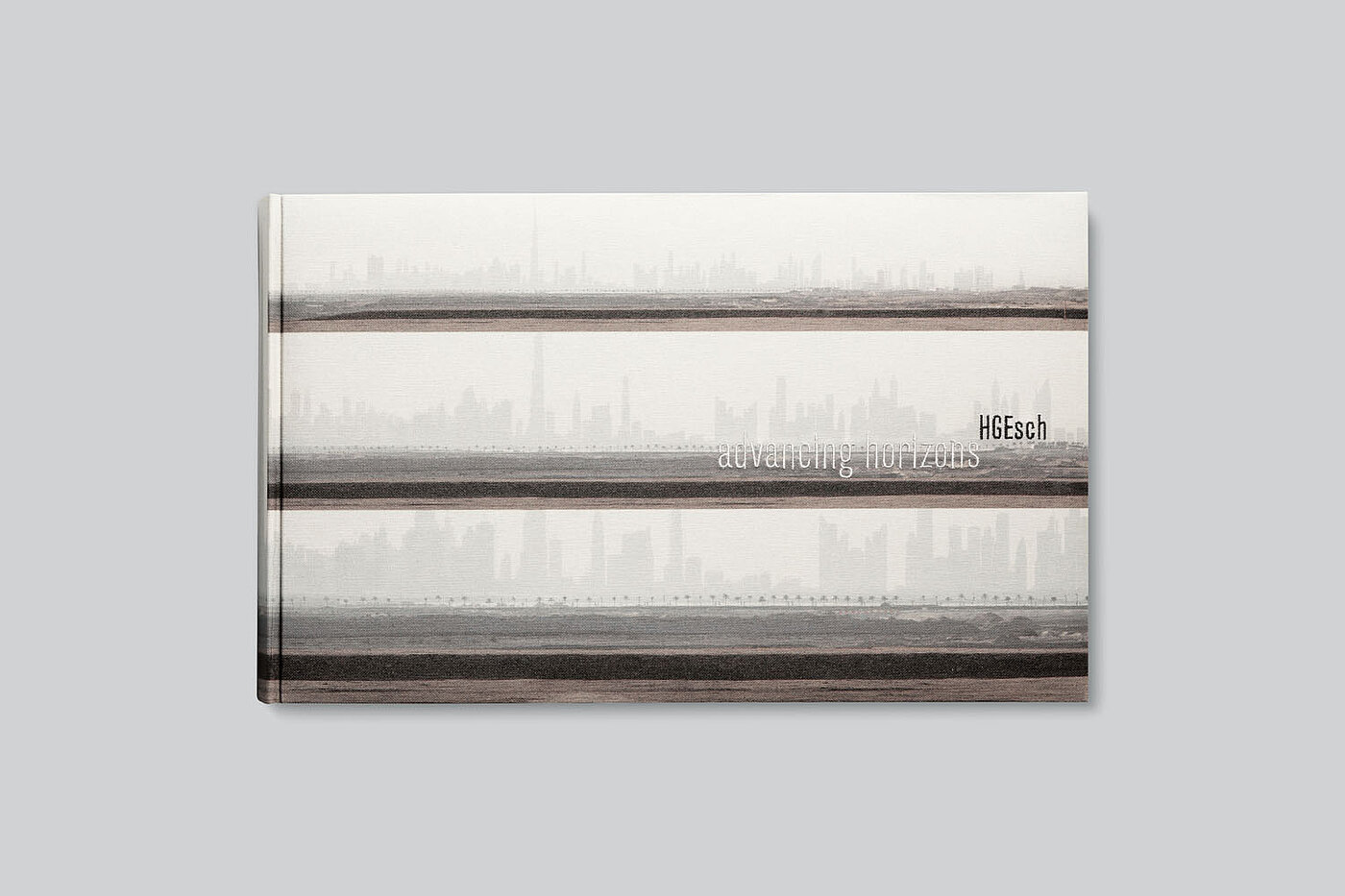
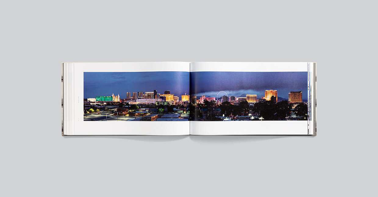
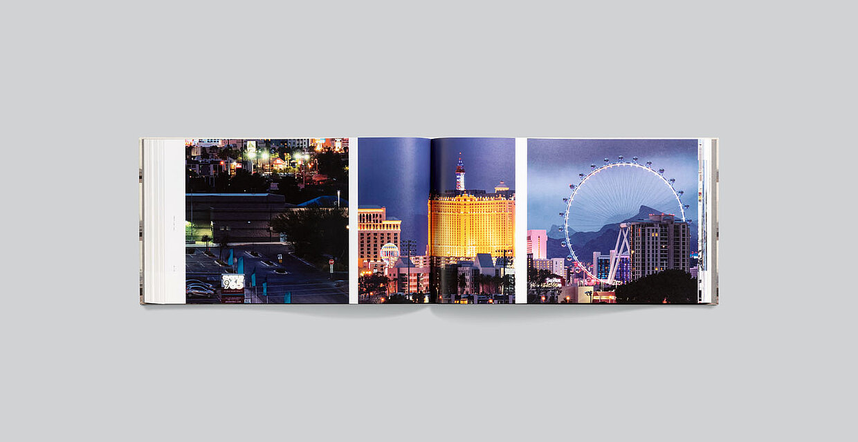
Whether opulent illustrated book, quiet fiction or structured reference book – each genre in book design requires designers to have a special feeling for its respective purpose. With novels, a good typesetting is the measure of all things. With an artist's book, on the other hand, an unusual format and the sensitive handling of it can be the deciding factor in making it stand out from the crowd. Last year, for example, “Advancing Horizons” impressed the jury of the Red Dot Award: Brands & Communication Design. It is a fascinating book of photographs by HGEsch, whose panoramic images, measuring a generous 47 x 27 cm, make it an impressive experience.
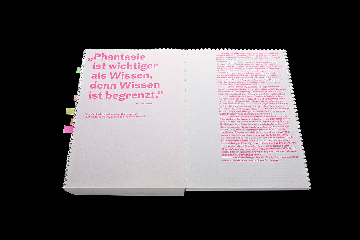
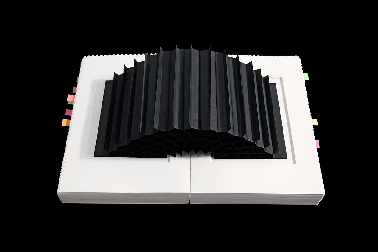
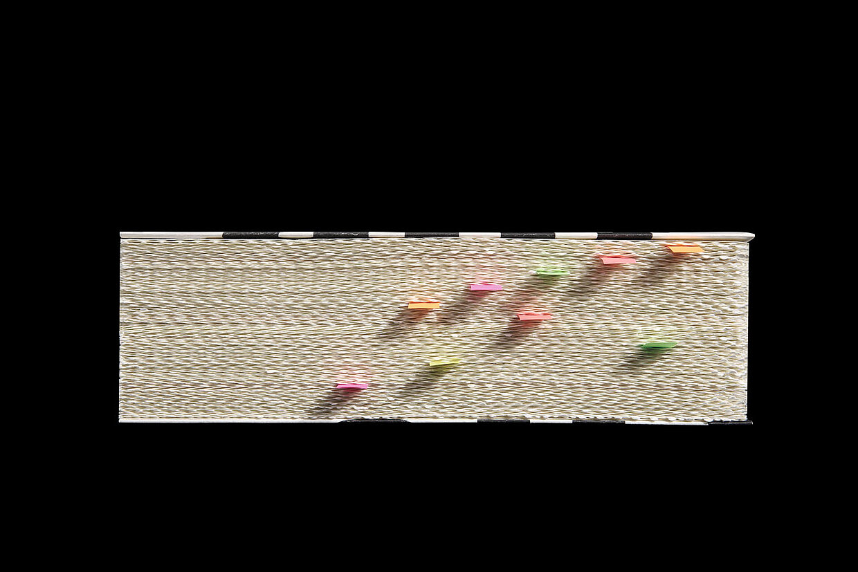
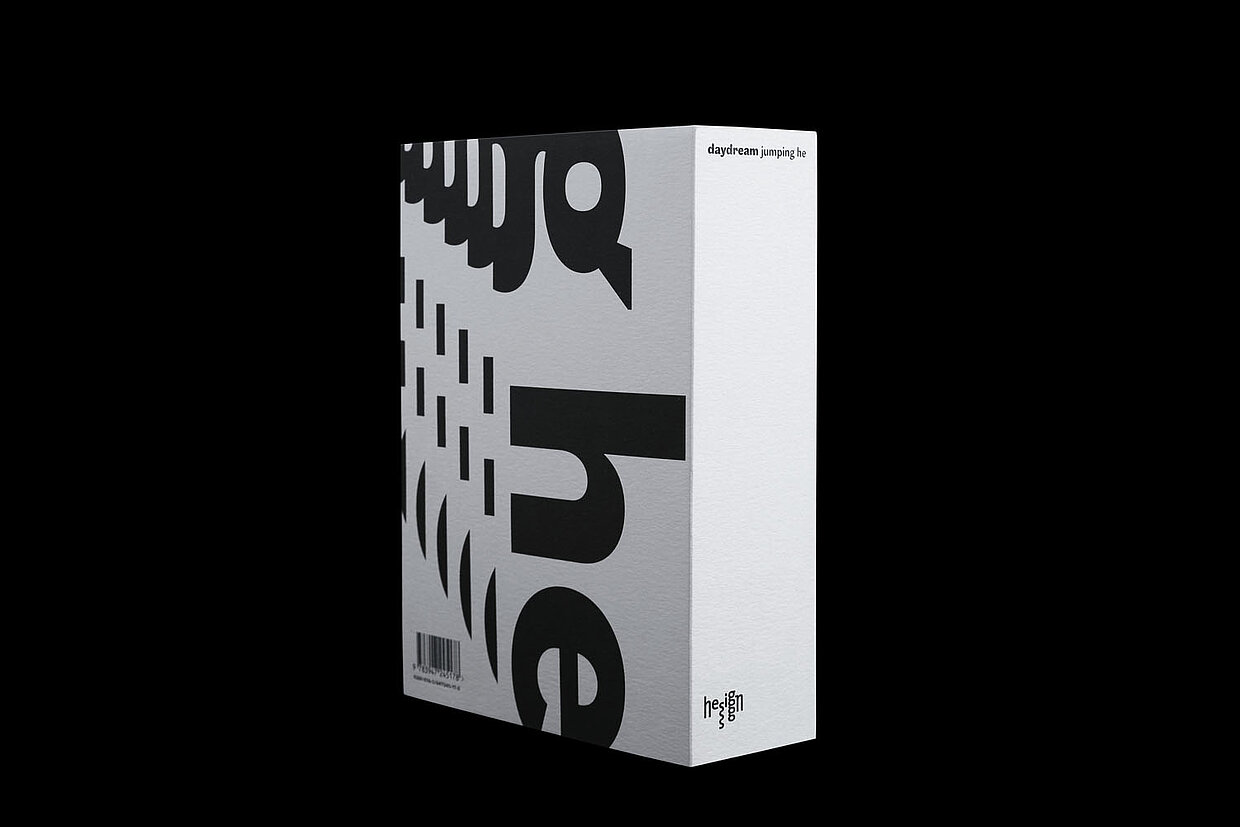
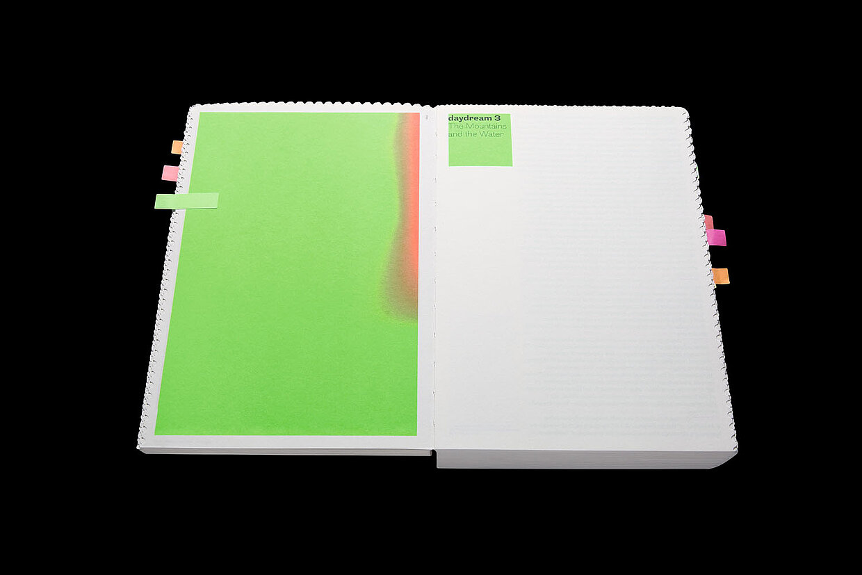
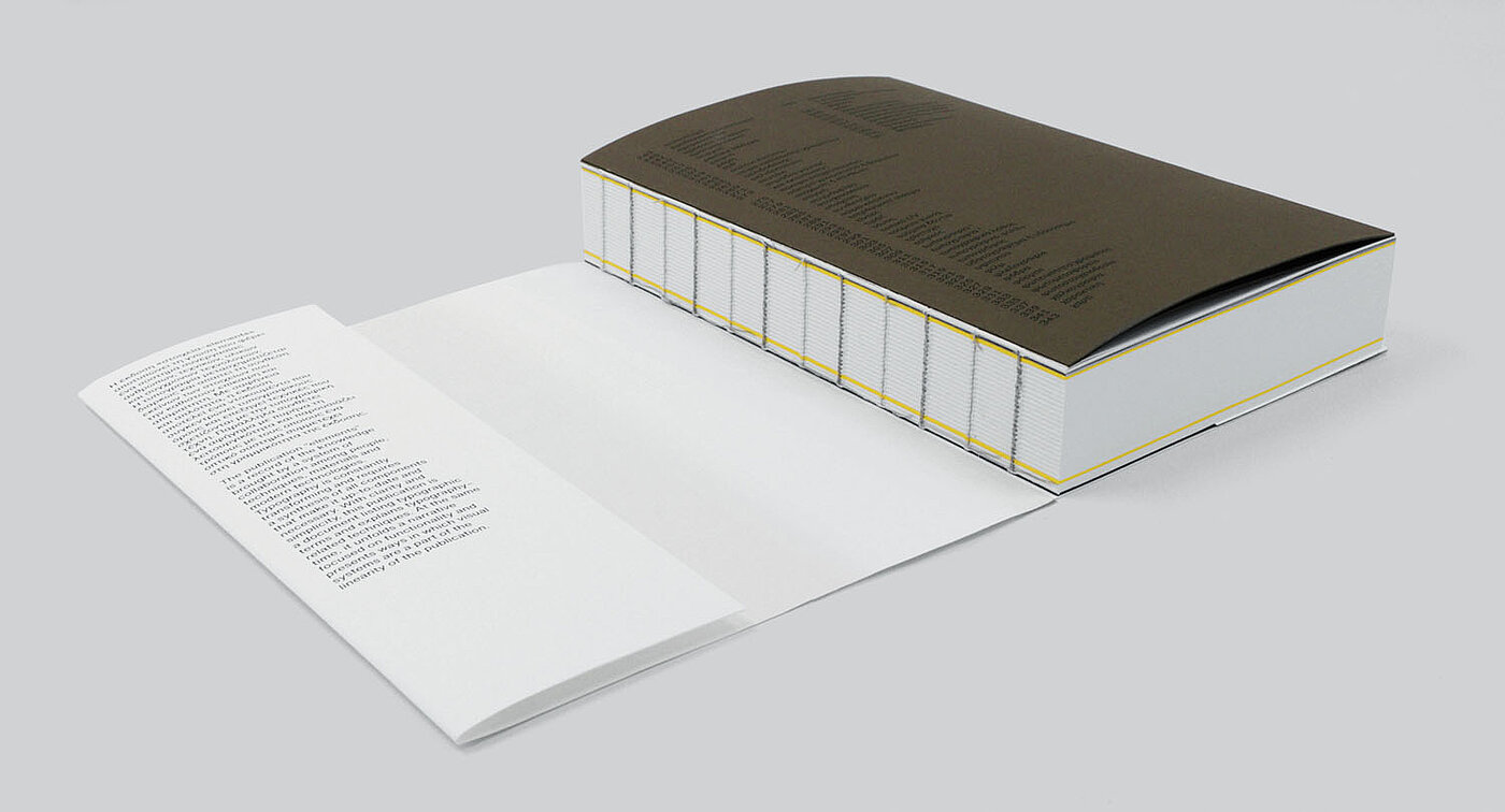
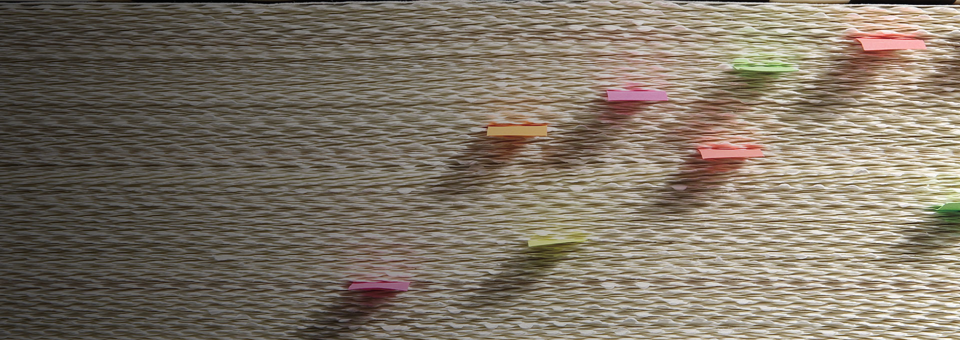
Time and again, the question arises as to what books have to achieve today in order to compete with electronic media. One possible answer to this is provided by the Red Dot: Grand Prix winner in the “Print” category in 2021: “Daydream” by Jianping He is far more than a documentation of his work exhibition in Shenzen: It is a desirable object. This is not only due to its opulent appearance with cleverly chosen volume paper and correspondingly pleasant weight. A multitude of design and printing details that mesh like cogs are also responsible for this: a serrated deckle edge, perfect impact behaviour despite its impressive size, glued-in post-its as a familiar orientation aid and an incorporated pop-up. Books have to surprise, carry away, be independent.
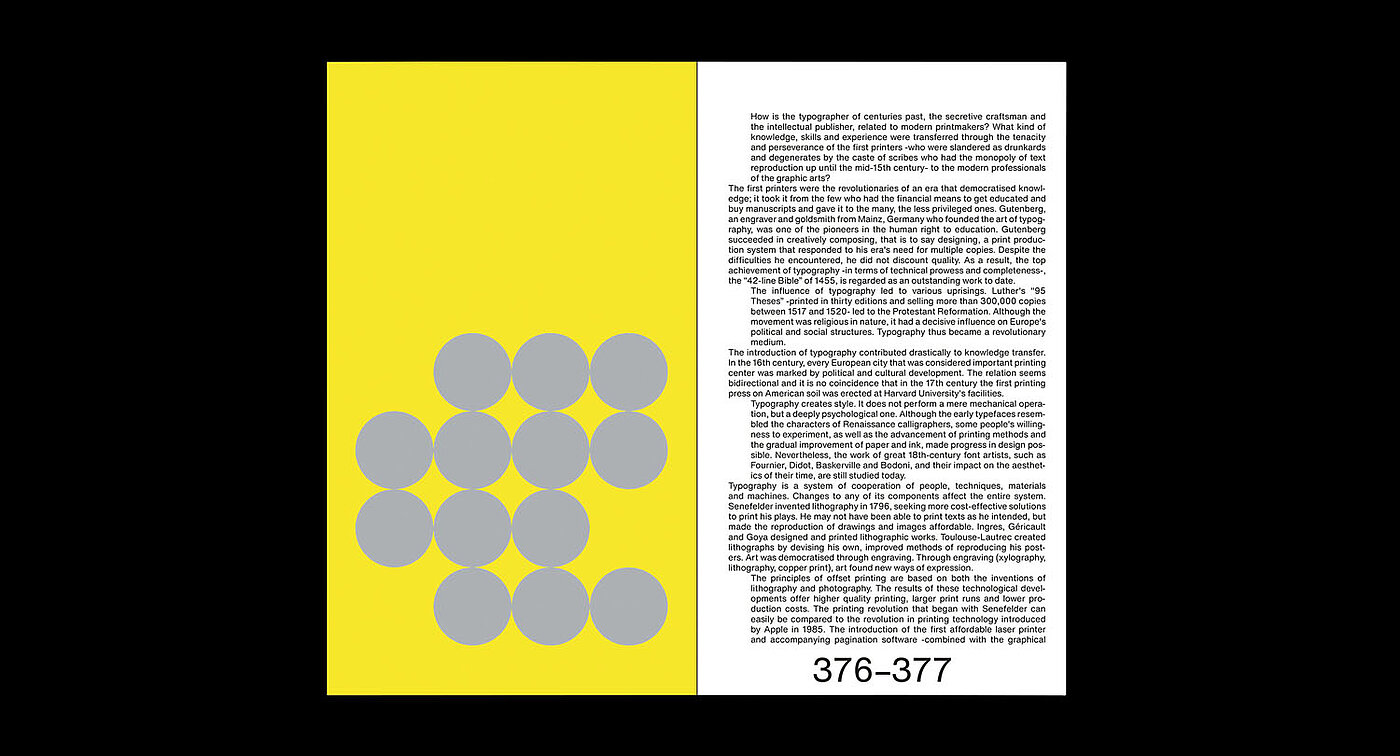
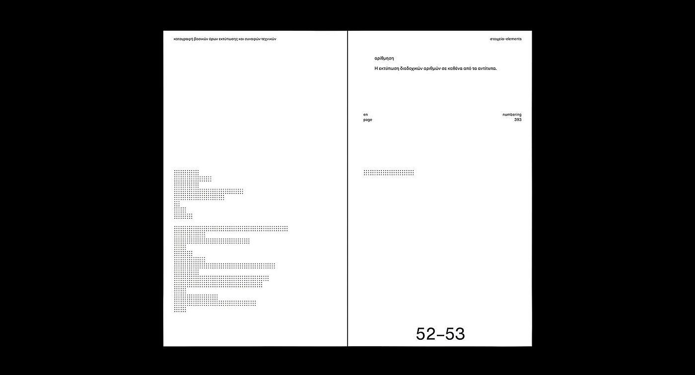
Especially in book design, typography can show its full strength: It does far more than visualise 24 letters and a few numbers and special characters. It can guide, structure, decorate and set subtle emphases. It is therefore a powerful instrument, but one that must be mastered. This becomes clear, for example, in the publication “Elements”, which was rewarded with a Red Dot: Best of the Best in 2021 for its careful use of typography, among other things. A restrained black-and-white compendium that was also convincing with elegant blind embossing on the cover and bound transparent pages.
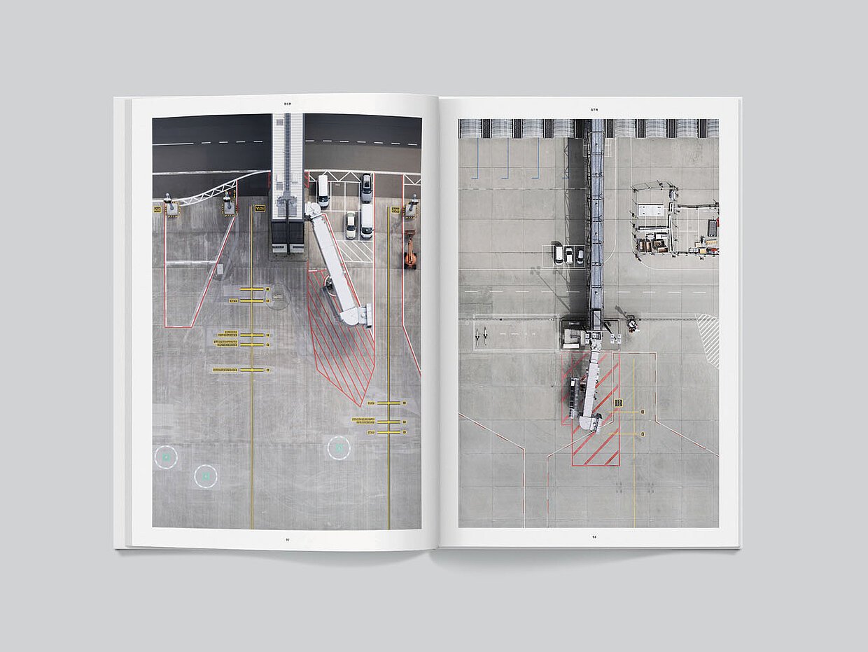
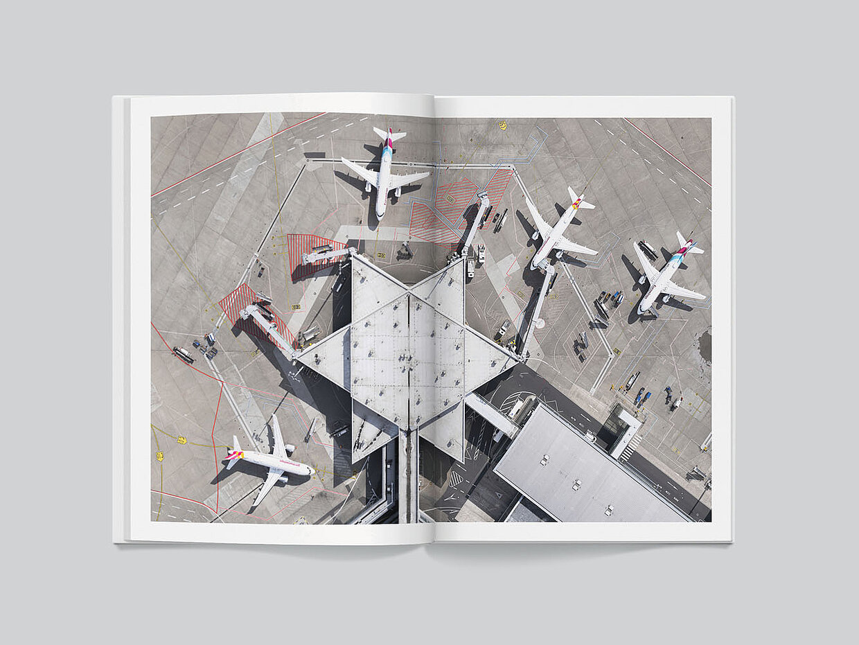
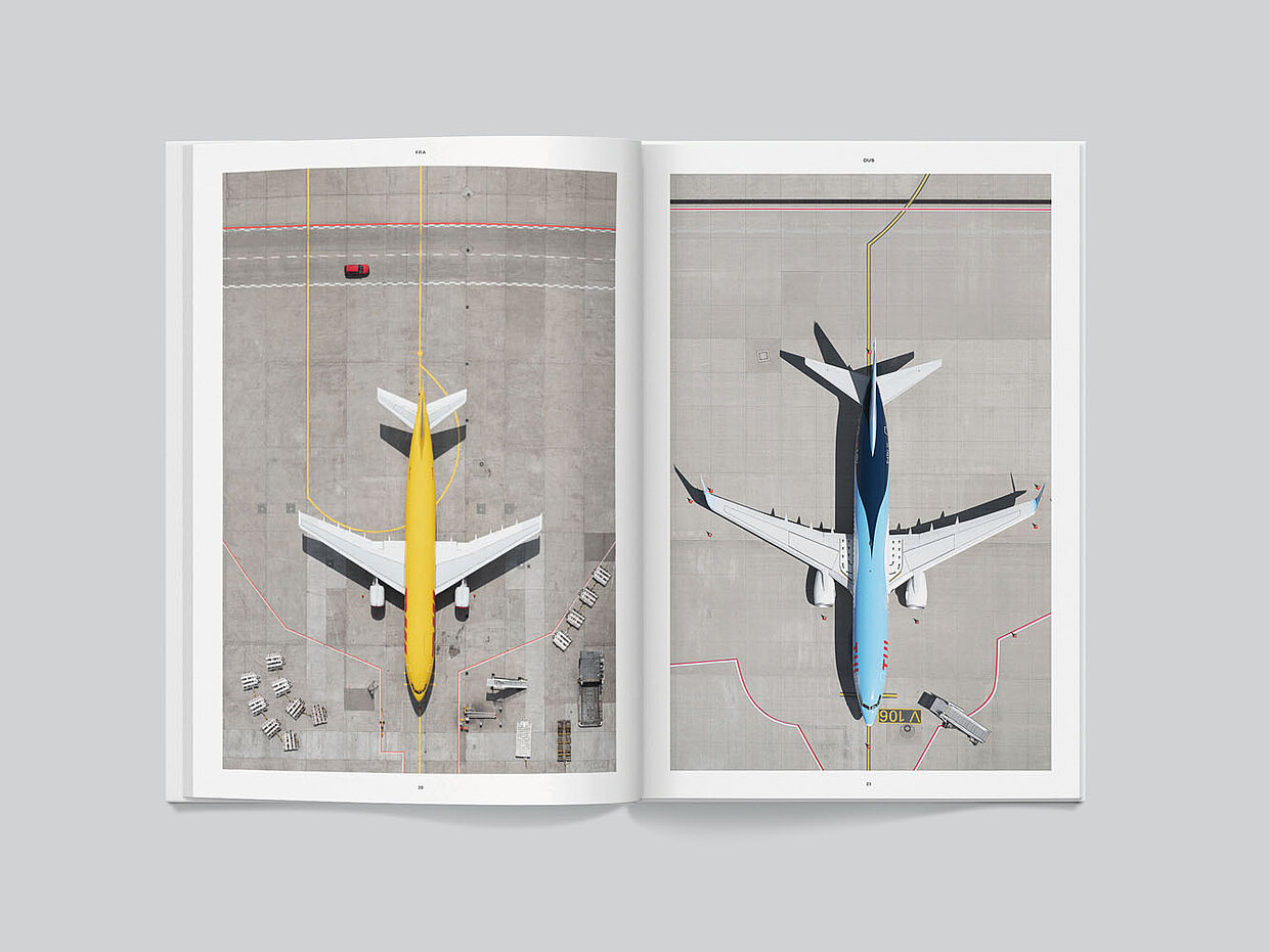
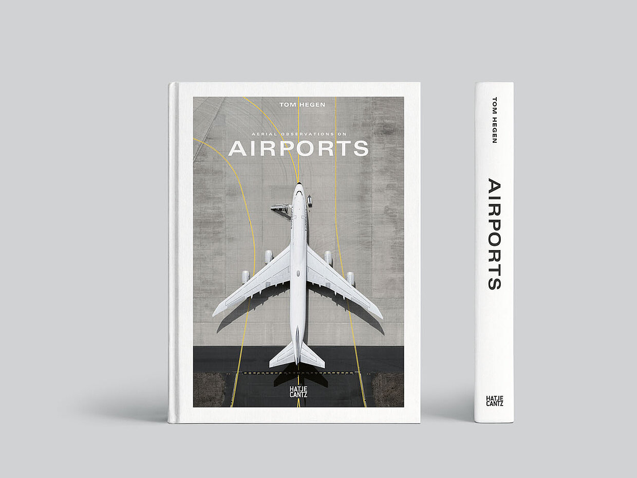
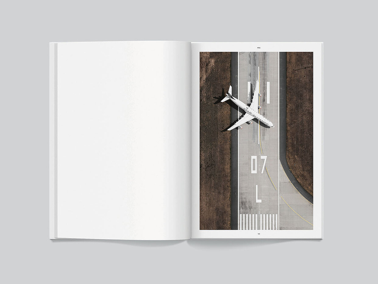
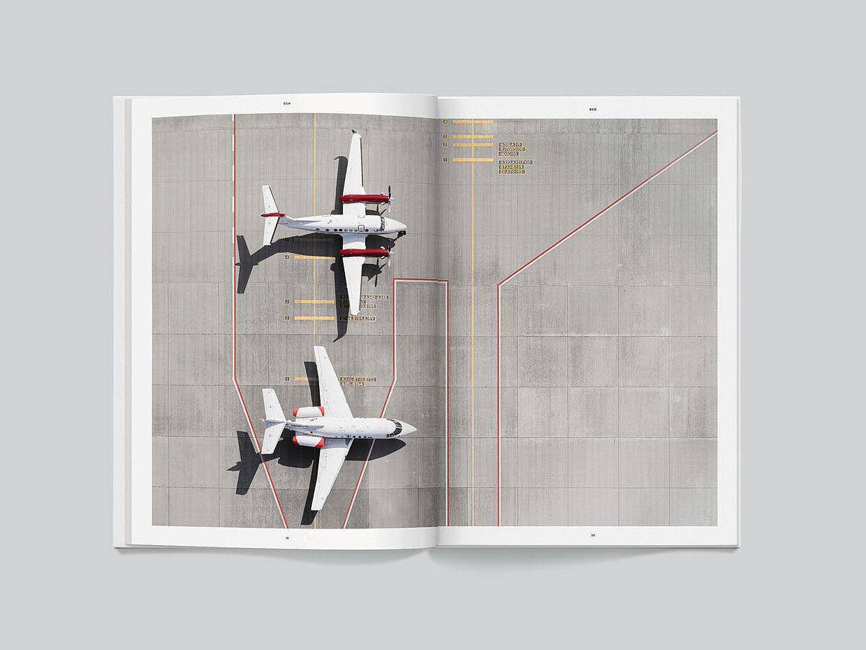
And there is something else that distinguishes the book from digital media: photography is not simply strung together – it is structured and frozen for eternity. Thus, an exciting book object sometimes needs no more than a sense of format, sorting and the flow of seeing, as Tom Hegen’s “Airports”, which won a Red Dot: Best of the Best in 2021, proves. An exciting photographic theme, a thoughtful choice of motifs, excellent repro and brilliant printing show what a book must be today – the manifestation of relevant content in the best form of craftsmanship.
You can also find more excellent print work in our Winners Section.
![[Translate to English:]](/fileadmin/_processed_/d/0/csm_Teaser_Print_1_3863dc4235.jpg "[Translate to English:]")
