Brand Design

Ukrainian Creative Week

Back Download

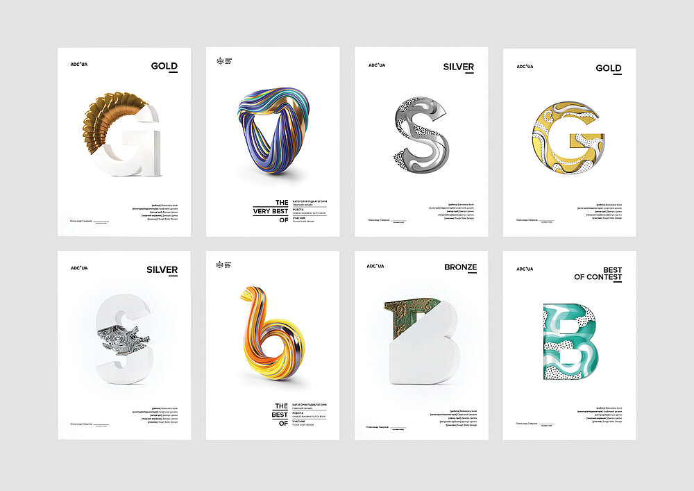
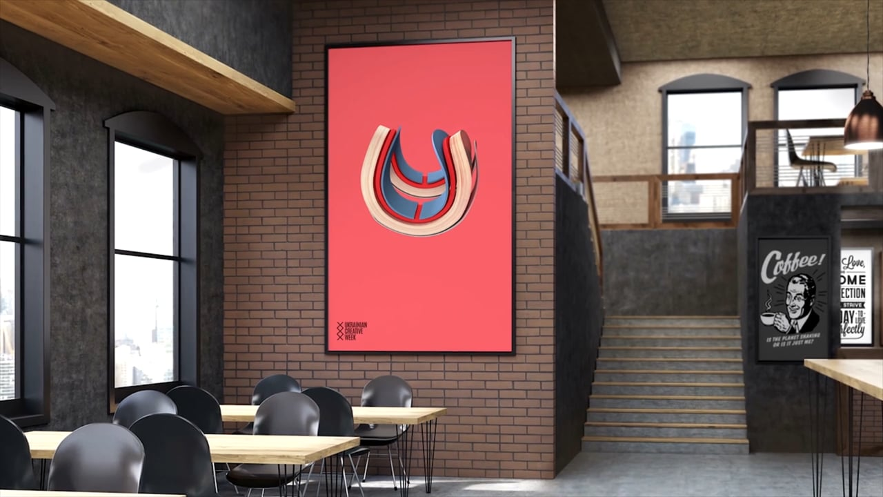
In 2016, it was decided that three Ukrainian design and advertising festivals – UA Design, ADC * UA and KAKADU – were to be held in one place and followed by a week of seminars and workshops. This new event, called Ukrainian Creative Week, naturally called for a new visual identity not only to promote the creative week itself, but also to convey the message that the chances of winning had tripled, because submissions would naturally take part in all three competitions of all three festivals at once. For the visual branding, 24 different variations of the letters U, C and W were developed which were to be mixed on site depending on individual preferences and the medium used. There were no limits to creativity, so that the three-dimensional letters ended up featuring animal fur in one design or a wood look in another, or they represented deformed cars, chocolate-dripping donuts and even brightly coloured siphon tubes. Everybody was invited to experience the creative spirit of the festival. Yet, the brand design remained clearly recognisable across all digital and analogue media, including booklets, posters and even in festival diplomas.

Statement by the Jury

The brand design concept for the Ukrainian Creative Week, which actually comprised three festivals, captivates with a logo consisting of the three letters U, C and W. The fact that the 24 variations designed for this purpose could be combined freely, had not only generated high attention to the festival, it had also produced a high degree of autonomy and playfulness across all media – as is highly suitable for a creative event of this kind.

Red Dot: Best of the Best

By starting the video, you agree that data, e.g. your IP address, will be sent to Vimeo. vimeo.com/privacy

Others interested too