Corporate Design

FH Bielefeld – University of Applied Sciences

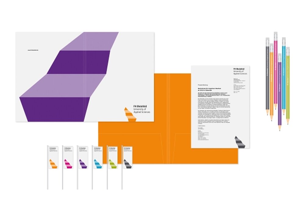
The word mark of the FH Bielefeld – University of Applied Sciences, illustrated as an abstract staircase, plays with the visual charm of two- and three-dimensionality. Its orientation is deliberately contrary to design conventions and appears unusually bulky. This aims to express how – in the process of study and research – a straight path is not necessary for attaining success. Here, both logo and colour scheme are easy to recognise. When applied to different media, the flexible basic form of the logo assumes various magnifications, orientations and turns.

Credits
-
Client:FH Bielefeld – University of Applied Sciences
-
Design:beierarbeit GmbH, Bielefeld
-
creative direction:Prof. Dirk Fütterer, Prof. Uwe Göbel
-
graphic design:Mareike Knocks, Michael Erdmann, Robert Fischer


