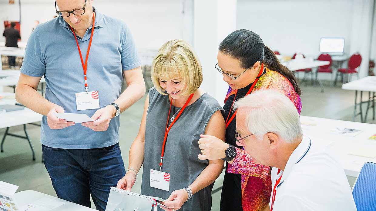
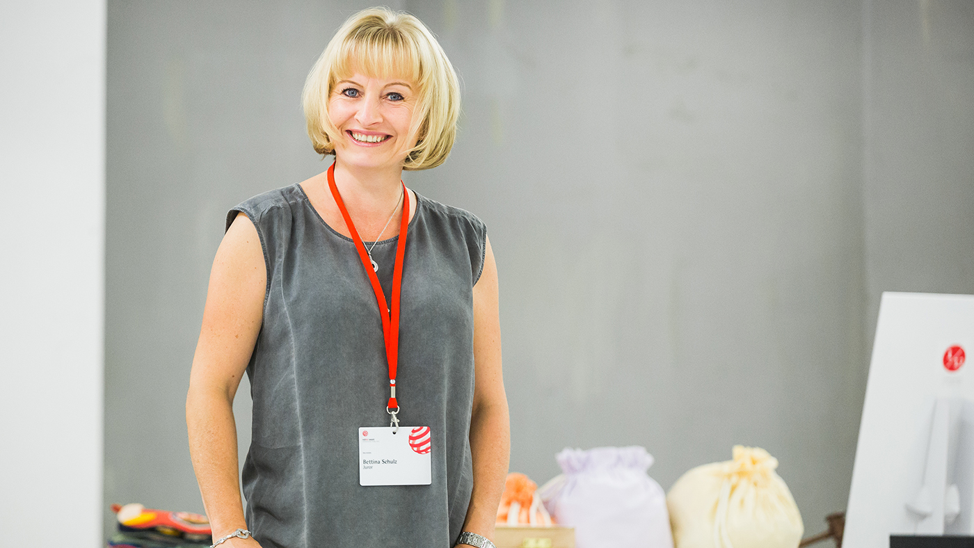
Bettina Schulz has been a member of the Red Dot jury since 2008. The print design expert is a jury member of numerous other international design competitions and was editor-in-chief of the trade magazine "novum - World of Graphic Design" until 2019. She has since set up her own editorial office in Munich and is a founding member of the Creative Paper Conference.
In this interview, she tells us why she doesn't read e-books and what paper has to do with ingredients in cooking.
Red Dot: Online journalism is booming, and e-books are the new normal in many households. So how important is the “feel” of a medium to you? And does it depend on the type of content?
Bettina Schulz: To be honest, I’ve never read an e-book in my life. Online content is a blessing if you’re doing research or need fast information or a news update. But when I read a book, I want the whole experience – leafing back and forth through the pages and putting it on my shelf when I’ve finished. I can recall exactly when I read almost every book, and what my life was like at the time. For that very same reason I find it difficult to give books away. To some extent they become a part of me, and I think that’s only possible because of their physicality. That aside, studies have provided substantiated evidence that analogue reading activates larger areas of the brain than digital reading. For me, analogue and digital reading are two entirely different activities. I can listen to music at home, or I can go to a concert and listen to it live. Along the same lines, I can dip into information online, or immerse myself in a book.
And, on the subject of working for media, I like to write blogs because it’s easy to make quick changes or additions. For the opposite reason, I also like to write for customer magazines that have print deadlines. There’s a kind of finality to it. Once the magazine is printed, it becomes an unchangeable reality. Nothing could be more wonderful than unpacking the complimentary copy. It’s the manifestation of my own work.
Are there some types of text where it makes no difference whether the paper has a good feel or not?
The paper doesn’t necessarily have to feel good. That’s always a very subjective perception anyways. But it is important that that the paper corresponds to the content. Just think how strange it would be to see a discount store brochure advertising special offers printed on exquisite-quality paper. However much the discount store invests in the paper, it will never get its message across. On a purely functional level, I always get annoyed when a coffee-table book uses high-gloss paper. Choice of paper is particularly important with fiction books, because paper colour – in addition to typeface – can cause eye fatigue. Paper performs the same role in communications as ingredients do in cooking … the wrong choice can ruin even the finest of dishes.
Our sense of smell is even more important than touch when emotionally processing impressions. Sometimes, when we smell a specific perfume, it reminds us of how our grandmother used to read to us as children. But there’s no other link between smell and literature beyond this personal level, is there?
Well, paper can be scented with microcapsules that break when rubbed. But in my opinion this isn’t a very favourable approach, especially since both the paper and the printing ink have their own specific aroma in addition to the fragrance that is being added. It’s like a perfume that blossoms differently depending on the skin. Or perhaps this approach doesn’t work well because fragrances – and how we perceive them – are highly individual. I think we would probably all agree that a cat’s fur is soft. But with fragrances, there would surely be less consensus, because something that smells like a flower to one person might smell like damp grass to another.
The choice of a binding or a paper type affects not only haptics, but also how the print product sounds when it is touched or when the pages are turned. How important to you are the sounds that print products make when they are used?
Sounds would be less important to me than a book binding that functions properly. Print products that are difficult to open are probably the most annoying thing for readers, especially in the case of large-format items.
There are of course many other print products besides books and magazines. Business cards, for example, are still very popular corporate branding tools. Is it worthwhile for a company to invest in special embossed finishes or other elements that appeal to the senses?
Let’s just say that a company that doesn’t give any thought to the paper type or finish of its business cards is missing out on a great opportunity to be remembered for something in addition to its address and telephone number. You have to ask yourself which business cards you keep and why. In many cases, even after the contact details have already served their purpose, people tend to keep a high-quality business card. So it not only fulfils the function of sharing contact details but is also linked to a memory and the associated feeling of being appreciated.
Corporate sounds and colours are often used to build a recognisable brand. Is the effect of print products underestimated when it comes to brand recognition?
I definitely think that companies are aware of the effect of print products. That’s why many businesses have made corporate publishing integral to their communications. It’s exciting to see how many companies are evolving from enterprise to publicist, addressing new issues and looking at their own actions from a different perspective. And their customers “consume” this corporate information in a different way because of the format in which they receive it – not just at their desk, but also on the sofa or in the bath. Print can address people, mobilise them and appeal to their emotions in an incredible number of ways. The perfect choice of paper plays an important role in this process because it can communicate values, reflect character traits and convey subtle messages. Once you’ve immersed yourself in the subject of haptics and paper, and in the myriad of different printing and finishing possibilities, you’ll never get away from it again …


