![[Translate to English:]](/fileadmin/_processed_/5/6/csm_04-DP06063-2023BC_neu_4c5cbc3550.jpg "[Translate to English:]")
Real Nuts Lda.
Winners profile
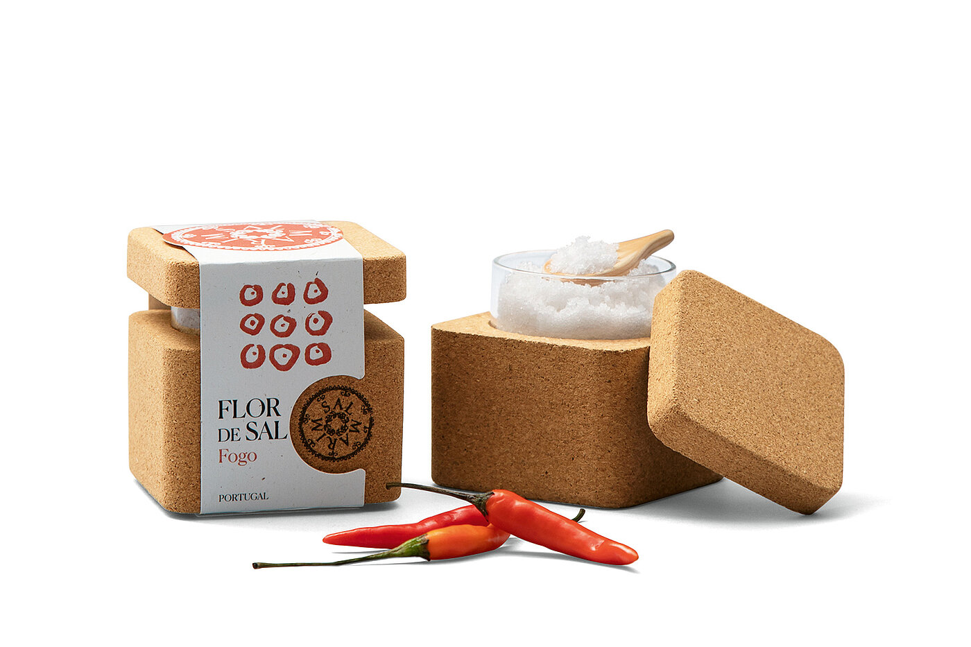
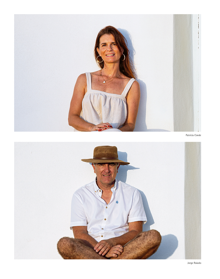
The creative boutique NUTS was founded in 2015 by Patrícia Conde, the current CEO and creative director. Her passion for design and hospitality led her to specialise in food and the travel industry. Her objective is to “nourish and energise brands” – nomen est omen. And so SALMARIM’s high-quality salts were also packaged by her team in a powerful and sustainable way.
Red Dot: The packaging for SALMARIM is designed to be very sustainable. Can you tell us something about the materials?
NUTS Branding: The packaging that I developed together with Jorge Raiado of SALMARIM is sustainable in several ways. Firstly, through the choice of materials like cork, recycled glass, waste wood for the hand-carved spoons and FSC-certified paper. We have also minimised the printed areas to save ink. Secondly, the sale actively supports RIAS, the Centre for Recovery and Research of Wild Animals. And last but not least, the project is socially sustainable because it benefits local artisans and traditional industries involved in the production.
The components are also reusable. Is that essential for more sustainability today?
I believe that the design of the future can be inspired by the past, when objects were reused much more often and had a longer lifespan. Design must contribute to this awareness and to the durability of objects. Salmarim’s packaging can, over time, become a salt pot, a decorative candlestick or a flowerpot, and the label can serve as a bookmark – there are no limits to creativity.
The graphic design conveys a high product quality. Can design help us learn to appreciate food more again?
Salt has always been considered more of a low-value product, but in fact the quality of salt can affect not only taste but also health. We believe that with this packaging we are highlighting the quality of Salmarim salt, which is harvested by hand in the salt pans of Castro Marim. With the packaging, we also pay tribute to its production. Well-designed and sustainably conceived packaging is always also a tribute to the people who have worked on a product with passion and knowledge.
The packaging is designed as a series – it is possible to distinguish between the varieties at first glance. To what extent was it important to focus on reduction?
From the beginning, my vision for this project was a minimalist design that respects the organic nature and delicacy of Flor de Sal. That’s why we created illustrations with simple lines and distinct colours to easily identify the different flavours of the range. On the cork box, which is also very minimalist, we wanted the texture and colour of the product to be visible, so that the consumer has visual contact with the product from the very first moment.