![[Translate to English:]](/fileadmin/_processed_/e/3/csm_05-DP06321-2023BC_neu_e3ffce0c30.jpg "[Translate to English:]")
Péter Orbán, Dániel Nagy
Winners profile
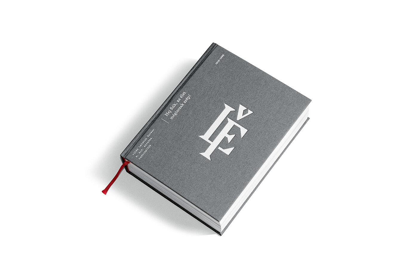
For more than ten years, the congenial design team of Péter Orbán and Dániel Nagy worked together under the name Hidden Characters, realising branding, editorial and packaging projects for European clients. In 2022, they dissolved the studio but not their successful collaboration, as the launch of the project “Hey Lads, Life is Beautiful After All!” proves.
Red Dot: In your opinion, what must book design generally achieve today?
Péter Orbán, Dániel Nagy: In today’s digital-heavy world, the primary goal of book design is to provide a unique reading experience through thoughtful and deliberate choices. In other words, a tangible and narrative connection must be established between the reader and the story. The best result is when the design of a book highlights and communicates its story even more effectively than the original manuscript. By carefully crafting a book as a value-added object in its own right, the effort and costs associated with its publication are justified.
For “Hey Lads, Life is Beautiful After All!” different kinds of paper were used. How important is materiality in design?
We believe that materiality and haptics are very important in design in general, and in book design in particular: material selection and printing finishes are truly crucial elements. In our case, the materials used should reflect the essence of the original diary entries, scripts and photo albums, while adding a contemporary touch. The core concept was to use two different paper stocks to create a transition between the two book parts – World War I and World War II – and to reflect the evolving perspective of the protagonist. In addition, we incorporated translucent paper to amplify certain elements, such as depicting movement on the battlefield.
How did you approach the structure of the 676-page book?
It was a multifaceted challenge in which historical research, text editing and fact-checking ran parallel to the design process. Several years of close collaboration with the historian-editor and the client ensured a comprehensive and engaging result. The structure of the book was decided early on, dividing it into two main parts: World War I and World War II. A further aim was to enrich the narrative with maps, documents and notes, meticulously dating each page for precise chronological navigation.
As a diary, the work tells the author’s personal story. How did you translate his emotions into the design?
Our intention was to subtly convey the author’s emotions through certain design transitions. Using distinct typefaces and shifts in layout for the two parts of the book allowed us to create a sophisticated portrayal of his journey. The first part embraces a classical and conservative layout, while the second part gradually introduces more fluid and less rigid arrangements, symbolising the shift in the author’s thinking.