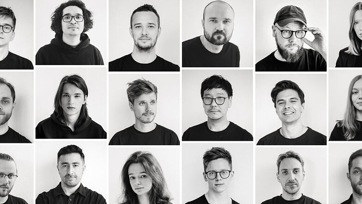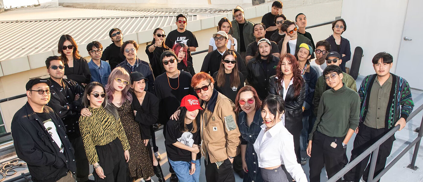
Anyone who calls themselves “DUCTSTORE the design guru” sets the bar high right from the start, and Nontawat Charoenchasri certainly has no lack of determination. He founded his agency in 2005 at the age of just 27, with “DUCTSTORE” summarising the basic philosophy: everything the office designs is seen as a product – from architecture and graphic design to installations. With this multidisciplinary approach, the aim is to push the boundaries of design and counteract the mainstream. In order to still convey expertise in (interior) architecture on the one hand and communication design on the other, “THE OTHERS” was founded as a second studio in 2016. A third business unit, “IAMEVERYTHING”, was launched shortly afterwards, emphasising Charoenchasri’s ambition to simply ignore trends: when global communication trends shifted towards digital, he launched a high-end print magazine that he distributed for free to Thailand’s top creatives, gaining numerous new clients in the process. Both his experience as creative director of Wallpaper Magazine (Thai edition) and his passion for outstanding design stood him in good stead in this endeavour. In the offices today, a 40-strong team realises strong concepts in 2D and 3D, as well as hybrid implementations that combine architecture and graphic design. And so, after many successful years, “the design guru” is proving to be something of a self-fulfilling prophecy …
Interview with DUCTSTORE the design guru Co., Ltd.
Red Dot: In this project for Jorakay, brand communication and architecture are closely linked. Was the trade fair stand at ASA 2024 a logical development of the previous year’s stand, which was also very successful (see p. XX)?
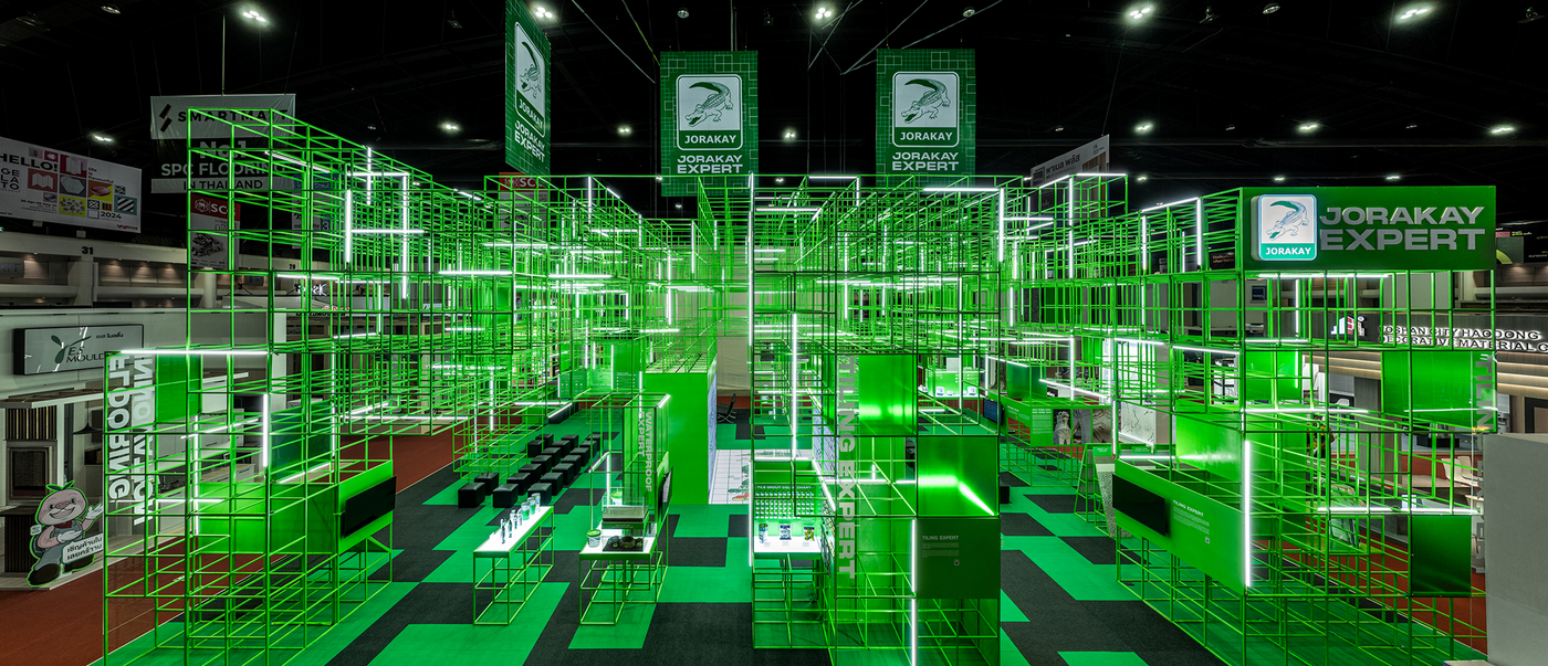
DUCTSTORE the design guru Co., Ltd.: The two pavilions share similarities in terms of branding communication, but their design concepts are completely different. In 2023, the pavilion for Jorakay used elements from the spines on a crocodile’s back and creatively transformed them to match the CI branding. In contrast, the pavilion for Jorakay in 2024 decodes the theme of Architect '67 “Collective Language” and picks up on the key visual diagram. It is based on a grid system, which is foundational to architecture, and inspired by that of a crocodile’s belly. It is therefore a progressive and abstract further development of the concept, presenting a new interpretation of the crocodile. The result is a space and time pavilion that was a great success at the event.
Basically, this is a very radical reduction. Has it made the brand more tangible?
Unfolding the crocodile’s belly scales and extracting the interesting grid system to develop a new diagram, and then extruding it from 2D to 3D space, has transformed the crocodile into a pavilion that is simple yet complex and also more universal. It goes beyond reflecting the crocodile itself to offer an opportunity for viewers to interpret the meaning of the diagram and structure in their own way. For instance, the lines and texture reminded some visitors of grout – a well-known product of the Jorakay brand. The traditional product presentation was replaced by multimedia and LED displays, while dynamic light installations added to the pavilion’s appeal.
The development sounds very natural. What was the biggest difficulty for you?
The real challenge for us was how we could design the stand differently than the previous year. And how we could ensure that the structure, lighting and other elements worked harmoniously. Our goal was to help visitors understand Jorakay’s brand story, services and products, to create a memorable brand experience, and at the same time to provide new inspiration through our design. All this had to be achieved without sacrificing Jorakay’s communication and brand awareness goals at Architect Expo 2024.


