Over the course of their history, the Liesborn Gospels have been honoured in a variety of ecclesiastical and secular ways. The interdisciplinary agency BOK+ was commissioned to bring this national cultural asset to life with all the senses in an exhibition. It has mastered the balancing act between sacral radiance and scholarly categorisation to create an immersive experience, with its effects also unfolding through – architecturally sophisticated – reduction.
Interview with BOK+
Red Dot: What was the biggest challenge in this project?
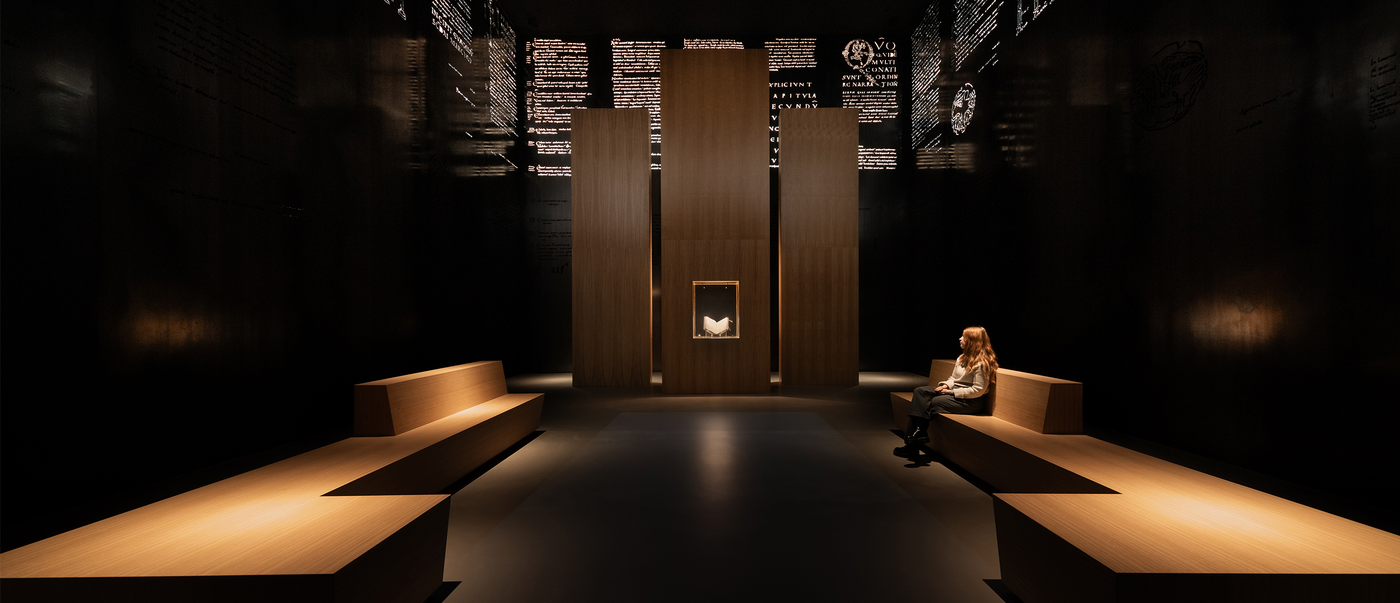
BOK+: We had to overcome a number of architectural and logistical challenges. For instance, the medieval manuscript – a national cultural asset – is presented in a display case with an extremely simple design. The requirements for climate and safety technology remain invisible in the truest sense of the word. In the event of an accident, the entire display case is transported by lift to a protected “climate-controlled safe” in the basement. This endeavour pursued a very clear objective: to create a new and unique space especially for this book, in which the boundaries between the secular and the religious become blurred.
The result is a very atmospheric space. How did this solution come about?
Visitors are not allowed to touch old books, so normally only a double-page spread can be seen in an exhibition. That wasn’t enough for us. Books are also small – so displaying it as “one among many” would not have done justice to the importance of the Gospels. This gave rise to the idea of bringing this medieval manuscript to life through the space. Quotes and decorations can therefore be found on the steel walls. The spatial proportions and the materiality of the space are inspired by the binding of the gospel book, merging the display space and the exhibit.
How was this technically realised?
The requirements for the construction, for which a suspended ceiling of the museum was removed, are not immediately obvious. Only 8 mm thick, the steel panels hang – without a supporting structure – from a newly erected structural frame at a height of more than 8 metres. As for the lettering, decorations and central biblical passages were selected from the manuscript, traced, converted into paths and precisely laser-cut into the steel. Finally, the individual wall panels, which weigh around half a ton, had to be lifted through the window with a crane and welded together on site.
Exhibitions are often overloaded by possibilities with multimedia options. How do you find the right balance here?
Our gospel room is very immersive and appeals to many senses. We deliberately use various subtle effects that work together without jeopardising the impression of simplicity. It is particularly important that the atmosphere created by this immersion matches the content of the exhibition. The project shows how it is possible to appeal to all the senses with minimal use of (digital) media.


