Communication design from Japan: creation under the sign of the rising sun
For many years, Red Dot is maintaining intensive relationships with Japan. Successful cooperations with designers and institutions from Nippon helped the promotion of outstanding design achievements, such as exhibitions in Tokio or Nagasaki. Just in 2017, the Red Dot Design Museum in Essen, Germany, presented award-winning Japanese products in the exhibition “Under the Sign of the Circle”. The country’s designers regularly prove their know-how in the Red Dot Award: Communication Design, too. In the recent competition, the highest single distinction, the Red Dot: Grand Prix, went to Tokyo.
The senses of the future
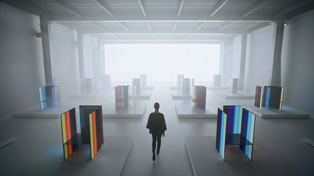
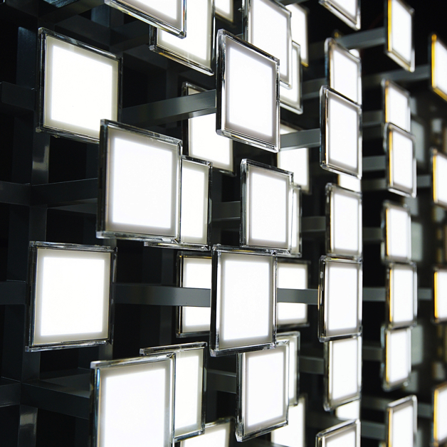
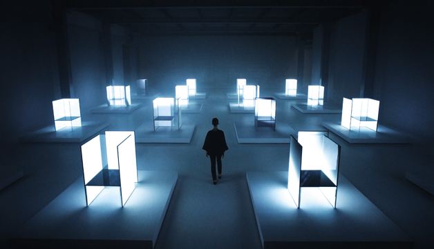
Tokujin Yoshioka Design created the exhibition design “S.F_Senses of the Future” for LG from South Korea on the occasion of the company’s 70th anniversary. The large-scale light installation was presented at the Milan Design Week 2017. It aims at illustrating the relationship between man and nature, and expressing LG’s design philosophy. This is based on the idea that innovative technology should be oriented towards human experience.
This is expressed by using ultra-thin LG OLED products of the company. In an impressive way, they are staged in form of illuminated futuristic chairs and a wall which simulates sunlight. In 2017, the Red Dot Jury awarded the Red Dot: Grand Prix for this outstanding creation. The exhibition design emphasises the orientation towards technology of Japan, which is best known for its advanced innovations.
Logo design between tradition and modernity
Also in classic works of communication design, such as the design of logos, innovative approaches become apparent, for example when tradition and modernity are brought in line with each other according to the Japanese principle of harmony. The so-called “Wa” aims at combining different values, people, points of view and positions, and unite them on a higher level. It is the basis of the vitality of modern Japanese design of the 21st century and can also be found in the logo for the Olympic Games, which take place in Tokyo in 2020.
The chequered pattern became formally known as “ichimatsu moyo” in the Edo period (1603-1867). The design by Asao Tokolo picks it up and shows it in the traditional Japanese colour of indigo blue, so that the logo expresses elegance and sophistication. It is composed of three varieties of rectangular shapes, which represent different countries, cultures and ways of thinking. This way, the design, which embraces aspects of Western logo design, expresses the message of “unity in diversity”.
Akira Kobayashi is Red Dot juror
Just like the Olympics, the Red Dot Award: Communication Design provides a platform for presenting one’s own achievements. From logos to exhibition design to apps, posters and packaging – works from Japan and numerous other nations around the globe are submitted tothe competition every year. They are evaluated by the internationally composed Red Dot Jury. In 2018, it will be supported by Akira Kobayashi for the second time. He is familiar with the socio-cultural characteristics of Japanese design.
Born in 1960, he started his career as a type designer at Sha-Ken Co., Ltd. in 1983. Later, he studied calligraphy and typography in London and on his return to Japan in 1990, he joined Jiyu-Kobo. From 1993 to 1997, he worked for TypeBank, where he designed a Latin alphabet to match the digital Japanese fonts of the foundry. Afterwards, he became a freelance type designer and won numerous international awards. In 2001, he moved to Germany to accept his current position as type director at Monotype GmbH (formerly Linotype). With this expertise, Akira Kobayashi will examine and evaluate this year’s competition entries together with his jury colleagues. Only convincing design performances will receive the Red Dot quality seal.
» Further information on the Red Dot Award: Communication Design 2018