For over 85 years, GROHE has been combining two things: the elixir of life, water, and innovative product design. Over the years, the family-owned company has grown into a global brand that is now regarded as the epitome of stylish fittings and contemporary sanitary solutions.
Health through water
With the claim “Sanus per Aquam” – health through water – GROHE ushered in a new era in 2021. The spirit of the times is now characterised by self-care and a new awareness of health. As a result, the bathroom is gradually becoming a wellness oasis; personal well-being in a harmonious environment is coming to the fore. And just as GROHE products meet this need in terms of form and function, the brand image has also undergone another facelift. Reduced shapes, clear lines and simple aesthetics now characterise not only elegant fittings and sanitary equipment, but also a new GROHE logo. The brand-typical waves now seem to float above a clear and slimmer lettering. Lightness, harmonious proportions and simple elegance charge the established GROHE brand with a new story for the prevailing attitude to life. GROHE was also able to convince the jury at the Red Dot Award: Brands & Communication Design 2021 with this change.
Re-branding 2019
GROHE has pursued consistent brand management and communication since the 1950s. This also takes into account the changing demands on bathroom solutions. As an example, this manifested itself in a new image in 2019. The aim was to give the GROHE brand more clarity, precision and effectiveness. In addition, the company's claim at the time, “Pure joy of water”, was to be strengthened at all touchpoints and above all in the business-to-consumer sector. Important elements of the corporate design were retained. Simplification by dispensing with the previous frame contributed to a more precise appearance. In addition, a new design grid allowed for more flexibility to communicate the different GROHE worlds in a customised and target group-oriented manner.
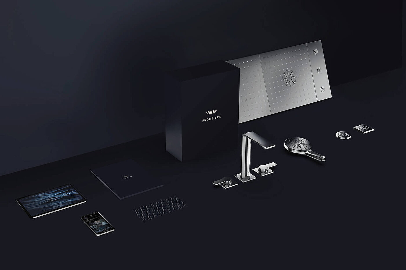
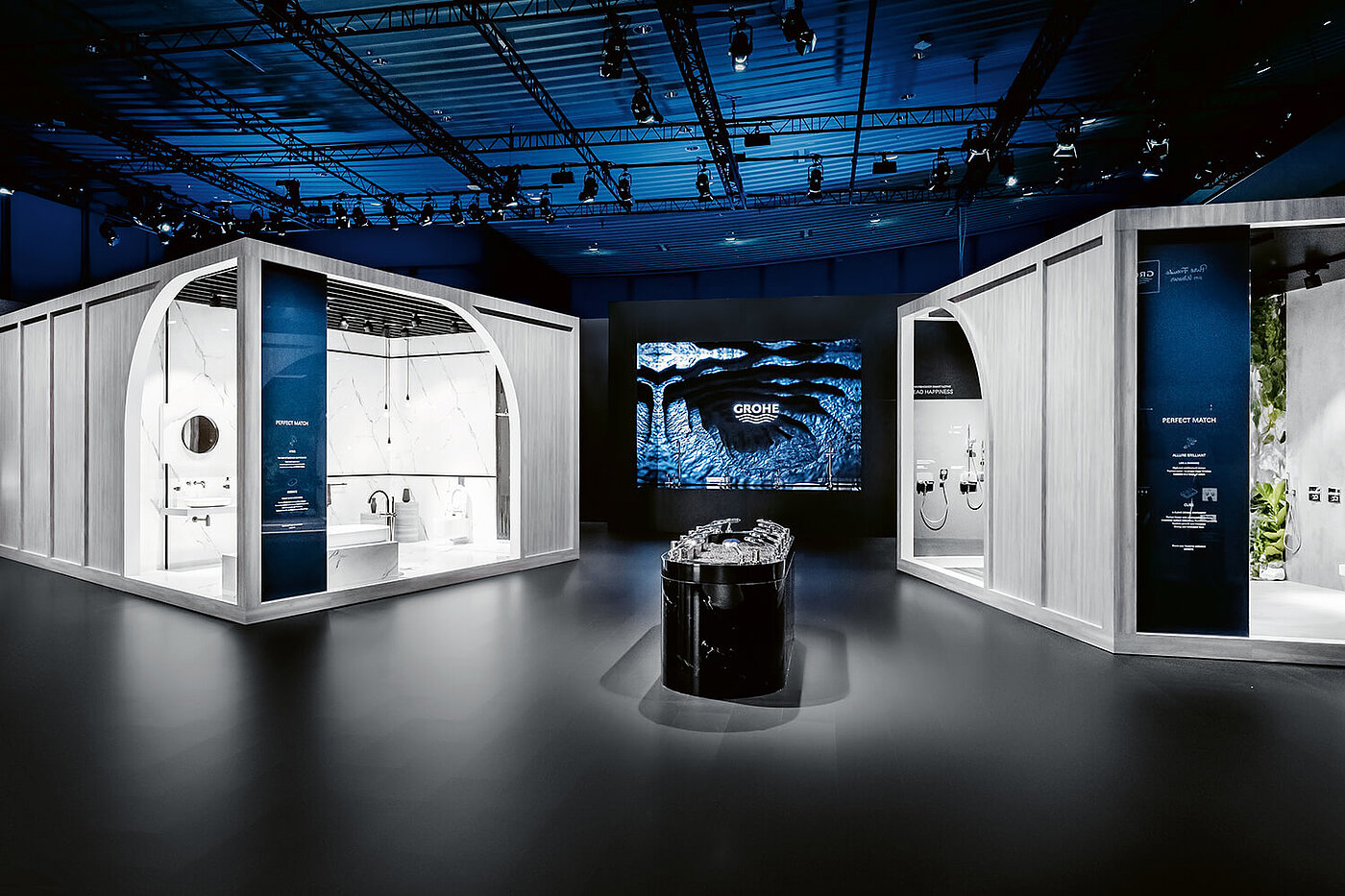
But a successful design strategy is not just about an image - its implementation reveals how serious a company is about brand management. And here, too, GROHE is convincing all along the line: worlds of experience at trade fairs, aesthetic packaging and successful communication build the bridge between brand, product and consumer:
This sustainable design policy, which has been pursued at a consistently high level for many decades at GROHE, earned the company the “Red Dot: Brand of the Year 2019” award - one of the highest honours in the Red Dot Award: Brands & Communication Design.
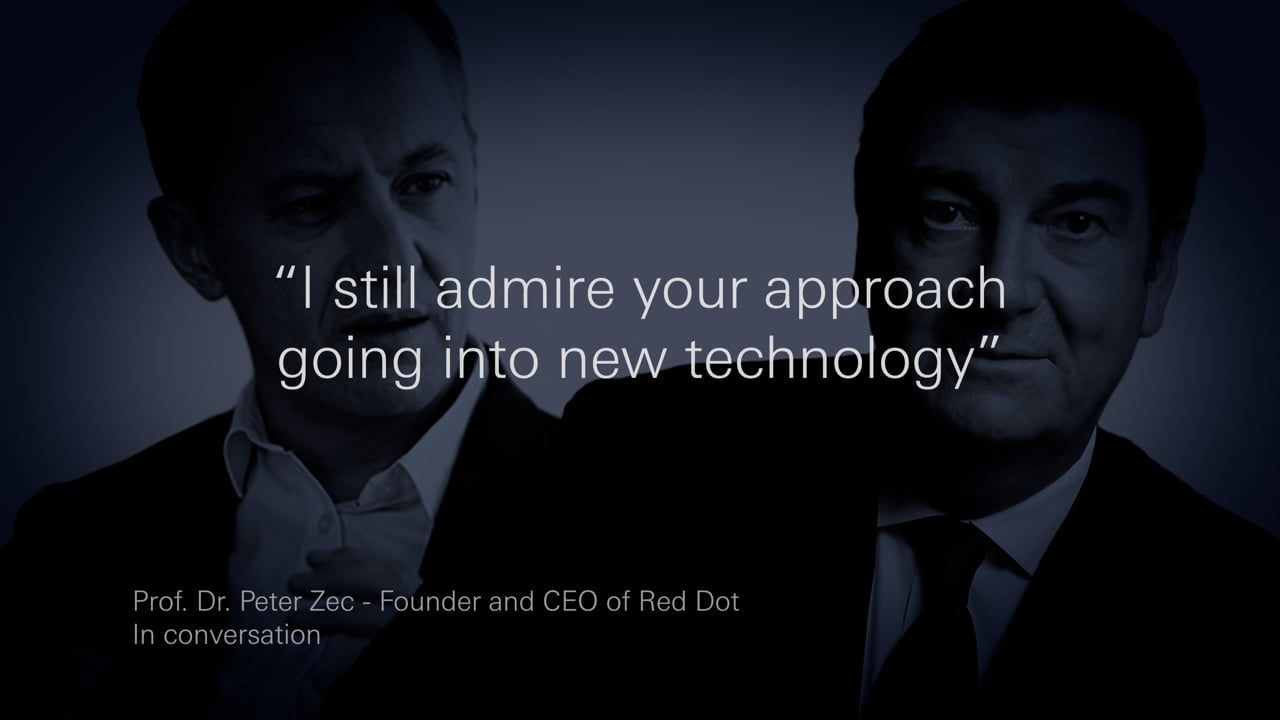
Eight years earlier, GROHE was awarded the honorary title “Red Dot: Design Team of the Year 2011” in the product design competition for consistent design quality with consistently high functionality. On the occasion of the 10th anniversary of the honorary title, Paul Flowers, Executive Vice President and Leader LIXIL Global Design, and Professor Dr. Peter Zec, Founder and CEO of Red Dot, met for a talk:

Quality, technology, design and, last but not least, sustainability are values of the GROHE brand core that extend across all company divisions and ensure long-term anchoring in the market. Through this focus and its consistent application to products, appearance and communication, GROHE repeatedly creates surprising brand experiences and sets new standards in its industry. This role model function of the company is confirmed by numerous Red Dot awards for innovative products, brand management and communication. A triad that has contributed to entrepreneurial success over 85 years.
Registration for the Red Dot Award: Brands & Communication Design now open
Brands still have the opportunity to apply for the “Red Dot: Brand of the Year” award until 17 June. Submit your brand profile and have the quality of your brand confirmed by renowned experts. Then use the internationally renowned Red Dot Label and communicate your competition success visibly on all platforms. You can find all information about the Red Dot Award: Brands & Communication Design on our website.


