Prerequisite for strong brands: awarded brand design
In order to position a brand on the market in the long term, it needs a thought-out appearance with a high recognition value. Thus, a well-elaborated brand design is essential. It promotes the brand, distinguishes it from competitors and makes it unique. In the Red Dot Award: Communication Design, companies can prove themselves in the category “Brand Design & Identity“ and strengthen their presence with a distinction. In 2017, among others, the projects “The New WeTransfer.com“, the “German Red Campaign” and “KaoHuo” were awarded the coveted Red Dot.
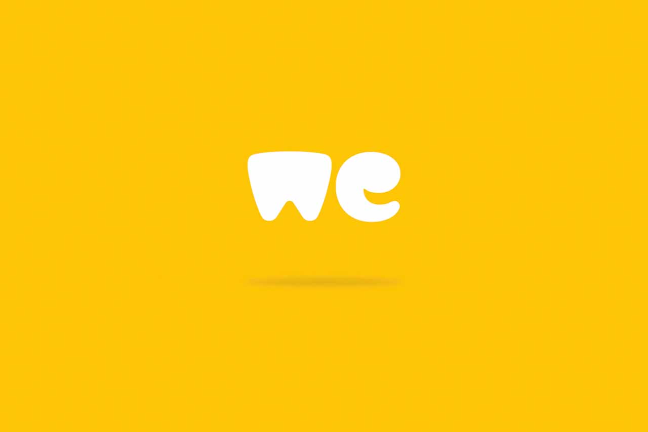
Design relaunch of WeTransfer
The design relaunch of the brand identity “The New WeTransfer.com“ focuses on the perception of the service as a creative platform. Therefore, the designers developed a simple logo with a communicative, friendly and adaptable appearance. It reflects the ideas of creative excellence and the craft behind it, as well as the collaborative nature of the file-transferring service. By leaving out the word "transfer" in the logo, the designers emphasise the company’s intention of bringing people together. The bold, rounded letters ensure good legibility.
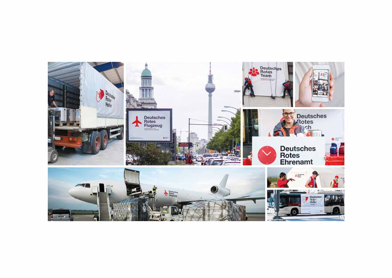
Branding for the German Red Cross
The recruitment campaign „German Red Campaign“ aims to promote the German Red Cross humanitarian aid organisation and representing its various fields of activity. For that purpose, Leo Burnett Germany redesigned the organisations’ established logo. Thus, for example, “Deutscher Roter Rettungsring” (German Red Lifebelt) stands for the lifeguard service or “Deutsche Rote Hoffnung” (German Red Hope) for the blood donation services. By encouraging thought and action, the campaign has drawn a lot of attention and thus recalled the many activities of the German Red Cross in the public mind.

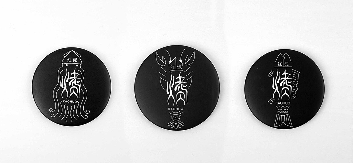
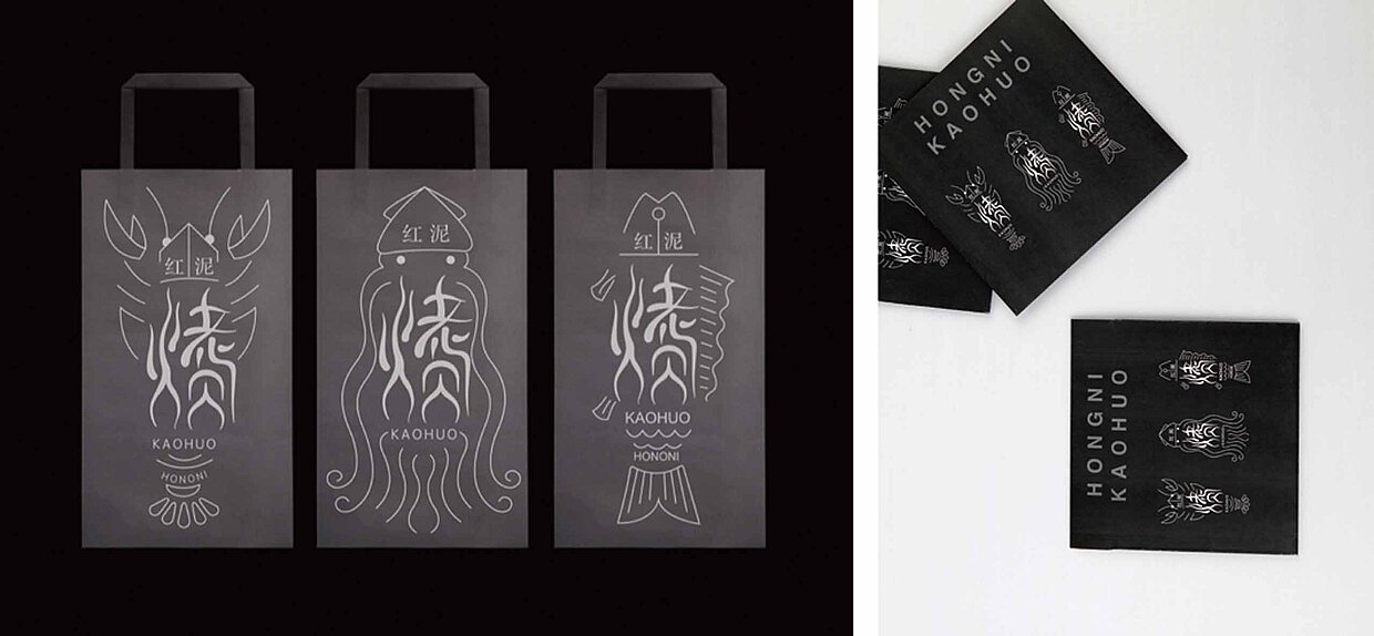
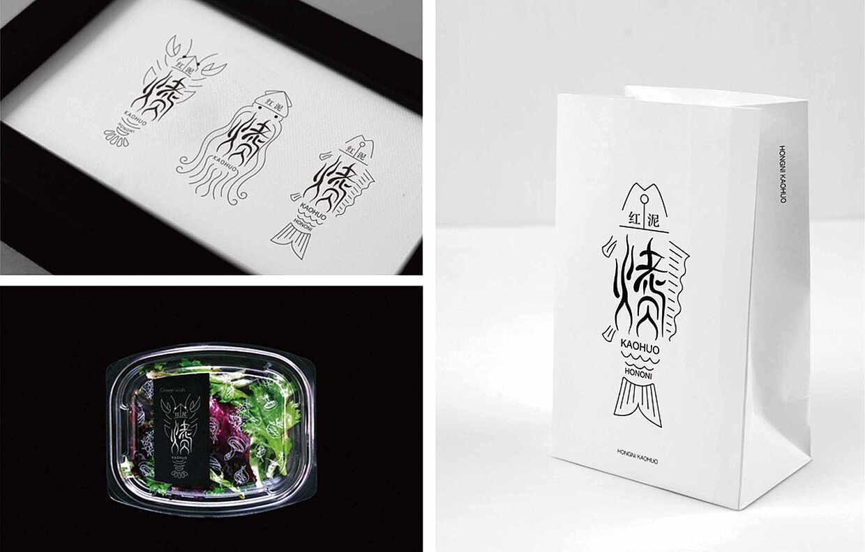
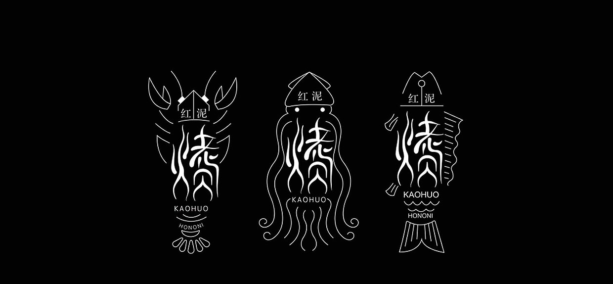
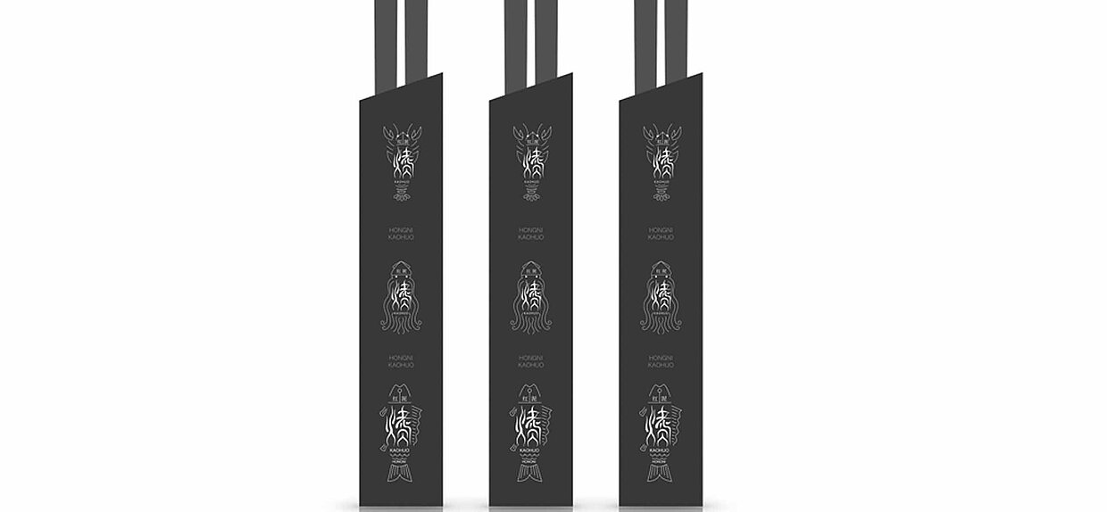
Chinese logo design
The logo design „KaoHuo”, designed by Lin Guosheng and Hu Bin from the Fine Arts School of Hangzhou Normal University for the Hangzhou Wheat Village Catering Management, combines Chinese characters with graphic elements. The main body is composed of the character for "grill" and "goods", while the symbol for grill shows a burning flame. The characters are combined with filigree illustrations of a sea fish, a shrimp and a squid, resulting in a new and flexible logo. It is used in the whole brand appearance and adorns aprons, carrier bags, buttons and packages for chopsticks.
Winner presentation
The grand finale of the Red Dot Award: Communication Design takes place in Berlin on the 26 October 2018. The laureates receive their well-earned trophies and certificates during the Red Dot Gala. Afterwards, they all can celebrate their successes together at the Designers’ Night, where the winners exhibition “Design on Stage” takes place. It will be exclusively shown for one night only in the ewerk Berlin. Here, the guests can convince themselves of the awarded brand designs and the other outstanding projects. In addition, they will be shown in the online exhibition from this day on.
