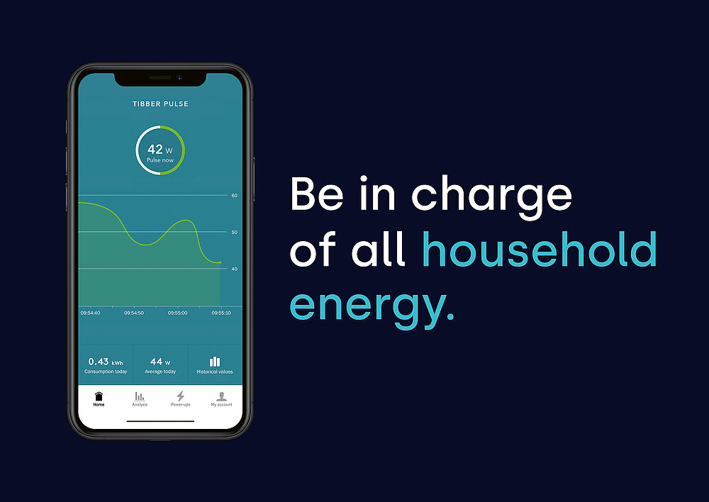
Tibber is a Norwegian digital energy company that was founded in 2016 with the aim of supplying households with 100 per cent renewable energy, while also offering end customers transparency and control over their electricity consumption and costs via a user-friendly smartphone app. With this idea, the start-up initially became popular mainly among early adopters who shared an affinity for technology. In the early stages, Tibber’s brand communication was imbued more by the technological aspects – promoting the app and its high-tech features as key differentiators. Visually too the brand was at first associated more as a tech start-up than an established energy provider.
In order to reach end users worldwide, Tibber had to be redefined and repositioned. The challenge was to transform the brand in such a way that it would resonate with a broader audience and build trust, without losing its original identity, twist and appeal. The aim was to raise interest with a different, smart and playful approach in order to set itself apart as a young brand from the competition of established electricity providers.
The existing values of human centricity, sustainability, usability as well as curiosity were defined as a central starting point in the repositioning of the brand. The aim was to create a resonating identity for a broader audience, which would also shift the focus in communication towards comprehensible benefits instead of purely technical features. The core attributes of the brand were defined as the basis for the new brand identity – Tibber should be perceived as dynamic and smart, yet always humane and inclusive. Today, Tibber also uses word plays, but remains clear in the message and avoids technical jargon altogether. Meanwhile, the visual identity has also been sharpened: the concise logo in light blue combines a stylised lightning bolt with the brand name in small letters. The visual approach combines photographs of modern family lifestyles with quirky and disruptive details derived from pop culture. Visual and tonal elements complement each other by enriching the same message in order to ensure that the brand is uniformly recognised.
크레딧
Company:
Tibber AB
Founding Year:
2016
Lead Agency:
Wörks
Helsinki, Finland
Company Founder:
Edgeir Vardal Aksnes, Daniel Lindén
Number of Employees:
50
Claim:
More power. Less electricity. / Join the Electric Revolution