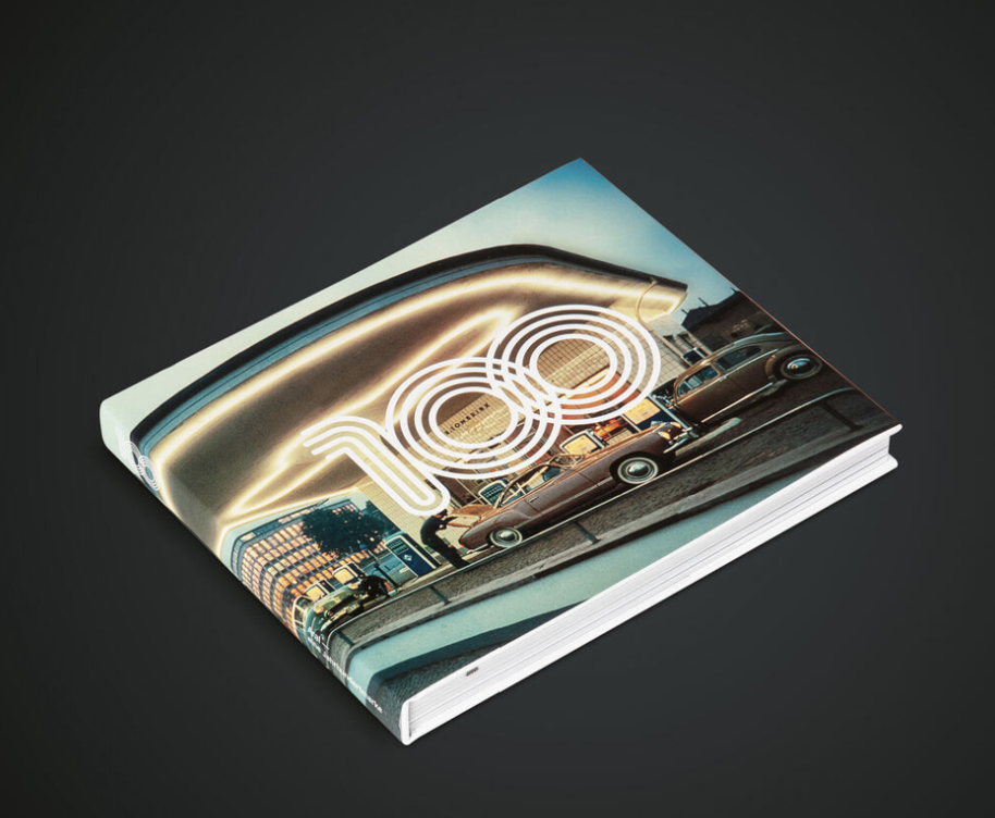
Designed as part of a series of calendars published over the last 20 years by a printer based in The Hague, the Ando calendar 2013 surprises with an appearance that resembles a leporello fold. The calendar is functional, yet due to the use of different patterns and colour schemes, it looks like a unique piece of craftsmanship. Instead of being printed using the usual CMYK process, these standard hues were substituted with four Pantone Matching System colours plus gold. All 2,000 copies have been bound by hand and contain twelve separate sections.
크레딧
Client:
Ando BV (Algemene Nederlandse Drukkerij Onderneming), The Hague
Design:
Walvis & Mosmans, The Hague
printing:
Fokko Tamminga, Ando BV
art direction:
Marc Mosmans, Tjeerd Walvis
graphic design:
Marc Mosmans, Nina Rödner, Aernout Tas, Wijnand de Vries