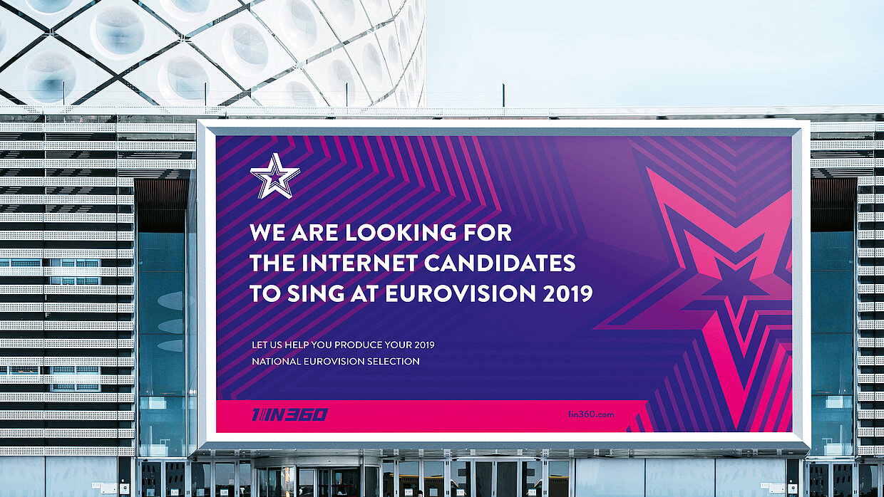
Client: 1 in 360 Ltd., London, United Kingdom

심사평
The idea of this corporate design, to turn the key visual of the “R” upside down with the aim of reflecting a rebellious approach embodied by the art prize and its name giver, has emerged as a highly appropriate and consistent implementation. Realised in striking pink, combined with gold and white, the appearance conveys a strong impression of both high quality and intended subversion, illustrating at the same time what art is capable of expressing.
