Clair is a South Korean company that specialises in the development and manufacture of filter and ventilation products. Under the brand name “MyClair”, the company now also offers a subscription service for air purifiers and filters that relies on IoT technology and mobile apps.
When designing the brand logo, the main concern was to ensure that the new logo did not clash with Clair’s existing logo. Instead, MyClair should be recognisable at first glance as a new service of the brand and clearly associated with mobile devices as well as new products.
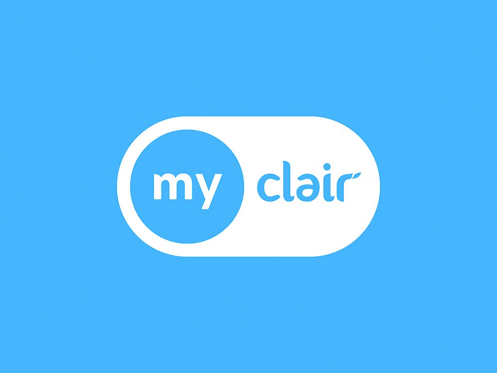
The logo design picks up on the design motif of the on / off icons, which is already familiar to customers through the use of mobile devices. By separating “My” and “Clair” and assigning them to the icons that control the on / off functions, it was possible to integrate the already existing Clair word-image mark without changing it. At the same time, an independent logo was created by combining it with the clear icon shapes and the addition of “My” in a different font. By using the logo as a button to control various functions in the app, the requirement that the logo should be intuitively associated with mobile services is also brought to life in terms of pure functionality. Furthermore, the logo was designed in such a way that it can be flexibly extended to different MyClair services by replacing either the “my” or the “clair” lettering with prefixes or by inserting additional identifiers such as “children” and the like.
Sky blue was chosen as the brand and logo colour to symbolise clean air. To increase flexibility for use in print media, black and white were added as secondary colours. In addition, four pastel colours were chosen for the app to provide real-time information on the condition of air in a room by representing gradations of air quality.
Easy-to-understand infographics are used across all media to display air and filter values. Pictograms enable quick orientation within the app, while illustrations in black and white provide variety and liven up the brand presence, adding a charming and playful touch.