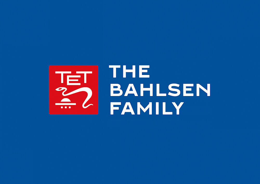
A relaunch of the corporate design was created for the traditional family business Bahlsen. The new umbrella brand was to be timeless and traditional in the best sense while, at the same time, promoting the innovative strength of the company. The TET quality seal, which had been especially developed in the early company history, reemerges in the new logo. In addition, the distinctive san serif typeface expresses the family context of the company directly in the name of the umbrella brand: THE BAHLSEN FAMILY. The word mark is based on a handmade typography created in the 1920s. Each letter and each character was individually proportioned.
크레딧
Client:
Bahlsen GmbH & Co. KG, Hannover, Germany
Design:
MUTABOR, Hamburg, Germany
Creative Direction:
Sven Ritterhoff
Design Team:
Moritz Carstens, Lasse Lemster, Jan Hellmerichs, Simon Büssem