Food Packaging

Pocky THE GIFT

Zurück Download

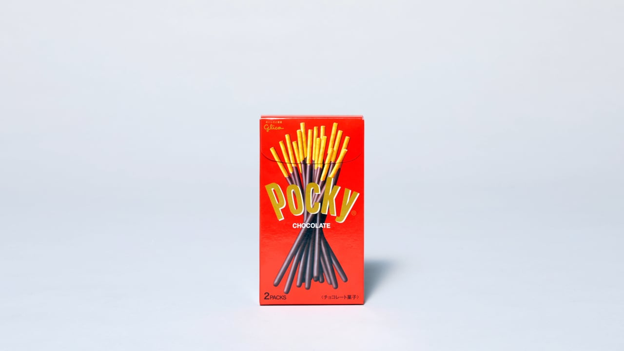
Pocky sticks have been Japan’s top-selling chocolate snack for decades. It is kids and teenagers in particular who love them because the chocolate sticks are easy to handle and share with friends. In order to appeal more to the target group of young adults and to give them a way to enjoy Pocky sticks, a stylish new packaging was created – for use exclusively at upscale shops and sales outlets. The result is an overall simple, rectangular packaging in various colours and sizes with an equally reduced printing, which allows the product to be presented and prepared in a variety of ways in the shops. With their simple and colourful appearance, they immediately catch the eye almost everywhere and encourage consumers to celebrate small and large moments with them or to give them to friends as a fashionable gift. The inside of the product boxes also features graphics to heighten the sense of surprise when opening the package.

Begründung der Jury

The redesign of the legendary Pocky chocolate sticks packaging is a great example of the effect that target group-specific design and appeal can have. The new identity is marked by a bold, minimalist aesthetic that is sustainable and at the same time makes customers want the product – an overall very well-thought-out branding with a playful touch.

Red Dot: Best of the Best

Andere interessierte auch