Loading...

Foxi Tea
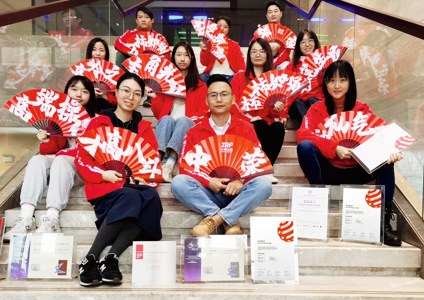
The Creative Centre of ZRP Printing Group considers brand planning as the core, from brand positioning, conceptual design to series product packaging design, and carries out the entire case planning. It consists of a team with a comprehensive range of innovative design and overall packaging solution capabilities in terms of graphics, structure, ID, CMF (colour, material, finishing).
Red Dot: Why did you become a designer?
ZRP Printing Group: We believe that design means improving people’s livelihood and making life better. Especially since the pandemic, we have also begun to reflect on the relationship between human beings and the world. Topics such as environmental issues, natural issues, and emotional catharsis have returned to the discussion field. How to add more value to design is a problem we have been thinking about. At different scales, we hope to find and always pay attention to the key points that affect its changes through insight into the systematic operation of specific issues in the “social process”, and to creatively reconfigure various resources to form new impetus and productivity. At the same time, we use the design language of aesthetics and narrative, which we are good at, to spread, so as to achieve the purpose of social improvement pragmatically.
What intention do you pursue with your award-winning work?
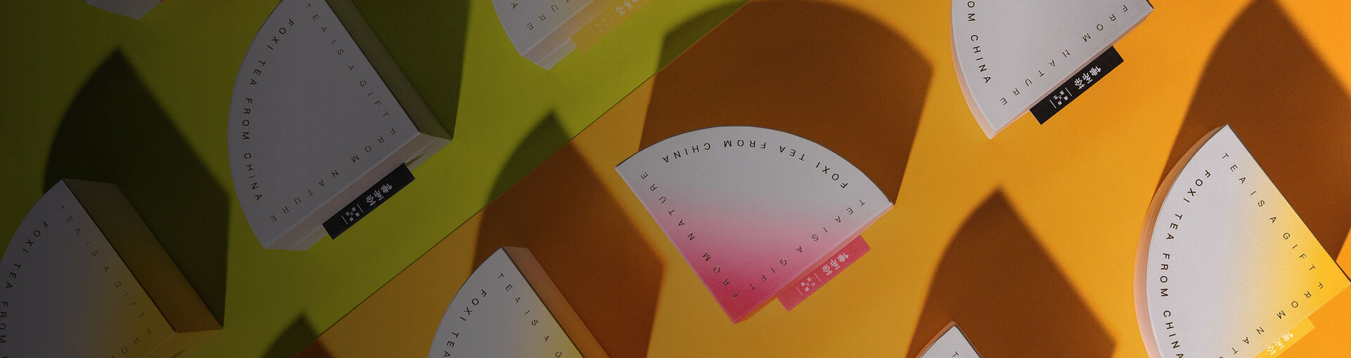
We hope that the work cannot only provide products with the most basic packaging functions, but also establish a more emotional connection with consumers. The packaging’s outer form is based on quarter circle, reminiscent of a meditating Zen master and the Buddhist system. It corresponds to the modern consumer’s attitude to life and thus offers him a medium to express his. The shape also resembles the epitome of the spring tea mountain, and the natural transition from young to old tea leaves. There are no limits to people’s imagination. Four relatively pure colours were selected to form a colour matrix to convey the natural beauty of the carvings and the hibiscus water and to draw into the relationship between consumers and nature. The new vision is more modern and closer to people’s lives. Although the pandemic has caused distance between people, it is hoped that this packaging can establish more emotional connection points while creating a sense of identity with the people’s attitude to life.


