Brand Identity

Zibra

返回 Download

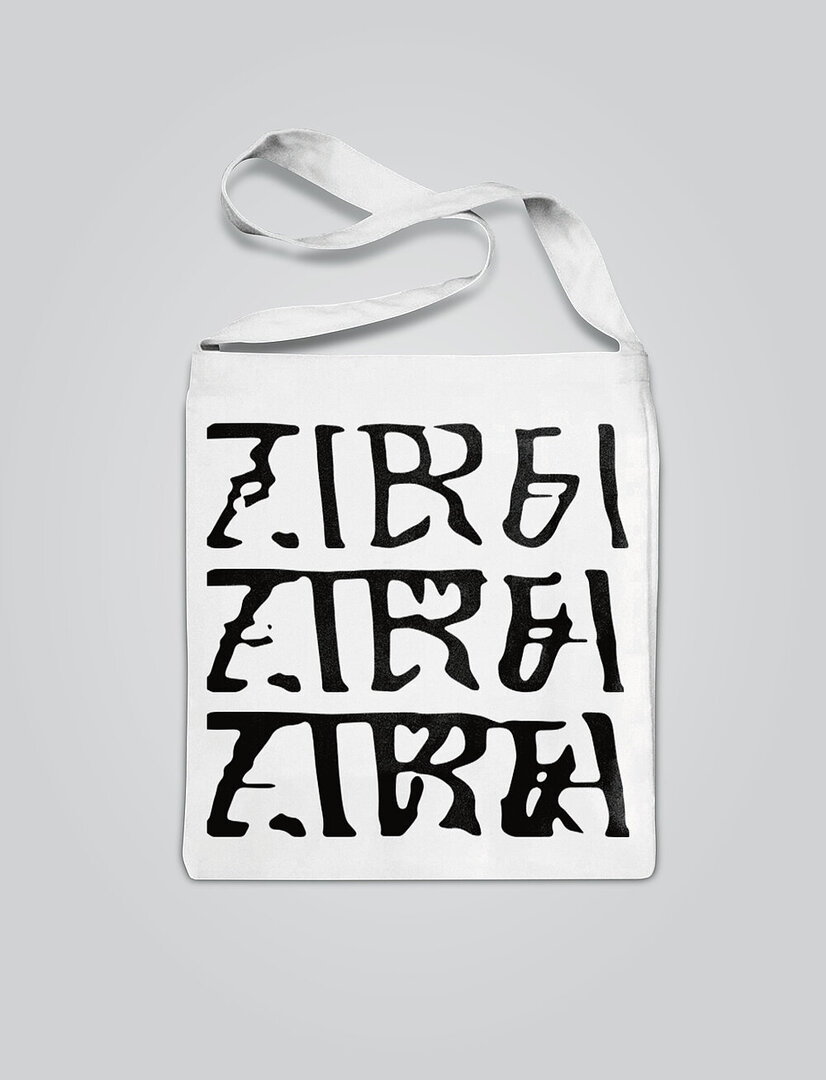
Zibra is a company that develops AI-based software systems for the production of 3D and game content. To emphasise the human/machine concept, a brand identity was designed that is dynamic and itself created through machine learning. It uses graphic elements of the animal zebra, which immediately comes to mind when hearing or reading the name Zibra, and the aesthetics of an artificial intelligence. The typographic set consists of two typefaces. The first is a classic static sans-serif typeface, while the contours of the second have been heavily distorted using special software. Through a generative adversarial network, the arcs and straight lines of the fonts were broken to reappear mixed in a completely unusual and vivid manner. Based on machine learning, the neural network was also trained to recognise over 500 fonts and their differences. The key visual for Zibra was created independently as a dynamic transition between all the fonts studied, with each individual image representing the Zibra logo in an easy-to-recognise manner. The combination of white and black in conjunction with the identity thus creates a graphic impression that is reminiscent of the zebra print.

评审团评语

Zibra’s brand identity is particularly convincing because it is computer-generated and thus expresses and conveys exactly what the day-to-day business of this IT company is all about. Oriented towards the client’s competencies, this is generative design at its best. The synthesis process gives the logo a constantly changing appearance that nevertheless remains clearly identifiable at all times, also because the black-and-white look creates a direct link to the name.

Red Dot: Best of the Best

Others interested too