Buoy Bottle
Nozawa Onsen Distillery

In 2022, the Nozawa Onsen Distillery was founded in the ski resort of the same name in Japan’s Nagano prefecture. As a picturesque ski area, the village and surrounding countryside are especially popular among winter holidaymakers.
What is less well known is that, with its varied landscape and bountiful nature, Nozawa Onsen also has plenty to offer at other times of year. With the aim of popularising the region through high-quality, artisanal spirits, local villagers worked together with foreign residents to found the Nozawa Onsen Distillery. It is housed in a former cannery and is used to produce gin and whisky made with regional spring water and local ingredients.
The canaria design agency was entrusted with developing the distillery’s branding. “The particular challenge we faced was to create a brand design for this distillery that would be judged not only by people who enjoy drinking spirits; everyone in the village also had to feel they could identify with the distillery and be able to say, ‘This distillery belongs to us’,” canaria’s creative director Yuji Tokuda explained. Thus, the origin of the drinks lies at the core of the branding.
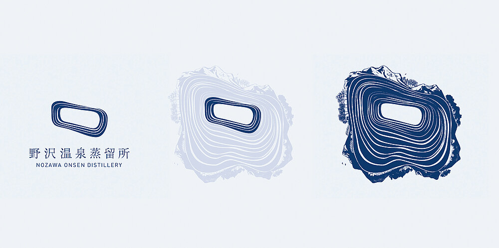
The overall design concept is based on the theme of the “Blessings of the water’s circulation”, thereby evoking a particular feature of the village and the surrounding nature – namely the fact that everything is defined by water, with snow, meltwater, hot springs and landscapes carved by water over 50 years shaping the appearance of Nozawa Onsen. The huge invisible water circulation system. At the heart of the visual identity is the logo symbolising water, its movement and cycle. It is the distillation of a more comprehensive illustration, in which the central logo is surrounded by intricately detailed impressions of the village and the local flora and fauna in every season. The typography also references the theme of “water” as a motif in the form of water droplets in various parts of the characters, while the primary brand colour of dark marine blue symbolises water itself. Consisting of simply shaped bottles with wooden stoppers, the drinks’ packaging design foregrounds the label, featuring variations of the illustration. Depending on the flavour, the colour furthermore changes in reference to the main botanical ingredient – a design system that allows for expansion of the product range. The logo can also be found in the interior of the distillery: on floors, wooden barrels, signage and merchandise alike.
“The key visual is intricately detailed and tells a story so that it evokes an emotional response in anyone who comes into contact with it, and this makes it memorable,” the jury reasoned in its statement. It also felt that the entire branding was very consistent, from the logo to the packaging design and promotional items, through to the corporate architecture. The result, the jury believed, is an overarching brand identity that is distinctive and allows people to identify with it, so that the Nozawa Onsen Distillery may be able to transcend its role as another spirit brand to become a symbol for the revitalisation of the region.

参与人士
-
Brand Owner:Nozawa Onsen Distillery
-
Founding Year:2022
-
Company Founder:David Elsworth / Philip Richards
-
Number of Employees:10
-
Claim:TASTE THE SPIRIT OF NOZAWA
