Buoy Bottle
MFIT Rebrand

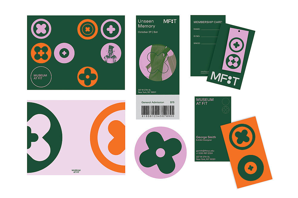
The MFIT REBRAND project in New York integrates digital art and computing to develop a new visual language, logotype, and generative design toolkits, ensuring adaptability and engagement across all media platforms and enhancing the museum’s connection with its audience.
Drawing inspiration from classic button patterns and intricate garment techniques, these elements are reimagined as a versatile geometric design framework. Here, buttons transcend their utilitarian role, symbolising connection, unity, and the seamless blending of disparate elements. The symbolism resonates with the museum’s ethos, which emphasises diversity, inclusivity, and inventive thought. To infuse youthful energy and vibrancy, a modular visual construct has been consistently applied throughout the brand’s identity.
One of the main challenges faced during this rebranding process was crafting a visual narrative that resonates not only with the fashion community but also encapsulates the industry’s ceaseless dynamism. The solution involved harnessing the power of ‘processing’ for code-driven design, enabling the creation of a myriad of unique patterns that serve as a visual testament to the ever-adaptive, pulsating heart of the fashion realm.
Red Dot Award: Design Concept | Red Dot: Next Gen Award | Concept | Brand Design and Identity

参与人士
-
Designer:Ziqi Liu, United States
