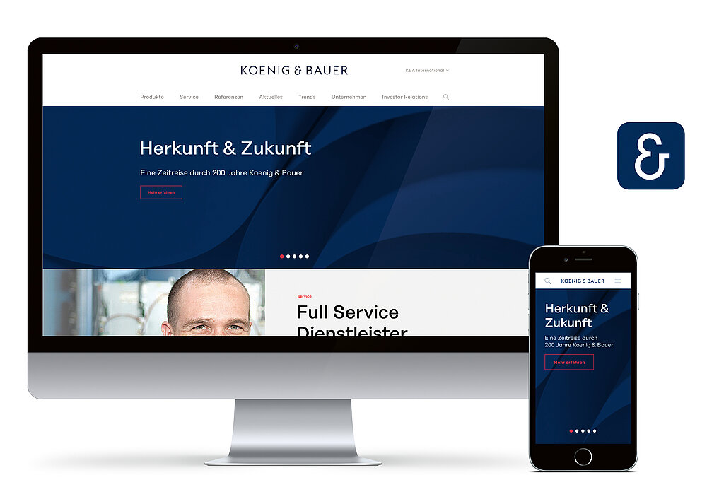
Corporate Design

Koenig & Bauer

The corporate identity relaunch on the occasion of the 200th anniversary of printing press manufacturer KBA includes its name, corporate design, corporate publishing and product design. In order to raise the emotional impact of the brand, the new word mark Koenig & Bauer states the names of the two innovative company founders. The ampersand between the two names gives the new corporate design the symbolic power of connection – not only between the founders but also between the company and its customers, between the employees and the future. The new claim “we’re on it” highlights this and also conveys the role as a driving force in an industrial sector which is in a state of constant change.

参与人士
-
Client:Koenig & Bauer AG, Würzburg, Germany
-
Design:MUTABOR, Hamburg, Germany
-
Lead / Concept / Idea:MUTABOR / Grauel Publishing
-
Creative Direction:Steffen Granz Sven Ritterhoff
-
Head of Strategy:Marle-Maria Janßen
-
Text / Editorial Work:Ralf Grauel Michael Matthiass Carsten Jasner Klaus Vogt Michael Prellberg Kai Schächtele
-
Client Service Management:Nina Schack
-
Editor-in-Chief:Ralf Grauel
-
Design Team:Marta Fromme Lara Resch Marina Nienhaus Marco Ivers Daniel Yaqub Maximilian Nertinger
-
Editorial Design:Carolin Rauen
-
Illustration:Jindrich Novotny


