![[Translate to English:] [Translate to English:]](/fileadmin/_processed_/d/6/csm_02-00345-2023BC.0940335_CO_abc15f08ec.jpg)
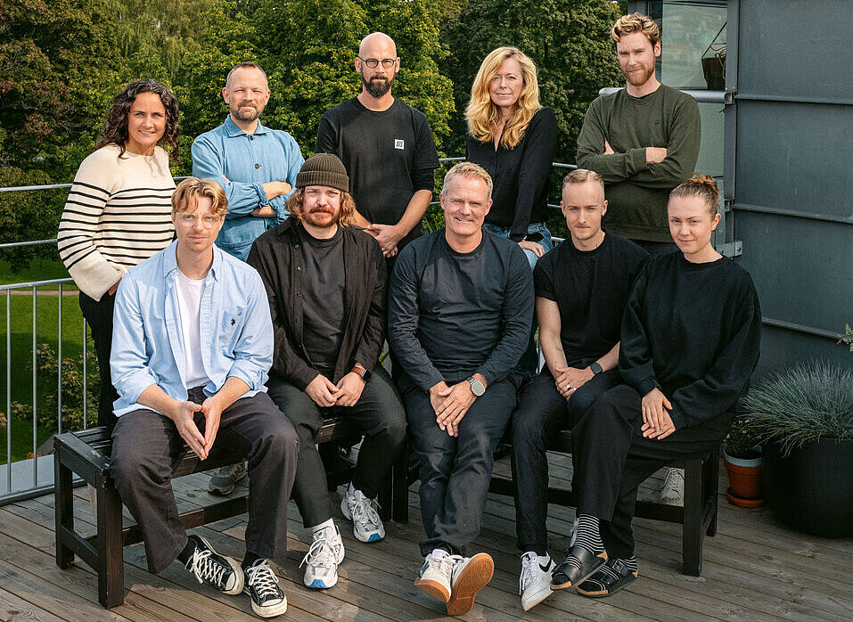
“We started in 2008 as a punk band, a small agency that vowed never to consist of more than five people and never to do anything but design. That didn’t work out,” said the two founders, Kenneth Pedersen and Kjetil Wold Østmoen from the Norwegian agency ANTI. What worked very well, however, was to transfer this somewhat anarchistic spirit to the growing number of employees (now 75 in two offices): a strategic approach, of course. Goal-oriented communication on all analogue and digital channels – in every case. But always also breaking through boundaries, constantly questioning the status quo, taking unconventional approaches – all this still characterises ANTI’s work to this day.
The agency’s name is by no means associated with a rejectionist attitude; rather, ANTI stands for “A New Type of Interference”. „Interference can be understood as disruption, but it can also be seen as a competitive advantage – or simply as: standing out from the crowd.“ Exactly what brands need today more than ever.
Red Dot about ANTI
Our name is our philosophy. ANTI stands for “A New Type of Interference” – and that’s exactly what brands need.
ANTI
###TITLE###
###DESCRIPTION###
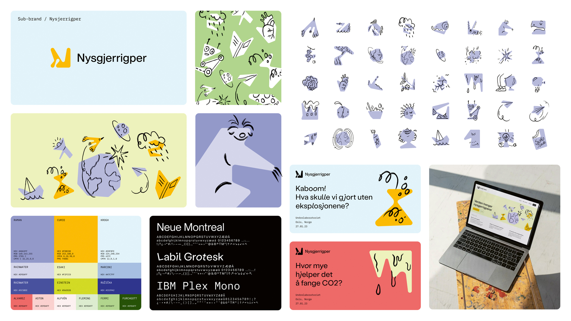
Forskningsrådet
For the complex visual identity of the Research Council of Norway, a Dubins Path Generator was used to create icons for the various specialised disciplines from randomly connected points on a grid. The result was a generative system that produces dozens of variations with a uniform look.
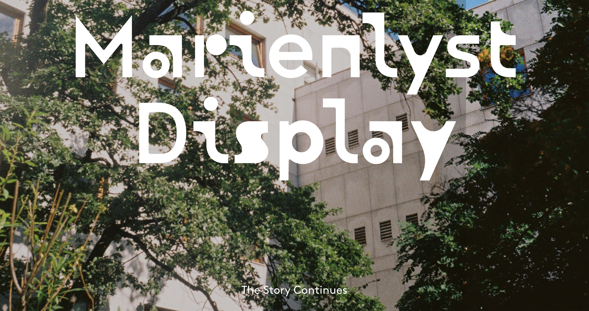
Marienlyst Display
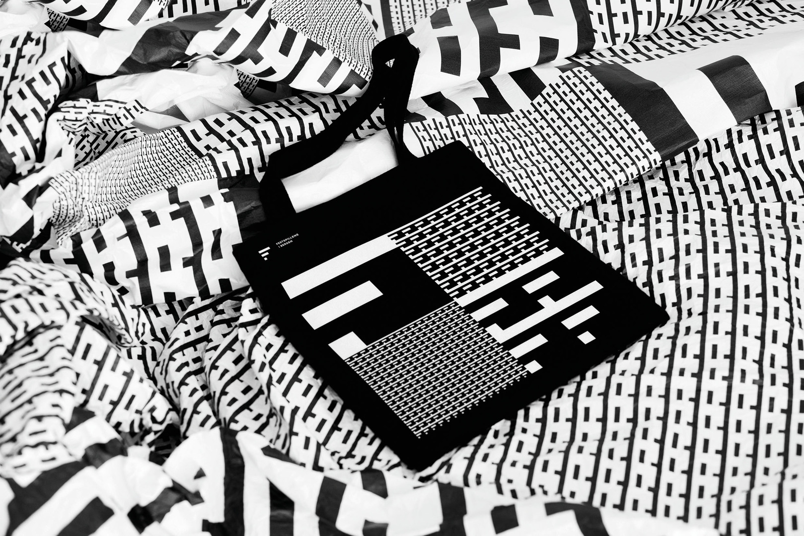
Based on the architectural characteristics of its namesake neighbourhood in Oslo, the "Marienlyst Display" font is the centrepiece of its new identity. It is particularly in digital applications, such as animations, that the font's playful strength becomes clear.


![[Translate to English:] [Translate to English:]](/fileadmin/_processed_/0/e/csm_07-00833-2023BC.0941983_CO_371ea42c33.jpg)
