

Interview with Zapiens Design
or copy the link
Whey is a side product of dairy production, but nobody really has any use for it. Why is that? Studio Zapiens, a team of hybrid brand development specialists, soon came up with the perfect product. YOOY uses colourful visuals and an immersive digital experience to make you want to do something good for yourself and the environment.
Red Dot about Zapiens Design
We were looking for a typeface that, despite its personality, would not compromise readability, since we needed to minimise the number of hierarchies on the website, and Sunset Gothic Pro perfectly fulfilled the dual role of headline and body copy.
Fran Vela
###DESCRIPTION###
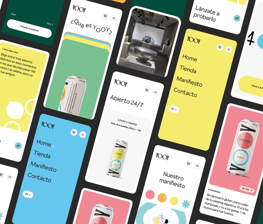
YOOY’s website offers users an immersive experience and supports the extraordinary brand identity. Interactive colours and shapes are used to convey not only the product personality but also the brand’s commitment.
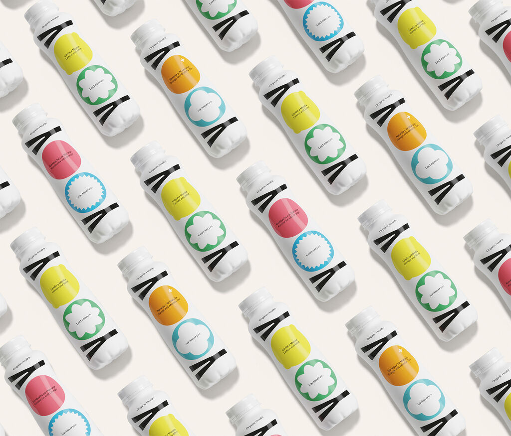
YOOY is a lactoserum that represents a shift towards new consumption patterns based on natural food by-products. The vibrant and expressive colours reflect the brand’s natural ingredients and flavours.
