Luminous Design
Location:
Keep Moving

Movement is the key element in the logistics industry. This is why the rebranding for Logika is based on a dynamic system that allows for great flexibility. With a keen sense for the visual translation of the brand values, Luminous Design has succeeded in making a powerful statement – demonstrating the creative team’s many years of experience with a focus on branding and packaging, as well as its passion for bold communication.
Red Dot about Luminous Design
The presentation of a brand’s design development in the form of animations is a new weapon in the designer’s quiver.
Alexandros Christofidis
Facts and figures
10
Employees as of 20246
Distinctions in the Red Dot Award2000
Year of foundationAwarded in
Awarded projects 2024
###TITLE###
###DESCRIPTION###
Logika
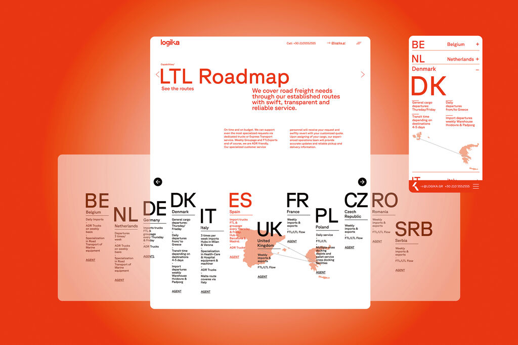
The website design for Logika prioritises the sharing of information through its strong typographic character. The main sections of the site are quickly accessible from the landing page, making it easy for users to find the information they are looking for.
FIX Hellas
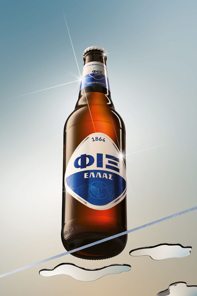
The new packaging design, based on the rebranding of the Greek beer brand FIX HELLAS, communicates the origin of the beer in a modern and unambiguous manner.
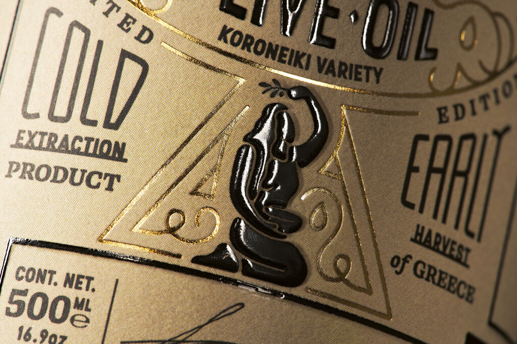
Holiston Olive Oil
The name and packaging of Holiston Olive Oil were designed to reflect the holistic concept of the brand. In addition, the label design conveys traditional crafting, as well as the premium quality of the product.
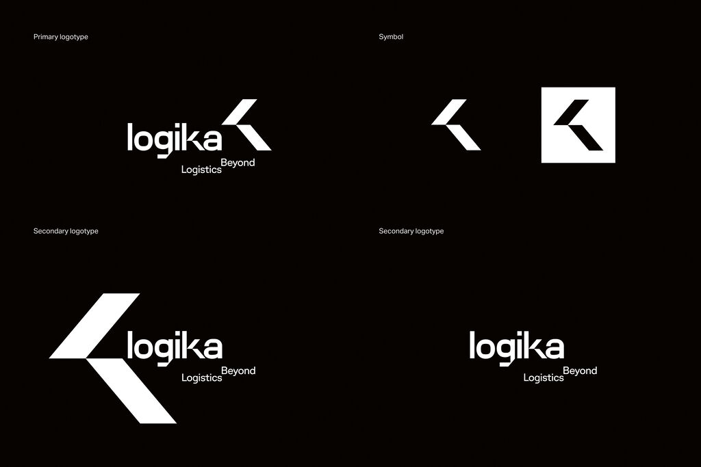
Logika
The basis for the redesign of the visual identity is the new logo, with its flexible system for wordmark and symbol. When an integral element of the existing design was redefined, the diagonal axes took on an important role in the new identity, emphasising the brand’s dynamism.


