Information Design,Orientation System,Visual Identity

SL (Stockholm Public Transport)

Back Download

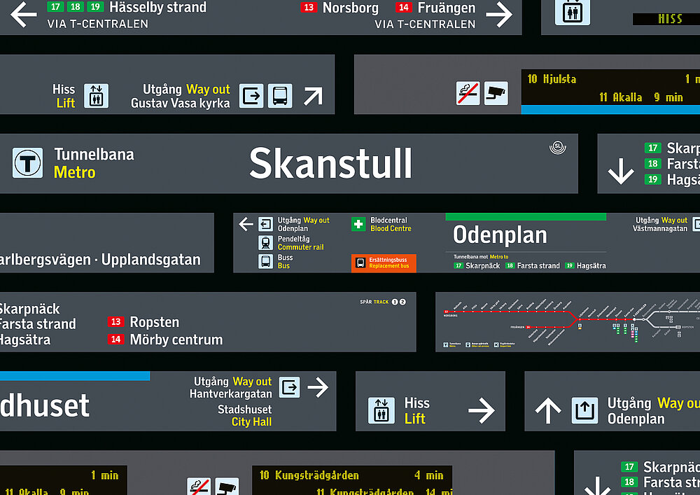
The goal of SL, the Stockholm Public Transport, is to ensure that the journey of 800,000 passengers every day is as smooth and seamless as possible. Against this backdrop, wayfinding systems are the backbone of any public transport system, required to provide all information people need to easily find where they are going and quickly reach their destination. In this new visual identity and signage system, colours play an essential role. Instantly accessible and vi-sually clear, they highlight the different ways of navigation – be it by line number, by destination or simply by colour. The signage has been specially designed for use in the new programme and is complemented by an expanded version of the SL font family SL Gothic that has also been tailored to the new requirements. All pictograms have been revised to show a coherent appearance. They are easily recognisable without words and intuitive to understand – they inform, they warn, and they guide to make for pleasant journeys. Within the signage programme, they follow the same principles and thus provide consistent wayfinding when travelling by metro, bus, commuter rail, light rail, tram or ferry.

Statement by the Jury

Stockholm’s new public transport route guidance system embodies an example of highest design standards reaching perfect implementation. Three types of orientation – by colour, line number or destination – allow processing the incredible complexity of the data quickly and grasping all needed information even without being able to read. Every detail of the colour scheme, typeface and iconography has been carefully crafted.


Red Dot: Best of the Best

By starting the video, you agree that data, e.g. your IP address, will be sent to Vimeo. vimeo.com/privacy

Others interested too