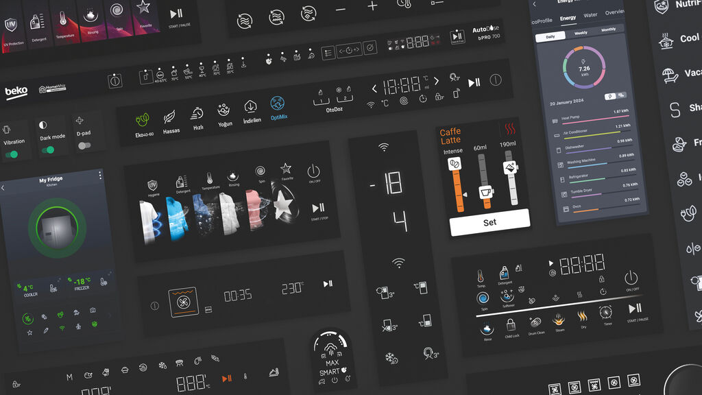
This custom typeface system was developed for the rebranding of SberBank when it converted to a system of digital services. The objective was to create a concise and noble effect, which is realised through a contemporary and technology-friendly font aiming to remain open and not appear cold. The versatile type system includes 48 styles and is divided into four main groups. Sans Text is conceived as a functional sans serif family, while the Sans Display version has a more flamboyant character. Serif Text, in turn, is intended for longer periods of reading, especially on paper, and Serif Display is a serif family for use in larger formats.
Credits
Client:
Sber, Moscow, Russia
Design:
Paratype, Moscow, Russia
Project Team:
Paratype: Alexandra Korolkova (Art Direction/Design)
Isabella Chaeva (Designer)
Vitaly Kuzmin (Designer)
Alexander Lubovenko (Designer)
Gennady Fridman (Technologist)
Olga Krylova (Technologist)
Konstantin Kunarev (Technologist)
Galina Kunareva (Technologist)
Zinaida Kuznetsova (Technologist)
Boris Levin (Technologist)