Deutsche Telekom

Back Download

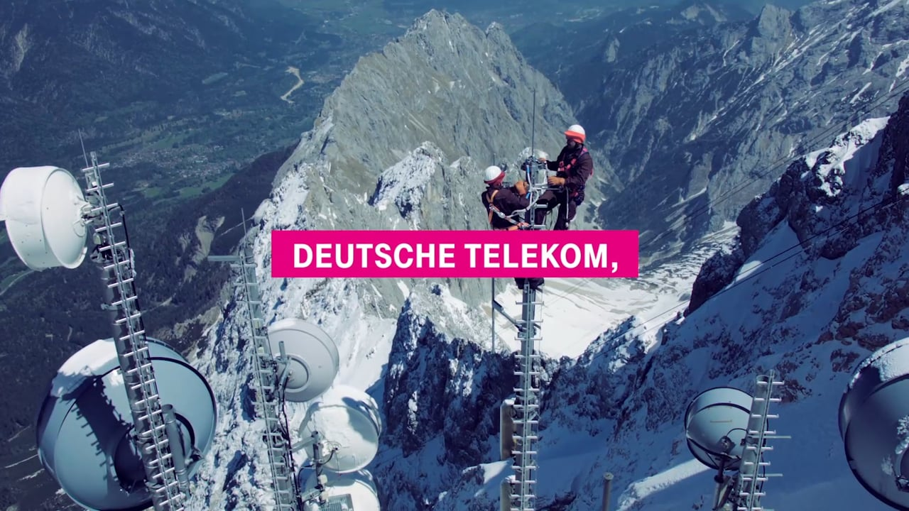
With subsidiaries in more than 50 countries, Deutsche Telekom is one of the world’s leading integrated telecommunications companies, providing the digital infrastructure for today’s and tomorrow’s society. The brand’s central claim “Life is for sharing.” is based on the human needs of people, whereby everyone wants to be connected to those important to him / her and to take part in joint experiences and share special moments. Today, digitisation is offering new ways to participate in communities and interact with other humans. Hence, Deutsche Telekom sees its purpose and responsibility in connecting everyone to this source of digital opportunities so as to enable participation and bridge the digital divide. To meet these needs, the company is developing the technical infrastructure for digitisation from fibre-optic connections to 5G mobile communications networks. On the other hand, Telekom conveys its social responsibility by promising: “We want nobody to feel left behind or overwhelmed. Because it is essential to our community and prosperity that everyone can participate in and shape the digital future.” This again marks the high relevance of the claim “Life is for sharing.” From commercials, products like the fashion and accessories collection “Love Magenta” and plans to sponsoring and product placement, every aspect of Deutsche Telekom’s brand image is embedded in a consistently conceived corporate design. The high demand on the quality of its holistic appearance is manifested in the registered, corporate colour of “Magenta”. The colour is so widely recognised today that, even without words, it clearly identifies the brand behind it. The consolidation of the old word mark to only the letter “T” reflects the transformation from a technology brand to an experience brand and a merging of previously separated technologies in a process that is proof of its own success. Framed by the four digits, the imposing solitaire with its long serifs suffices to reaffirm the unmistakable identity of the group and provides orientation as an umbrella brand. Complemented by a sound logo, whose lilting sound sequence stands out in the world of acoustic brandings and which has long taken a firm hold in people’s memories, Deutsche Telekom can be experienced on several sensory levels.

Statement by the Jury

The brand identity of Deutsche Telekom stands out through its simplicity and purism in particular. Over the years, the group has garnered attention with its commitment and mission to present itself with an always consistently crafted image. The brand has thus managed not only to reinvent itself time and again and encapsulate the zeitgeist in its commercials, it has also succeeded in remaining loyal to itself and being instantly recognisable at all times. Other outstanding features of the design appearance are the freshness and young spirit with which it appeals to both young and old alike and which has contributed to the group remaining relevant as a large brand.

Red Dot: Brand of the Year

By starting the video, you agree that data, e.g. your IP address, will be sent to Vimeo. vimeo.com/privacy

Others interested too