Excellent communication at all points – Successful examples of the Red Dot Award: Communication Design
The Red Dot Award: Communication Design 2016 is ready to start: From 29 February, creative designers from all over the world once again have the chance to challenge themselves in an international context. Winners can look forward to being awarded with the marketing label of the design industry, the Red Dot. Not to forget: The exposition on all Red Dot channels – like the following examples of outstanding projects from last year's competition. All works can be found in the Online Presentation.
This Is Not Calvados – Red Dot: Grand Prix 2015
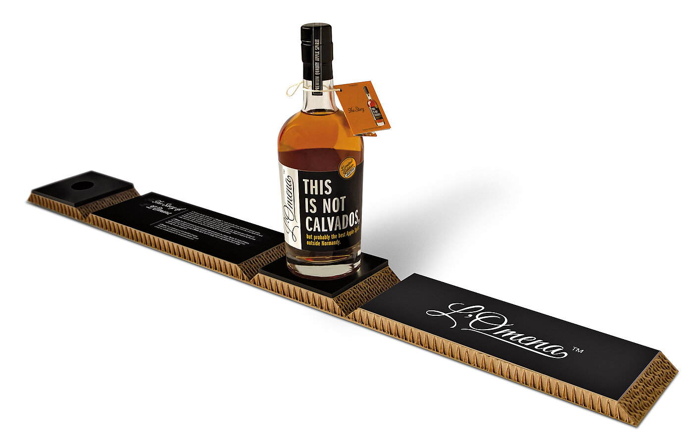
A premium product targeted at Calvados enthusiasts. Since the beverage was made for a niche market with fierce competition, the packaging design of the numbered bottles has been made to stand out and distinguish itself from other products in its category. The clear statement on the label “This Is Not Calvados” communicates the genre and challenges other Calvados products. The design aims to create a natural and hand-made look and feel. The light but strong package, made of environmentally friendly cardboard, also protects the product during transportation. “The packaging conceals nothing but makes its original content immediately visible”, comments the Red Dot jury.
The Burger Report – Red Dot: Best of the Best 2015
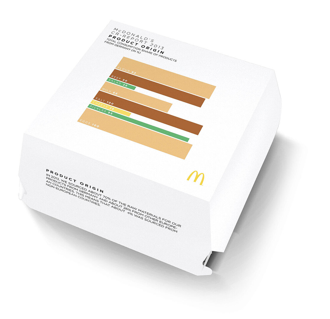
Corporate responsibility is a crucial component of the company policy of McDonald’s. The question preceding the design of the annual report was: how to fire the enthusiasm of a target group of mainly sales-driven partners for the important issue of corporate responsibility? The solution was to relate essential information from the corporate responsibility report with the one thing that partners are most interested in, at the very heart of the business: the burgers. The report was presented in easy-to-understand bar charts, which were also minimalistic representations of the restaurant’s most successful burgers. These diagrams with the key facts were printed on the original packaging of the six most important burgers and distributed among the partners. A QR code on the box was a direct link to the full report.
Audi Magazine – Red Dot 2015
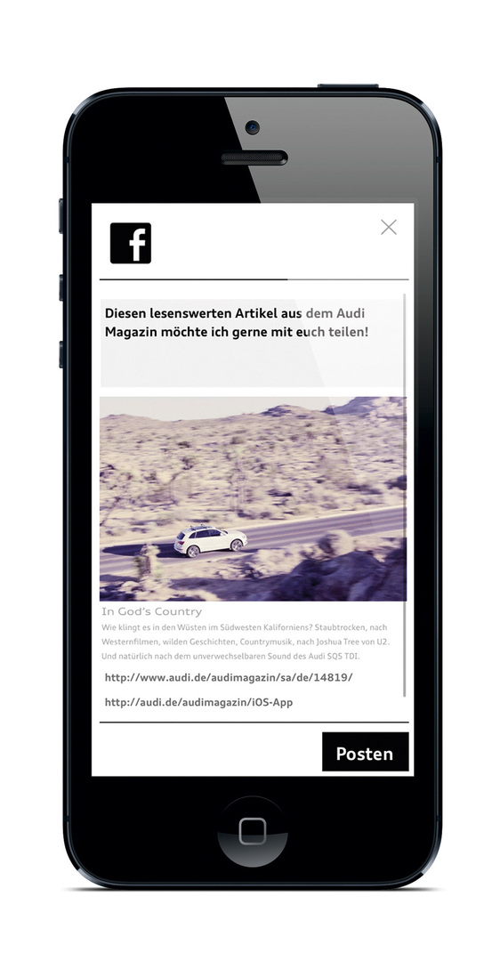
With the relaunch in 2014, the digital version of Audi Magazine switched to a blog-style. The app now runs as a continuous stream so that it is no longer necessary to download large files. All content is presented in a scroll-down format, can be accessed by the touch of a finger and shared across social media channels. The magazine’s key principles – opulent visuals, sophisticated content, and innovative design – also characterise the app crucially. Available free of charge for all Android and iOS devices, it successfully extends and supplements the magazine’s print edition.
Participation periods of the Red Dot Award: Communication Design 2016:
Early Bird: 29 February 2016 to 5 April 2016
Regular: 6 April 2016 to 12 May 2016
Latecomer: 13 May 2016 to 10 June 2016
More information: www.red-dot.org/cd


