Client: Ericsson, Stockholm, Sweden

심사평
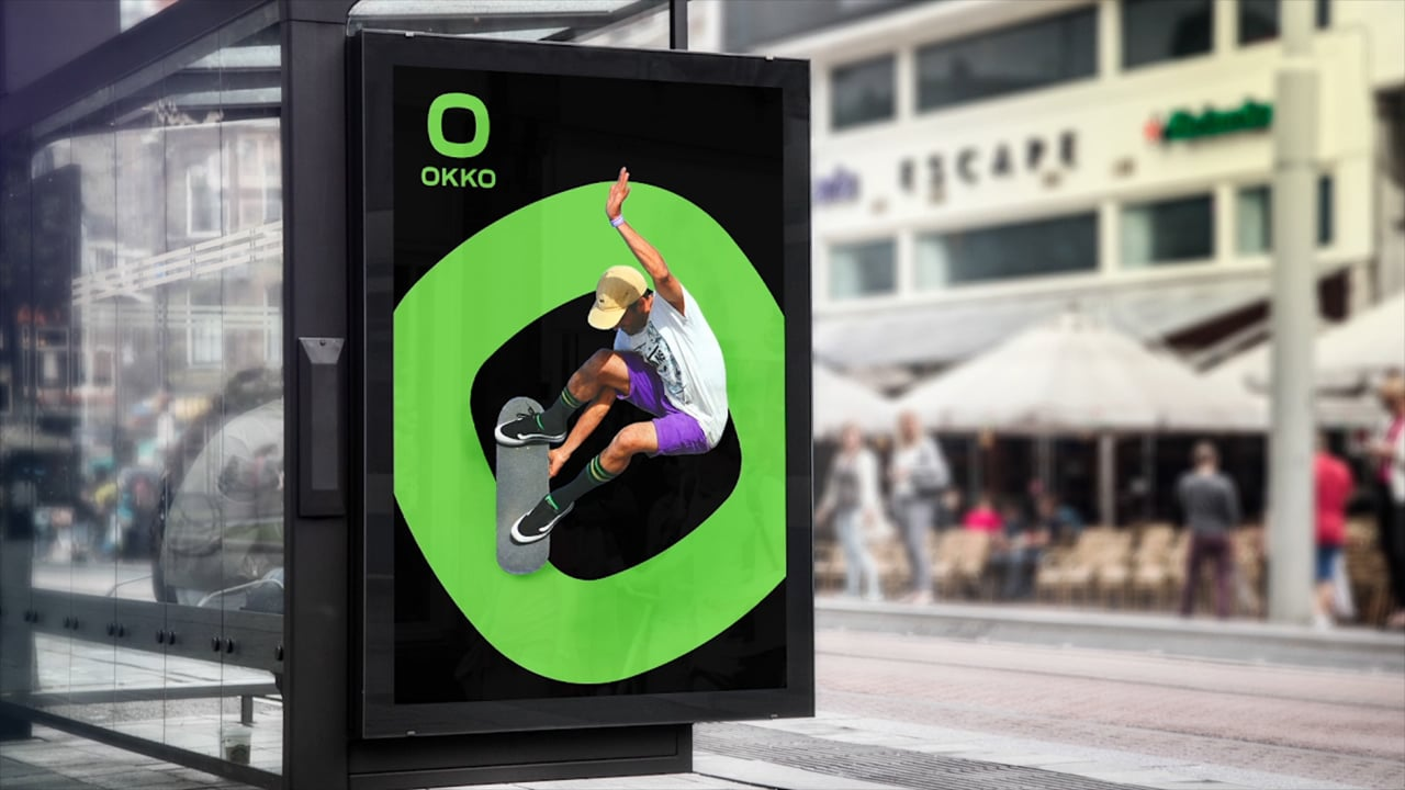
The new visuals for the brand OKKO exude a very powerful and energetic presence. The bold and strong logo uses black as a main carrier of the message symbolising petrol and oil, paired with highly vibrant colours distinguishing the individual products. The entire appearance truly complements the brand values and has emerged as a playful and versatile corporate visual platform that appeals to different audiences – a splendid example of design work.


