The Children’s Exploratorium of Hsinchu City is accommodated in the pavilion used by Taiwan present itself at the World Expo in Shanghai in 2010. It was subsequently re-erected in Hsinchu. To turn it into an Exploratorium, the building was converted, and a brand architecture developed that corresponded more closely to the museum’s concept of “Deconstructing, Exploring and Renewing”. So as to position the Exploratorium as a new and innovative place of learning and leisure, the city, which operates the museum, relied on the creation of a strong brand with an unmistakable visual identity.
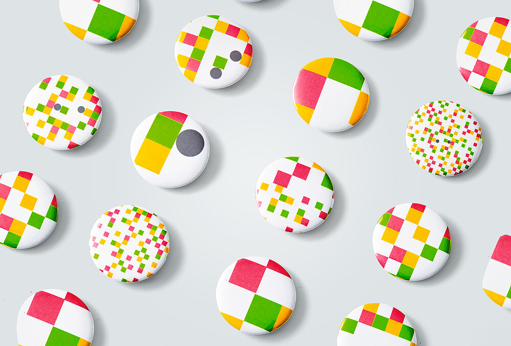
The Ken-Tsai Lee Design Lab was tasked with designing that identity. “For this project, the challenge lay in breaking with the public’s established image of a visual design as is typical for children,” Ken-Tsai Lee says, “At the same time, we needed to ensure that the design was innovative and conveyed the experimental and exploratory spirit of the Children’s Exploratorium.” The result of the design process is a pithy visual identity whose essence is based on three elements: the Chinese character 兒 for child, which is universally understood thanks to its imagery, pixel graphics as a symbol for technology as well as a labyrinth based on games such as Maze Game, Pacman and Snake as a reference to playful exploration. The colours chosen for the brand are pink, yellow and green with reduced colour saturation in order to appeal to children of all ages, to avoid visual overstimulation and distinguish the Exploratorium from other entertainment venues with its colour scheme. The institution’s logo combines all design elements. It is a deconstructed Chinese character composed of Tetris-like pixel elements in the three brand colours. It is both playful and contemporary in appearance and also is at the basis of a comprehensive pictogram system that for orientation in the building. Numerous versions of it are used on all communication materials, including an animated version.
As brand owner, the city of Hsinchu is convinced that “the unconventional design style may at first glance pose a challenge to public acceptance, but it is innovative and flexible and also consistent with our core concept. It is a design identity with a long-term outlook.” The Red Dot jury, on the other hand, says, “The visual identity of the Children’s Exploratorium not only has high recognisability, but is also inspirational. The design is appropriate for children, but its playful, creative use of traditional Chinese characters and high degree of abstraction also appeal to adults. With its flexible use of various design elements, it invites viewers to keep examining it – and that makes it ideally suited for a place of learning and exploration for children.”
크레딧
Company:
Children’s Exploratorium of Hsinchu City
Founding Year:
1982
Lead Agency:
Visual Image Design Co., Ltd.
Company Founder:
Hsinchu City Government
Number of Employees:
1066
Client:
Children’s Exploratorium of Hsinchu City, Hsinchu City, Taiwan