When not only the content is refreshing: Awarded packaging design
Whether ale, lager, export beer or Pils, whether Coke, lemonade or cider: The selection is wide when it comes to beer and soft drinks. If the choice for the refreshment should not only be made exclusively according to the preferred taste, the gaze can pass over a number of exciting packagings. These can certainly encourage conversations at the next party or at a cozy get-together.
The high art of the brewery and the high art of packaging come together at the Red Dot Award: Communication Design. Every year, the most exciting packaging solutions are awarded here. In 2017, for example, MillerCoors from the USA, the Paulaner Brewery Group and the Früh Brewery from Germany were honored.
Beer, stars and stripes: Miller Lite
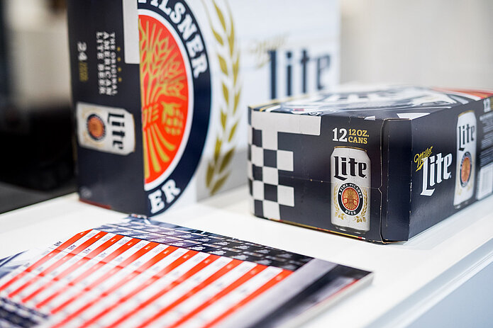
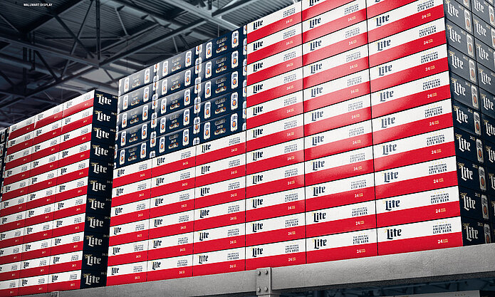
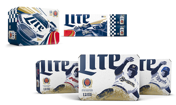
Recreating the American flag from packaging. This is possible thanks to MillerCoors, producer of the Miller Lite beer from the USA, since last year. The sides of the cardboard boxes, in which the beer cans are packed, are each held in red-white and blue. If the packs are stacked accordingly in the store, this results in an image of the American flag. Other elements of the Miller design capture the Americans' love for sports. The cartons contain baseball images and graphics of the famous motorsport events NASCAR and Indy 500. All designs are composed so that they can be used in various formats and, despite their diversity, can clearly be assigned to the branding family. An approach that convinced the Red Dot jury to award the Red Dot: Best of the Best.
With Früh Sport to a new terrain
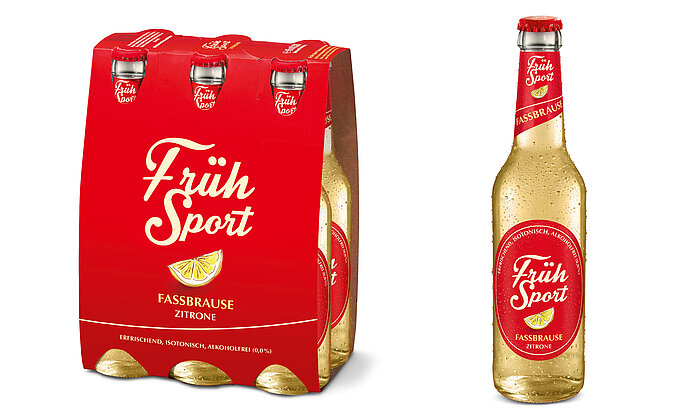
If an established beer brewery wants to conquer the soft drink market, it needs a good marketing idea, so that it does not get lost in the shuffle. The Kölsch beer brewery Cölner Hofbräu P. Josef Früh ventured this step and brought a non-alcoholic lemonade on the market. “Früh Sport” does not only catch the eye because of the naming, the design of the six-carrier as well as the individual bottles also convinced the Red Dot Jury. With a classic, clear appearance, the packaging stands out from the competition and at the same time fits into the existing portfolio of the traditional brewery. The design achievement was rewarded with the Red Dot.
The combination of innovation and tradition: Paulaner Zwickl
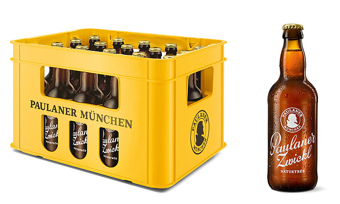
Full-bodied and tasty – this is what the brewery Paulaner from Munich promises with its new Zwickl beer. The so-called “Zwickeln” was formerly reserved for the brewers. During the brewing process, only they could take an unfiltered sample of the beer. This unadulterated taste is now characterises the new cellar beer of Paulaner. The originality of Zwickl is conveyed by the restrained, classic-looking design of the bottle. The glass decor is burned in. This makes the appearance unique and the label remains permanently on the bottle. Since no adhesive label is used, the packaging waste is reduced by two-thirds. In addition, the bottles do not have the capacity of 0.33 or 0.5 liters which is usual in Germany. The cellar beer of the Paulaner brewery is filled in 0.4 liter bottles.
Packaging design beyond the boundaries of the beverage industry
Not only beverage packaging is honored in the Red Dot Award: Communication Design. The Packaging Design category includes subcategories such as Beauty & Nursing, CDs & LPs, Fashion, Food & Health as well as Children, Luxury & Retail. Moreover, there are 16 additional categories, like “Poster”, “Advertising” and “Sound Design” available for participation. Invited to the competition are agencies, designers and companies from all over the world. The works can be registered until 15 June 2018.
» All information about the various registration phases, the evaluation and the participation costs can be found here.
