Typography: the power of award-winning types
Whether in magazines, on posters or on packaging – text does not only serve the transfer of information. The way it is designed influences subconsciously the perception of the content. Being an important tool for communication and a design element, the development and goal-driven usage of fonts are a complex field of activity. In the Red Dot Award: Communication Design, designers from all continents regularly prove how to communicate in an outstanding way with the help of typography.
Typography as a facilitator
Akira Kobayashi, awarded as a type designer several times, evaluates the works submitted to the Red Dot Award 2018. He explains: “The ultimate goal of type design is quite simple: to help convey messages to readers. Type can be expressive or attractive, but it should not distract the reader from the content.”
Scope of design
“Book typography was the starting point of my career and is still one of the fields I specialise in, but I am currently interested in notices and signs in public spaces. Signs are part of our urban landscape and often regulate or control our social activities. The scale of public signs is completely different from that of book typography, and the quality of design more directly affects viewers’ activities.” From his personal experience, the design expert knows that the requirements posed on typography vary depending on the purpose and environment.
Typography explains the content
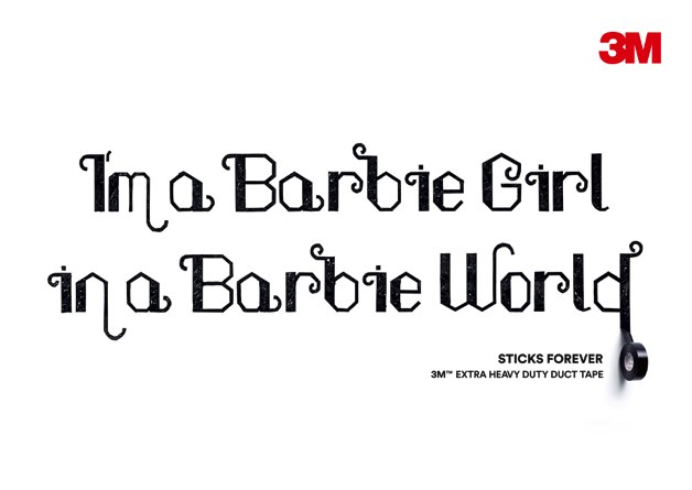
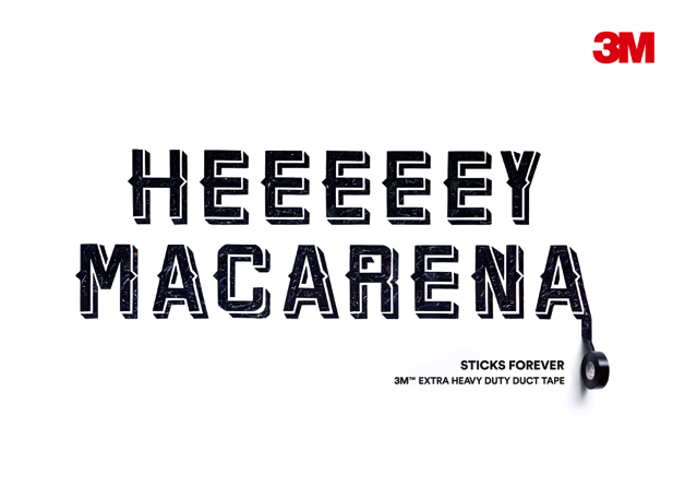
Kurt Weidemann said, “good typography explains the content. Not the designer.” This is made especially apparent by the 2017 Red Dot: Best of the Best awarded advertising campaign “3M Forever Sticking Billboards”. Designed by Cheil Germany, typography plays a crucial role in the work. Australian tape artist Buff Diss affixed well-known lyrics on large-scale billboards across Hong Kong using the adhesive tape of the manufacturer 3M to demonstrate that it is as adhesive as the illustrated catchy tunes. By designing the typography for each song in the way that the song is sung, the campaign immediately creates the melody in the viewer’s mind. This is why the lovely lettering with squiggly serifs of “Barbie Girl” arouses other associations than the vivid clear capital letters of “Macarena”. They have one thing in common: they stick in the mind.
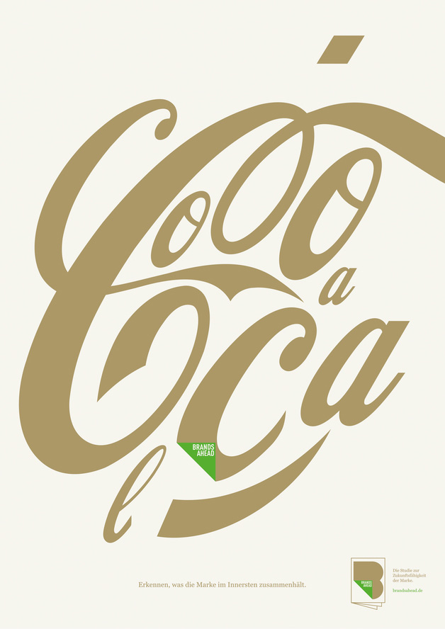
The recognition value of typography
Companies and brands take advantage of typography achieving emotional effects, just like colours do, and creating a picture in the viewer’s mind. When thinking of the name “Coca-Cola”, you unavoidably see the logo. Even if it is shown in a dismantled way, you will recognise the brand because of the distinctive typography. The poster series “Brands Ahead” by GREY and KW43 BRANDDESIGN, which was awarded with the Red Dot in 2017, illustrates this in an impressive manner.
Typography breaking boundaries
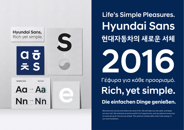
Moreover, the communication in a global market places special demands. Car manufacturer Hyundai met these by launching an exclusive typeface, which was awarded with the Red Dot in 2017. “Hyundai Sans” supports communication in 103 languages and, at the same time, is compatible with all media and digital devices. Its design is timeless and deviates from the brand’s traditional and technical style. Likewise, the traditional Korean letterforms influenced the form language of “Hyundai Sans”.
Developing a new typeface is not easy, explains Akira Kobayashi: “If you try to develop your own typeface, you will find yourself facing two things which are contradictory: you want to design a brand-new typeface, but in order to make it readable, your letterform must also be close enough to existing designs.”
Advice for participating in the award
Typography is one of 17 categories in which designers, agencies and companies can enter their projects in the Red Dot Award: Communication Design 2018. Akira Kobayashi explains what the jury demands: “First of all, whatever you are trying to say, your message should be understood by viewers. In the next step, your piece has to tell the story or the idea behind it. It does not need to be loud or fussy. Carefully arranged body text in a well-chosen typeface, for example, grabs the jury’s attention for sure because it speaks for itself! Personally, I want to see a good type or typography which shows respect for tradition in some way. I want to be surprised by a contemporary piece of work with a novel idea but based on the things which have been inherited from generation to generation.”
15 June 2018 is the final deadline for submitting brochures, books, covers, information systems, packaging, pictogram systems, posters, typefaces and many other projects.
» Further information on the participation in the Red Dot Award: Communication Design 2018