More than just lettering: Typography
In 2016, the category “Typography” again showed the wide range of the Red Dot Award: Communication Design – brochures, catalogues, film titles, information systems, magazines, packaging, pictogram systems, posters, typefaces and other projects were judged by the Red Dot Jury. Two Red Dot: Best of the Best awarded projects perfectly show this wide diversity: “By the Way” designed by Thomas Wirtz and “Kontrapunkt Miki” designed by Kontrapunkt Group A/S.
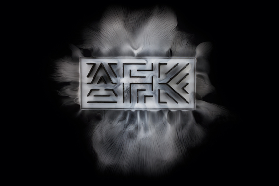
“BTW” and “AFK”– a student work combines typography and physical processes
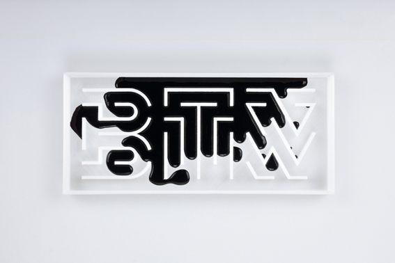
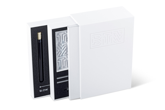
The work “By the Way - Typography and Material Behaviour” is a free design experiment: A self-designed font was printed in 3D so that it looks like a glass covered labyrinth in a box. By applying a variety of different chemical and physical processes, the letters are surrounded by e.g. fuming or burning liquids. One of the generated visual effects is a slow motion, that normally only can be realised digitally. This analogue-digital opposite is underlined by the usage of acronyms like “BTW” and “AFK” that are commonly used in the internet jargon and by the combination of the used attended media: With references to the associated website, the attendant book documents the search for constants within the experiment, the design of the font, including the development of the 3D printing models, as well as the studies of different physical phenomena. Especially the experimental character convinced the Red Dot Jury: “Thanks to the numerous physical experiments, it not only lends the typography a new visual level, but also plays with the digital and analogue dimensions – an autonomous approach with an impressive outlook in terms of both concept and aesthetic.”
The typeface “Kontrapunkt Miki”
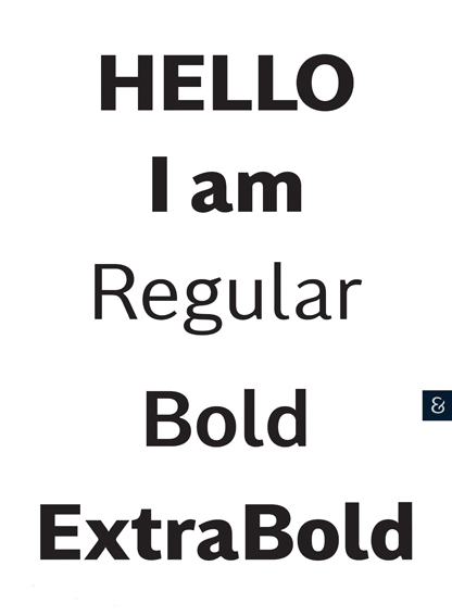
With less focus on experiments but with the basic idea of sharing, the typefaces of “Kontrapunkt” also convinced the jury. The typeface “Kontrapunkt Miki” is the third member of the free typefaces by Kontrapunkt. It was inspired by the discovery that many of the sans-serif typefaces are similar in expression and application. Therefore, “Kontrapunkt Miki” got more personality and a wider usage repertoire and stands between the Antiqua and the Sans-Serif design approach. The Red Dot Jury was convinced by its “purity”, the “balance, contrast and characteristics regarding the human shapes” and by the thick and thin lines. In their opinion, the “typeface is refreshing, elegant and straightforward”. Furthermore, it is an idea that does not only acknowledge the sources of inspiration but also the actual designs that are both relevant and applicable.
Award ceremony in Berlin shows Red Dot Award: Communication Design 2017 winner
Also in 2017, many exciting works were awarded in the category “Typography” of the Red Dot Award: Communication Design. These and all other winners will be presented at the Red Dot Gala in the Konzerthaus Berlin on 27 October 2017. You can find more information about the event here.


