A look beneath the surface: the use of colour in design
Colour plays an important role in the design process. It has an effect on how a product is perceived and it can be a unique characteristic of a company, affecting its entire external image. Moreover, the use of colour can mirror the trends and developments in a product segment or even in society.
Each year, the colour institute Pantone states a range of trend colours which characterise the seasonal fashion and design market. In Europe, bright yellow and green tones are currently used. These are typical colours for spring and summer, but they also attest the desire for ease in turbulent times. In contradiction to such ephemeral appearances, some shades are consistently tied to a brand or a product.
Ferrari is mainly associated with the red Rossa Corsa. This colour is a perfect reflection of the emotions and the passion that driving a Ferrari evokes. For the Finnish tool manufacturer Fiskars, orange plays a crucial role. Not only the logo is kept in orange, the colour was also successfully transferred to their products. Thereby, an iconic element of the brand has been established that also fulfils an important function: The orange coloured parts indicate where to touch the product.
With the introduction of the iMac in 1998, Apple was able to present a new computer that was easily accessible and appealing. The industrial designer Jonathan Ive put the so-called “grey-boxes” to rest and created a PC with a translucent case and cheerful colours, such as green and pink. At that time, the use of colour was a sign for the increasing digitalisation as computers began to be part of everyday life.
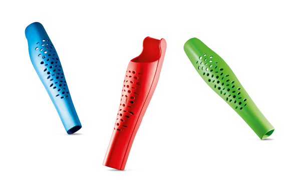
Furthermore, the choice of colour is part of a new design approach in the area of health care. As a result of technical progress and in order to make both, the medical personnel and the patients, feel comfortable, design has become a key feature in this area. The “Confetti” prosthetic leg panel is a good example for this. The Red Dot: Best of the Best winner 2017 captivates with an emotionalising form language and with the selection of fresh colours. This has a positive effect on the self-esteem of people who need prostheses.
Colouring is more than just the mere decor of a product. It is of central importance. It can fulfil the function of seduction, have a fixed symbolic value for products and companies, or is used as reference to cultural and social changes.


