NAVER is a South Korean internet company that was founded in 1999 and started with a web portal that offered a Korean-language search engine. The NAVER Business Platform (NBP) is a subsidiary of NAVER that supports the IT infrastructure of NAVER as well as its affiliated companies. The services the company offers also include the NAVER Cloud Platform (NCP), a work series which, consisting of a Workplace and a Workbox, provides business application services to SaaS (software as a service) with accumulated technology and know-how from various market experiences. In order to raise more public awareness of the Workplace and Workbox as global services and thus take a leap forward, the offer underwent a complete rebranding.
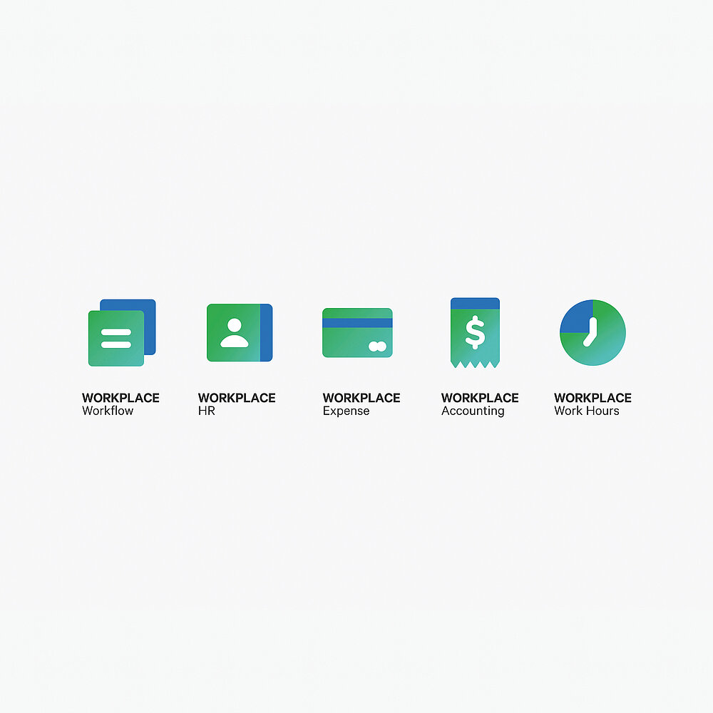
The new brand identity is based on the brand claim of “Simple, Share, and Solid”. Following the idea of these concept keywords, the image of the NAVER Cloud Platform was formed as an easy-to-use and intuitive service for global companies and start-ups, as well as embodying an efficient tool for collaborations. The focus of the new brand identity is on the use of images, symbols and pictograms, aimed at easy-to-understand usability of the Workplace, a cloud-based integrated communication solution, as well as the Workbox, a file-sharing service. The logos of the two services are each based on a hexagonal grid that symbolises the cloud-based work environment. In the case of the Workplace, the grid features two opposing surfaces that stand for “Place” and “Connection”. With the Workbox logo, a box that is open at the top and bottom is created within the grid, symbolising the “Box” as the cloud-based storage space, on the one hand, and the “Sync” as the real-time sharing of files, on the other. Various shades of blue, one green tone and white are used as the main brand colours. The combination of blue and green lends the logos a three-dimensional appeal, while the use of the colours across all media creates a homogeneous brand appearance with a high recognition value. The corporate typography of neo-grotesque sans-serif Calibre ensures that copy, digital and analogue, is easy to read even in small font sizes.